
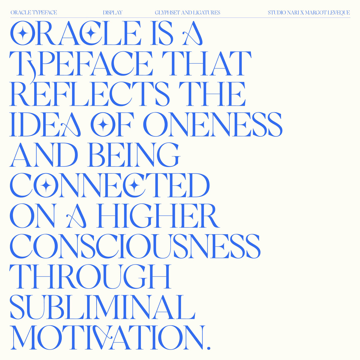
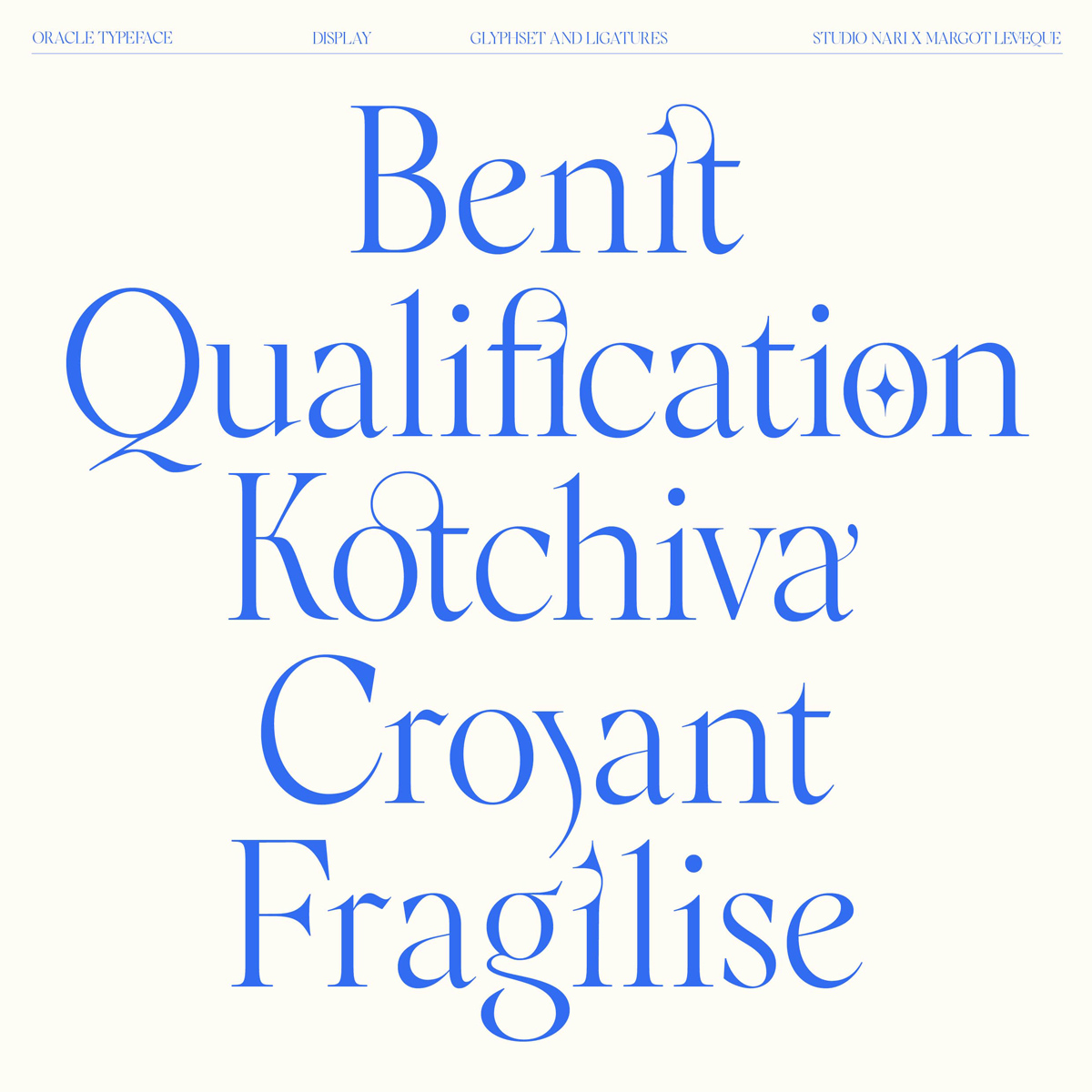
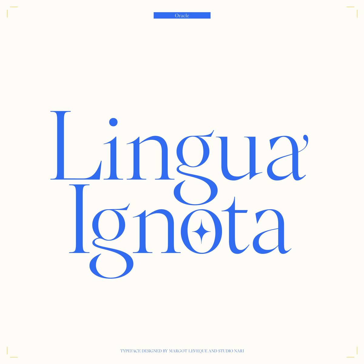
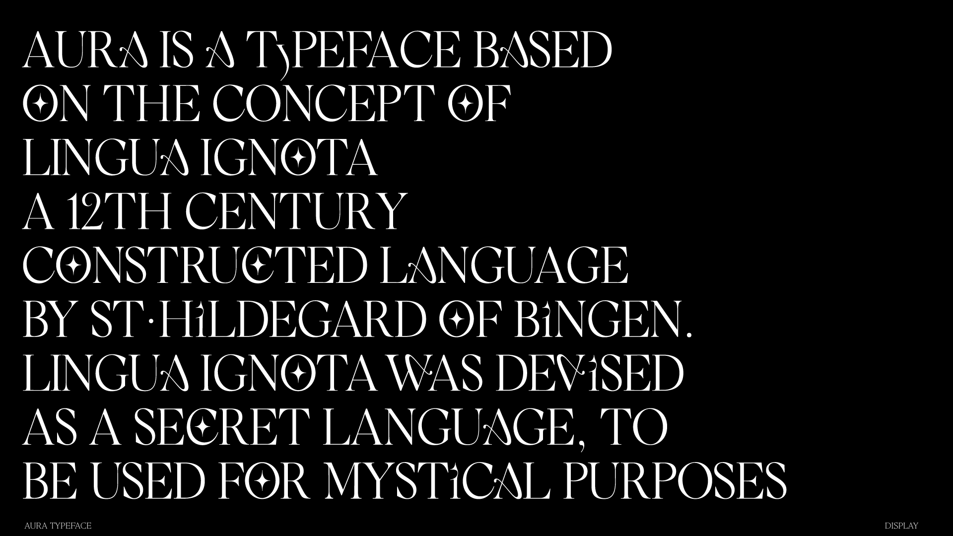
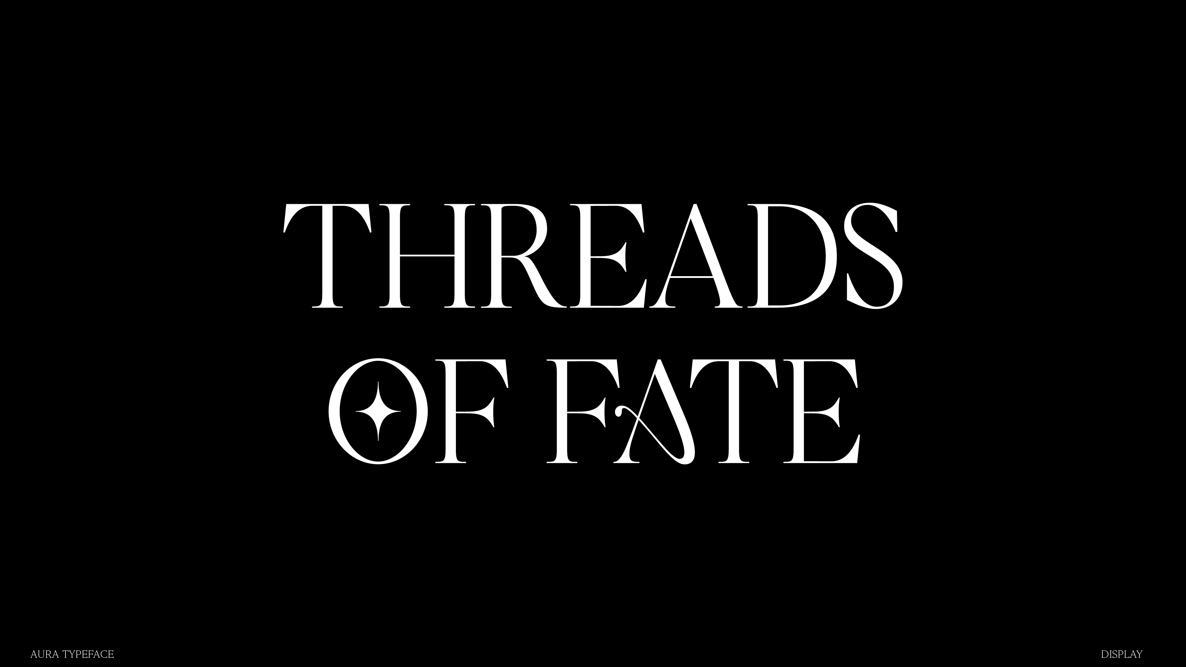
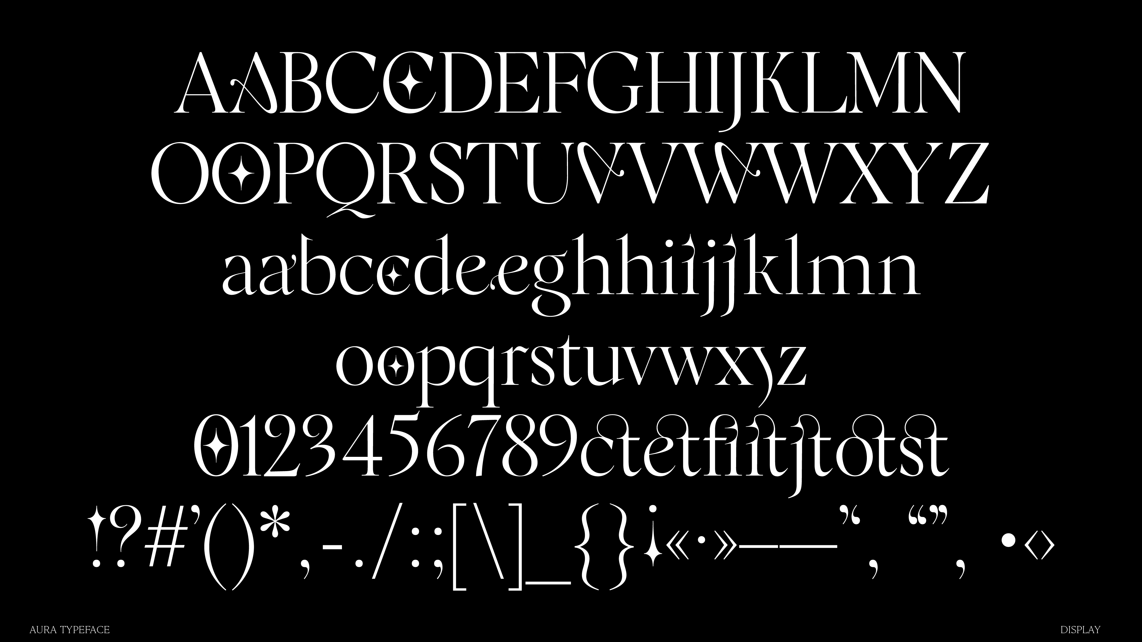
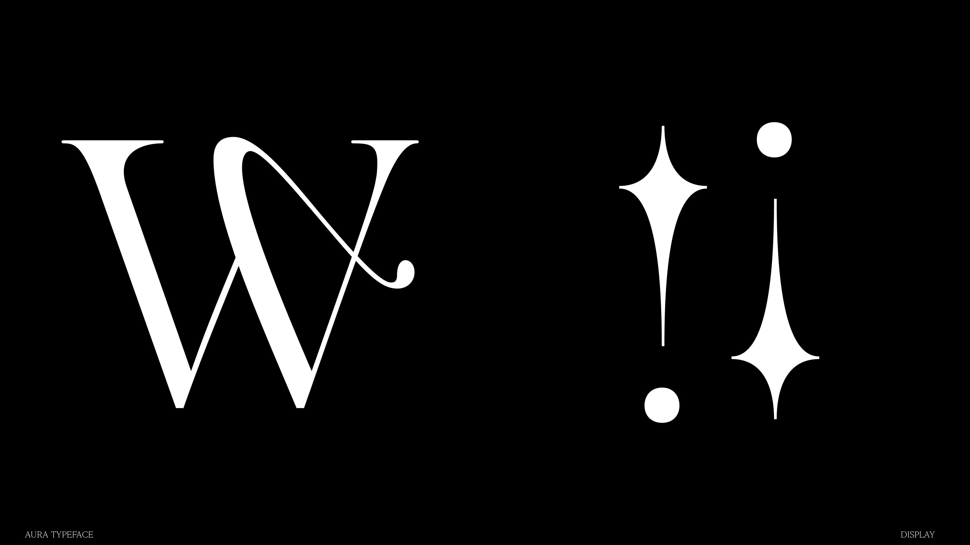
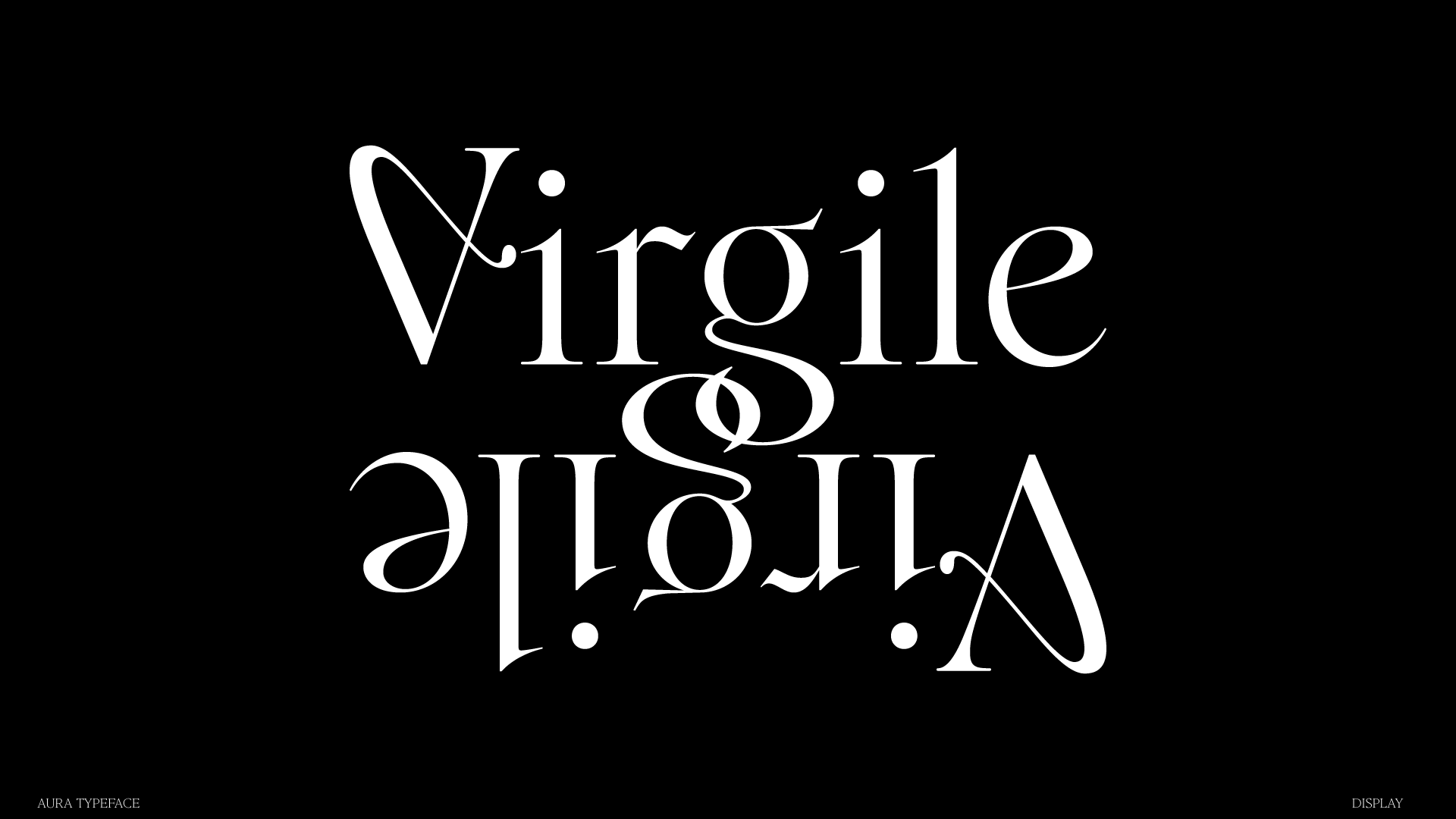
When being commissioned to design a custom typeface for The Threads of Fate, an oracle and tarot deck producer in Los Angeles, Caterina Bianchini from London based Studio Nari came up with the idea to revive Lingua Ignota, an ancient constructed language from the 21st century by St. Hildegard of Bingen. It was devised as a secret language to be used for mystical purposes. “It was a very fitting connection”, Caterina tells Collide24, “We wanted to build a typeface with layers, hidden symbols and glyphs that could construct a different feel to a word each time it was typed depending on the symbols you decided to choose to use.” After their first initial sketches, Studio Nari teamed up with Paris based graphic and type designer Margot Lévêque to build the final designs of the characters and form a very unique, symbolic typeface, called Aura. As a modern interpretation of Lingua Ignota, the typeface was created to hold symbols in the counters of the characters as well as have hidden graphic motifs embedded in the character builds. The juxtaposition of soft and sharp shapes creates a sense of movement and elegance within each character.
Describing them as “artfaces”, Studio Nari often offers the creation of a custom typeface to their clients when designing their identity system or logo. “We definitely don’t consider ourselves typographers (we leave that to the professionals) but we always try to offer that extra bespoke element to a client when delivering any identity project”, Caterina explains, “It allows us to create something that feels completely connected to their brand, it was built specifically for them and creates a different facet to the identity.” When they relaunched the studio this year, Margot has been one out of six creatives they asked to reimagine their brand for the launch and promote it on Instagram. “We had always been very fond of her beautifully classical style of typography, it sense of elegance and thoughtfulness captivated me!”, Caterina states. After a successful launch, the duo stayed in contact with each other and decided to collaborate on Aura soon after. “Having Margot a part of the project elevated the font to a different level”, Caterina states.
“To be honest, when I received her email, I was very excited! Caterina is one of my favorite graphic designers”, Margot tells us, “Right now we are working on an exciting new project! I hope we will work together often, we understand each other very well and we are going in the same direction, it’s very nice to work with someone like her!” Hoping to build upon this type family in the future, a full secondary uppercase set with every character holding a symbol with it is already in discussion.
While her creative career began by studying medium format photography, Caterina decided to specialize in communication design later on, inspired by famous designers like Bruno Munari, John Berger and John Baldessari. “As a design studio we like to focus a lot on concept, everything we do is very deeply researched and our concepts are always multi layered. This influences the way we design a lot too, as we enjoy building a lot of subliminal references into the work we create”, Caterina tells us, “Studio Nari stands for ‘Not always right ideas’, which is at the core of everything we do.” Drawing the focus away from the classic “Do’s & Dont’s” of textbook graphic design, Studio Nari aims at practicing a humanistic and artistic approach. Always pushing each brief to its limits, the Studio has produced distinctive work for a range of clients in the past, like Boiler Room, Crack Magazine, Apple Music, Nike and many more.
When approaching a new project, Studio Nari always divides the working process in three individual steps, called “The Art of Seeing”. The first step, Pausing, is about the mindfulness towards days-to-day objects, learn more about the way we think about surroundings and include this way of thinking in our creative process. From there, the second step is all about reflecting and going deeper into the possibilities and potential a project can have. The third and last step is about the appreciation towards the design and ideas you have created, without having it to be applied to rules or be liked by others.
Margot’s career as a freelancer began at the same time when she started her studies. “I knew absolutely nothing about graphic design, I had very little graphic culture – I think the only artist I could name was Marcel Duchamp! – I was completely lost and didn’t know what to do with my life”, she remembers. After her first successful projects, she discovered her passion for graphic design, emphasizing the importance of typography to her practice. “For me typography became indispensable. I think it’s partly thanks to a sentence from one of my teachers, Pascal Kouyoumdjian, that I heard in my first year at school: ‘If you’re good at typography, your design will be good, strong and your message will be heard’. And it’s true that if the typographic rules are well applied and mastered, design will automatically hold its own.”
After her Master’s degree in Typography, she spent a few months working at Pentagram in New York, alongside Paula Scher. “I think that’s when it all made sense. I knew what I wanted to do, especially what I didn’t want to do! I love my independence, working on my own, taking the time to get to know different people and different studios”, she states. With this wealth of experience, she already has a number of projects under her belt, working with clients like Hermès Paris, Vogue, Maserati, &Walsh and Actual Source.
When designing a typeface which she describes as a “long and complex process”, Margot draws a lot of inspiration from her surroundings. “Often, I find the inspiration in the street or on the internet with a single character that pushes me to develop the whole glypshet. But I never force myself!”, she explains, “After drawing some letters on layers, I vectorize them. Then, I think about the style and I harmonize the weights and I develop all the glyphset. Finally, the kerning and spacing (not the funniest moment!) But after that, when it’s all over, we can show it to the public. Honestly this is by far my favorite moment!” Her first and very well known typeface Romie has been two years in the making. “Today it has imperfections, but I’m not going to improve it, because this typography has a very successful history and brought me a lot of good memories”, Margot remembers.
Looking into the future, another collaboration between Studio Nari and Margot will be launched at the end of September – and according to them, “it’s quite a big one!” Stay tuned if you can’t wait to see more of this incredibly talented duo and be prepared for more magic and typographic finesse.
COLLABORATIONS TO LOOK AT:
Gentle Monster Kids Collection by Luca Mastroianni
Studio Nari
Margot Lévêque


