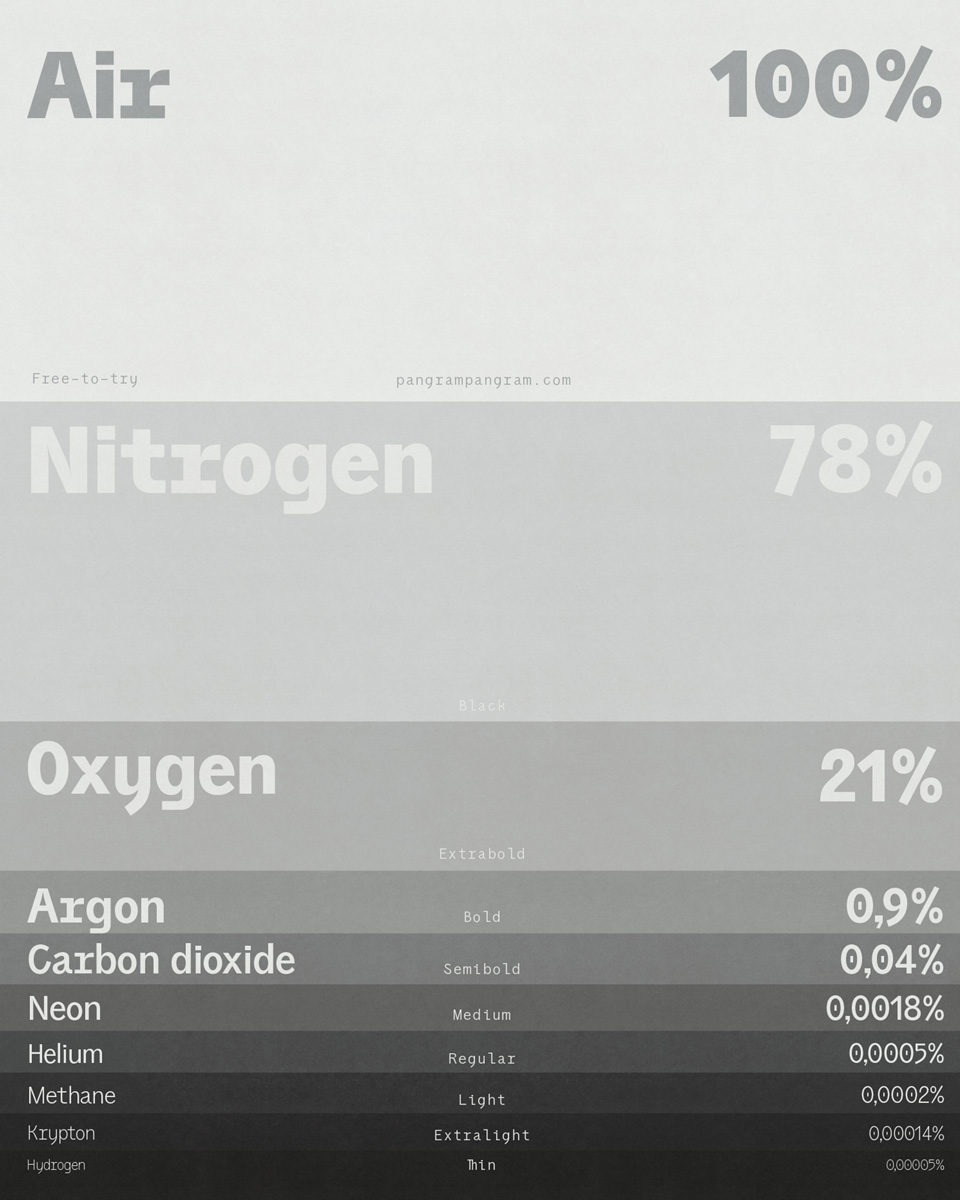
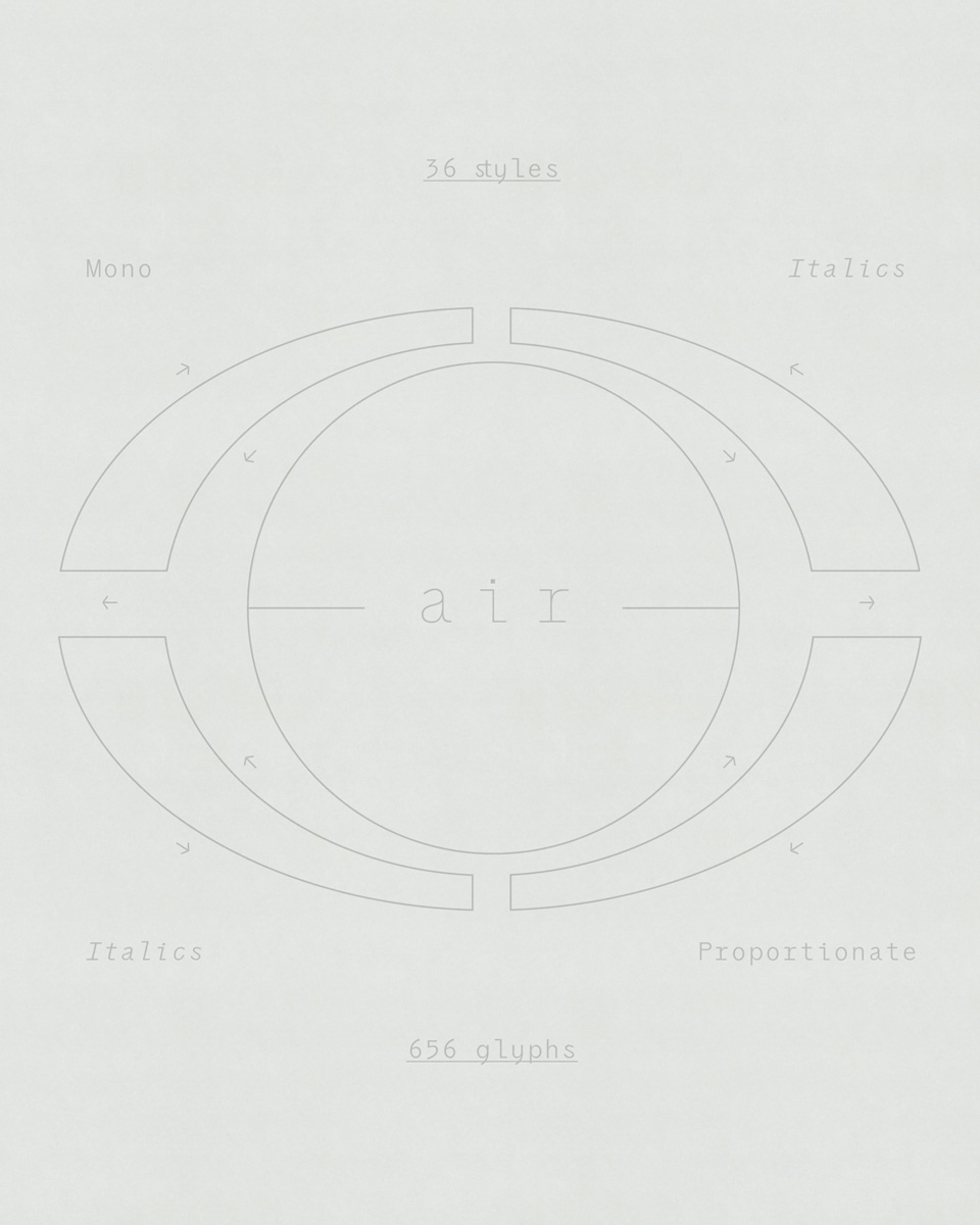
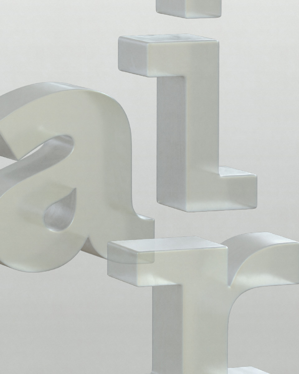
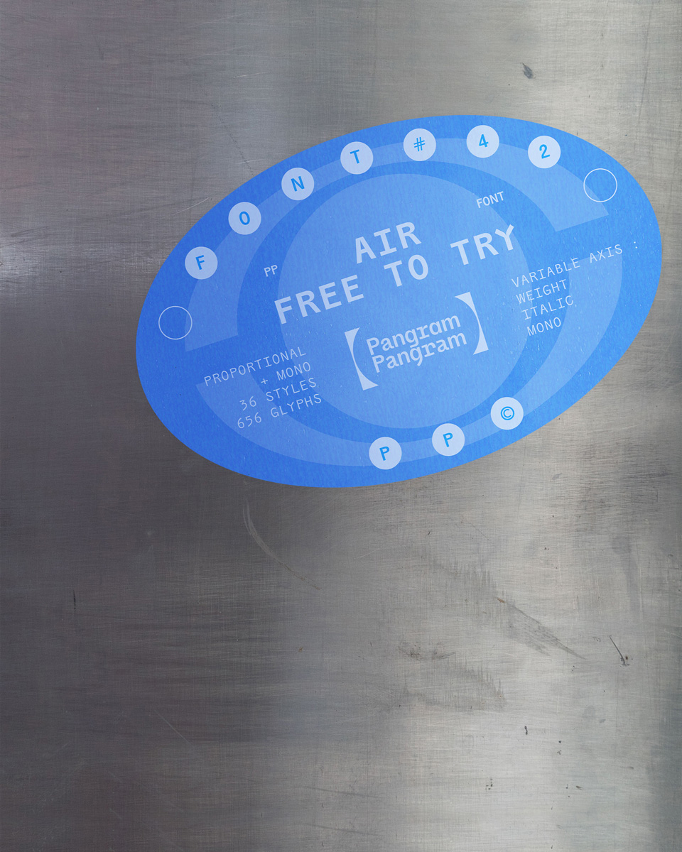
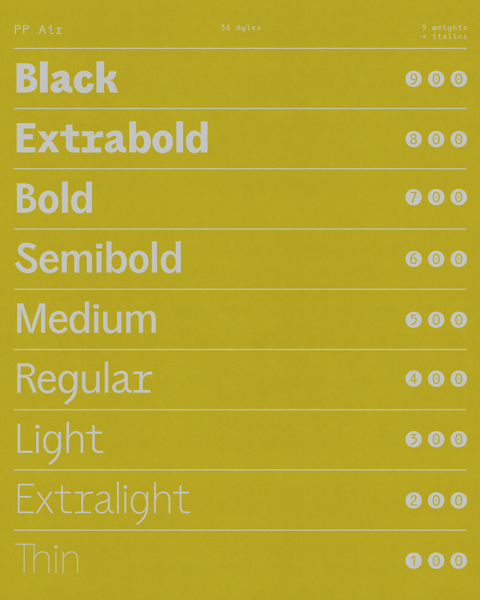
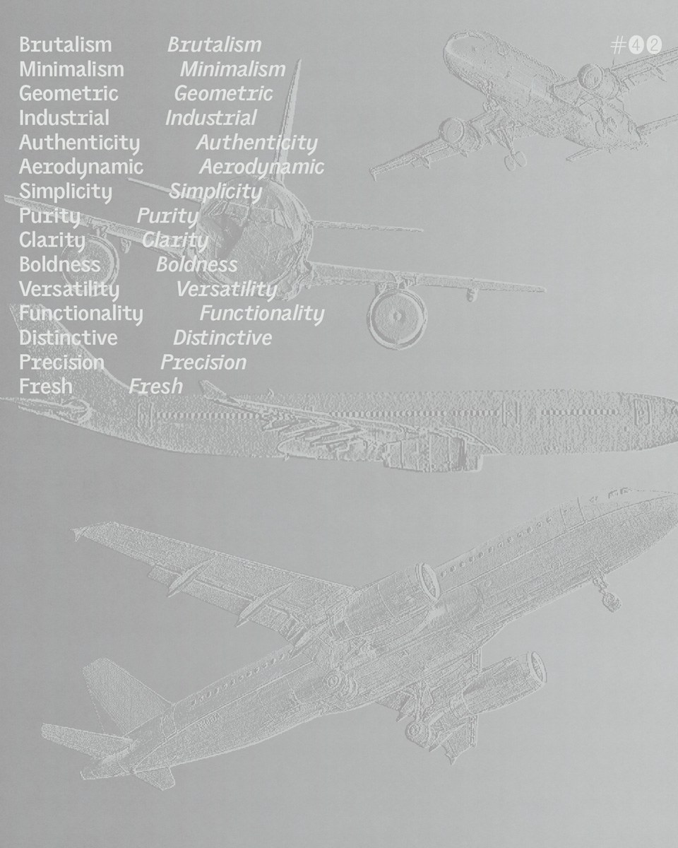
Inspired by airplanes and aerospace, “Air” is the latest brainchild of Mat Desjardins from pangram pangram and Caio Kondo from Inari Type. What looks like a typical grotesque workhorse at first glance turns out to be a beautifully designed type collection with meticulous attention to detail. Embracing the duality between simplicity and experimentation, Air consists of 36 weights in total, ranging from mono style to italic. The variable version of the typeface unites these axes in a single file. With a subtle nod to the sleek lines of aerospace design, Air offers a visually appealing and intriguing aesthetic.
Air was originally designed by Mat around two years ago. “I drew most of the alphabet of the first master where I incorporated most of the details I wanted to see in this new typeface,” he explains. The founder and creative director at pangram pangram has worked in the design industry for several years at various agencies and as a freelancer before answering his calling as a type designer—a passion he found after reading the book “Designing Type” by Karen Cheng.
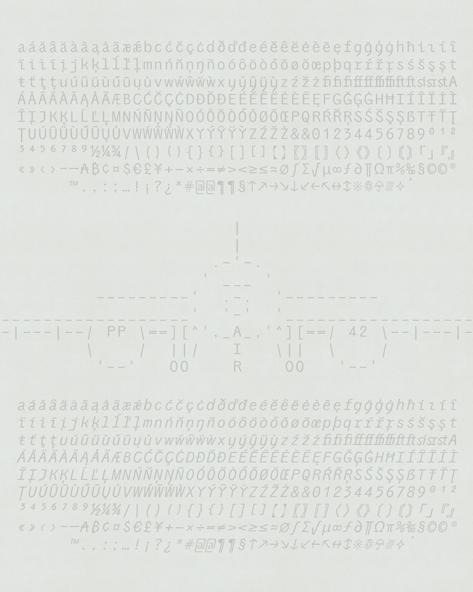
Once Mat had sketched his vision for Air, he decided to get Caio on board to expand the typeface and push the project even further. “This new typeface is no small feat. With the monospace and italics on top of making sure everything is perfectly variable, Caio’s hand was necessary to bring this project home.” Mat tells us. Since then, the duo has been hard at work to create the two families, Sans and Mono, of 656 characters each.
“From the very beginning, I was captivated by the originality and personality of that design, I knew that its concept would enable me to explore many new and unique things!” Caio remembers. “Some features stood out remarkably, like the connection of the Y and S terminals, for example. Throughout the expansion, I tried to exploit these characteristics to the fullest by applying them to symbols, punctuation, diacritics, and new alternatives in multiple style variations.” The Brazilian type designer with Japanese roots has long had a fascination with Latin and Japanese type design, fueled by his teachers and cultural heritage. After a few brief stints at other design studios, he founded Inari Type in 2020 and hasn’t looked back since. After an update, “Nikkei”—one of his first fonts created in collaboration with Lais Ikoma and Satsuki Arakaki—will soon be part of the pangram pangram catalog.
Now completed, Air brings a fresh and distinctive touch to the typographic landscape. What the future will bring is an open question. “If it becomes really popular, we might create the Cyrillic for it,” Matt states. “Otherwise, I had the idea of creating a type for each element. Again, if the traction is there, I might go down that path!”