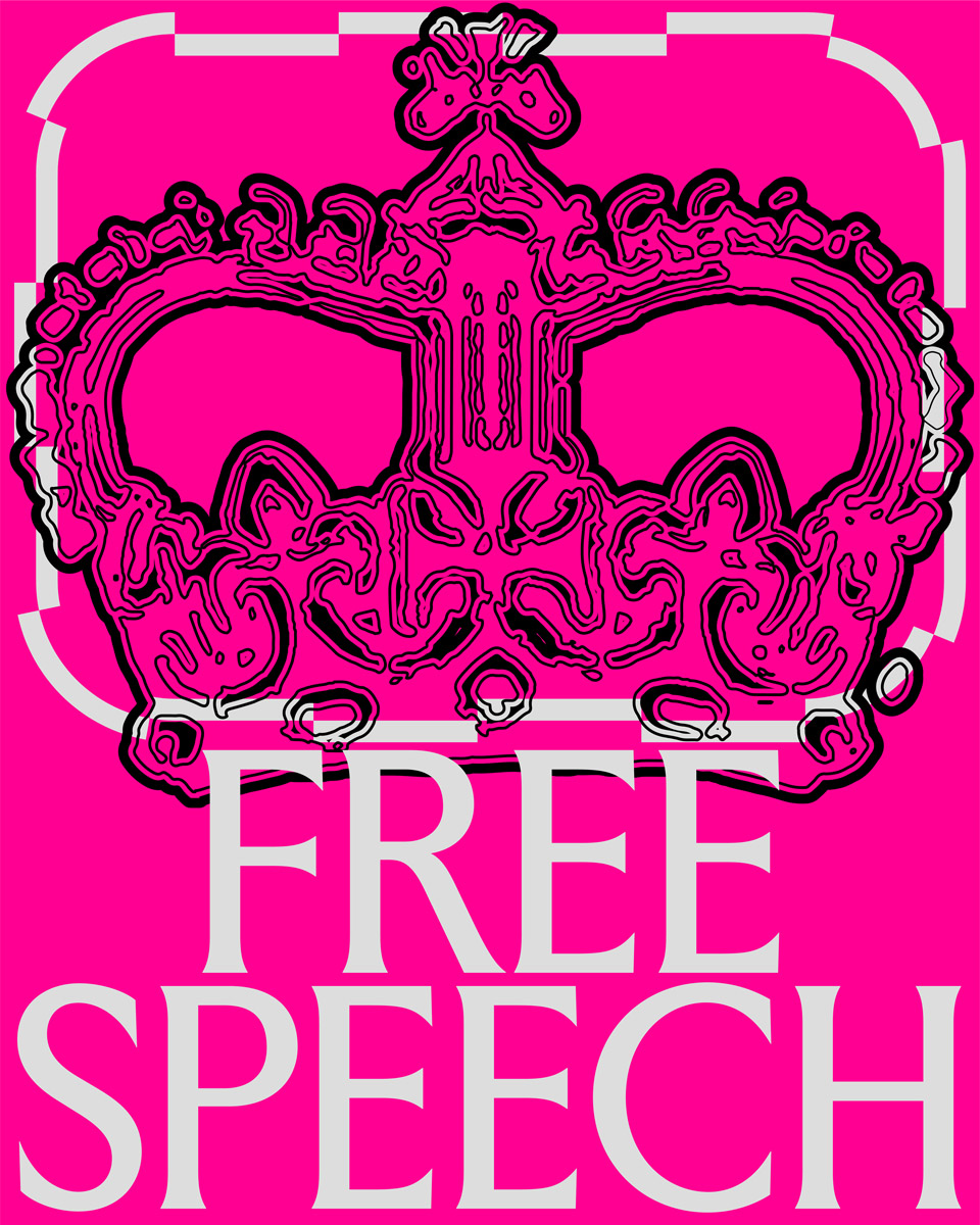
The death of Queen Elizabeth II in 2022 set off a wave of renewed scrutiny about the relevancy of the British monarchy as an institution in the future. While her passing after 70 years on the throne has been mourned by many, it also triggered worldwide debates about the British Empire’s violent exploitation of countries throughout its colonial history. Even within the UK, the gap between politics and people’s everyday life struggles becomes painfully clear when watching King Charles III’s pompous coronation ceremony amid spiraling living costs and looming strikes.
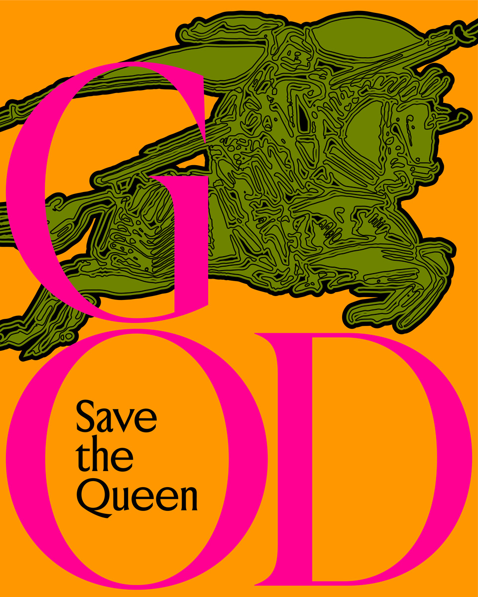
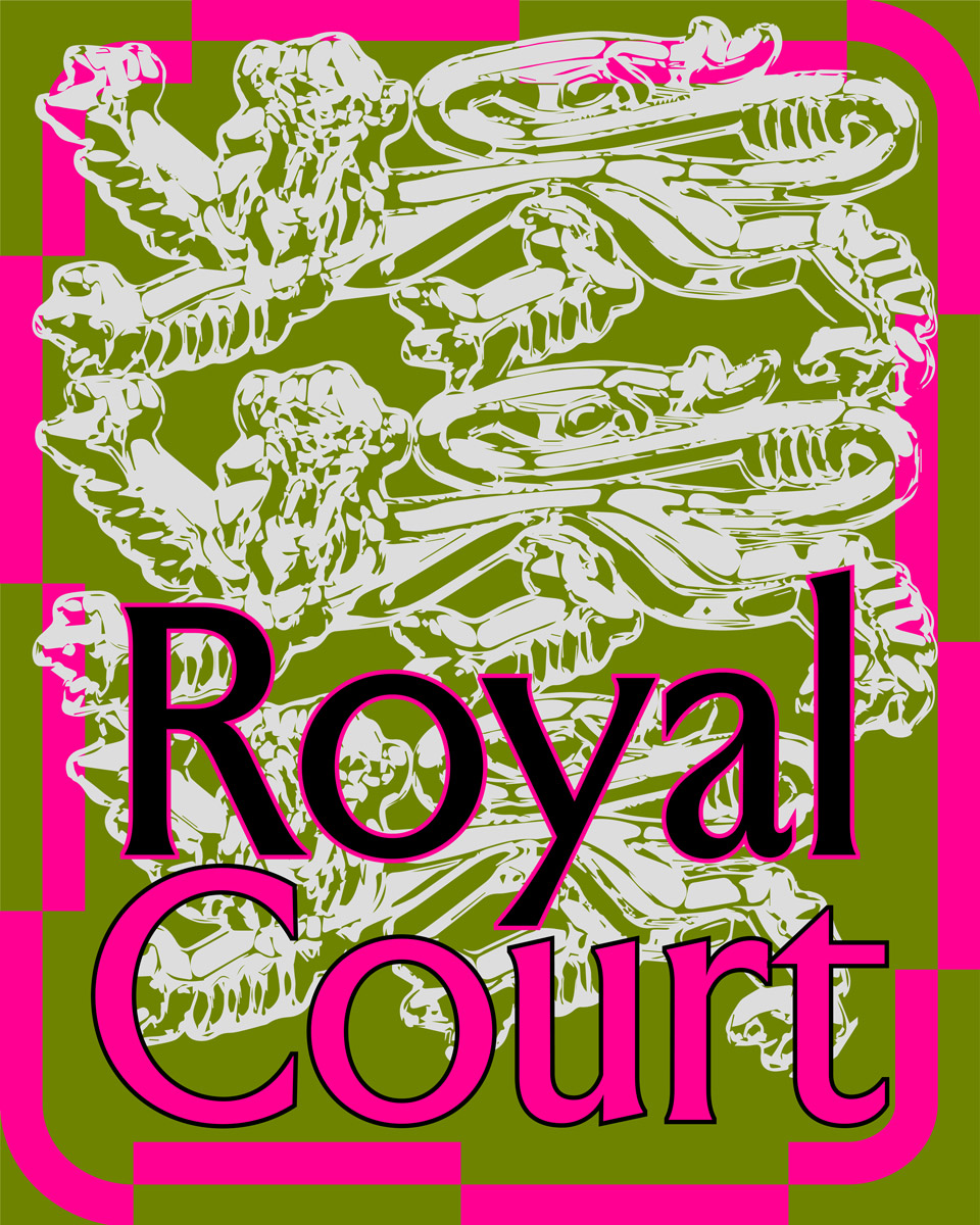
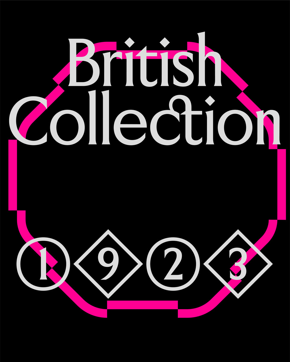
With their font family “Jubilee,” the two Italian type designers Piero Beninato and Valerio Monopoli took an almost satirical take on the British monarchy and its pompous traditions. “I have always seen the concept behind the project as an ironic discourse, more akin to the notes of ‘God Save the Queen’ by the Sex Pistols than the actual British anthem,” Piero tells Collide24. To create a rich typographic spectrum, the font family comes in six styles—Silver, Ruby, Golden, Diamond, Saphhire, and Platinum—one for each Jubilee of Queen Elizabeth II. The uneven hand-crafted proportions of its letterforms give the font family a distinctive character, bolstered further by its unique icons, crests, and diamond-like punctuation across its comprehensive glyph set.
Apart from its distinctive contrast between condensed and normal letterforms, “Silver” is a faithful reproduction of the legendary Gill Sans. The humanistic sans-serif family designed by Eric Gill and released by the British branch of Monotype in 1928 won the name “British Helvetica” due to its long-lasting popularity in British design. “Alternating wide and narrow letters is a quite clichéd way of spicing up a text, but in this case, it just meant stressing a concept that was already present in the original typeface,” Valerio explains. Many of its details, such as the sharp connections in the letters M and N, attempt to bring the old-established classic to the present. The font family was released on Pangram Pangram’s new foundry Off Type as part of their inaugural catalog.
Although “Jubilee” seems like a direct response to the current political debates, the duo completed this project shortly before Queen Elizabeth’s sudden passing in 2022. Valerio admits that he felt slightly insecure at first about how the font family would be perceived by the public, explaining that “Jubilee” is neither intended as a tribute nor a provocation. “For us, the crown’s lore was always merely a tool to link the font’s heritage and family structure to the British context, regardless of its political implication. In the same way that its name carries a double meaning, referring both to the underground line in London’s suburbs and one of the highest commemorative ceremonies dedicated to the monarchy.”

Two years have passed since we last talked to Valerio about the release of “Korium” with TYPE01. Since then, the Barcelona-based designer with Italian roots has devoted all his energy to type design. “I’ve managed to shed off many layers of insecurity in regards to my practice, especially when it comes to production and mastering,” Valerio tells us. “This intensive training made me explore a wide range of styles and concepts, which ironically caused a new form of insecurity: Designing a whole collection of fonts truly puts a designer’s versatility to the test. I’ve started noticing some repeating patterns in my products, stemming from a form of automatic creativity that I first struggled to develop and that I now have to unlearn somehow.” In the past two years, Valerio has been working on more than 20 different type families, 10 of them as part of the inaugural catalog of Off Type.
“At one point, producing all these fonts became unmanageable,” Valerio explains, “so I started looking for help. Bringing Piero in was a no-brainer. He had not only the know-how but also the mindset to work on these kinds of trans-stylistic projects, so I felt confident that we could tackle this challenge together. Through this collaboration, I realized how important it is to me to work with like-minded people.”
Born and raised in a small town near Venice, the area around his hometown inspired Piero’s creative practice in unexpected ways. “The architecture, the lagoon landscape, the food, and the dialect—all of this feeds into my work, making it more coherent,” Piero reflects. In 2016, he moved to Barcelona to enroll in the master’s program in typography at EINA where his teacher, the calligrapher Keith Adams, had a lasting impact on his practice. “Although I am a lover of historical typographic and calligraphic patterns, there is no period or style that I am particularly inspired by. Each project is an independent system with its own identity, background of references, and cultural context. I normally start designing a typeface by imagining its final use; it greatly impacts the stylistic choices during the process.” During his time at EINA, he also co-founded the collective Orlando Furioso Type Club.
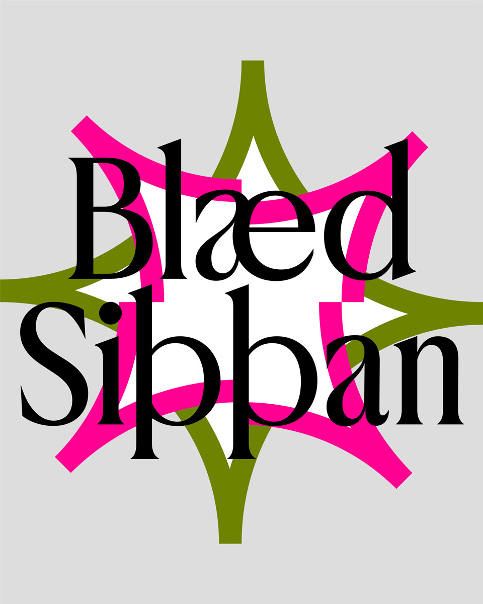
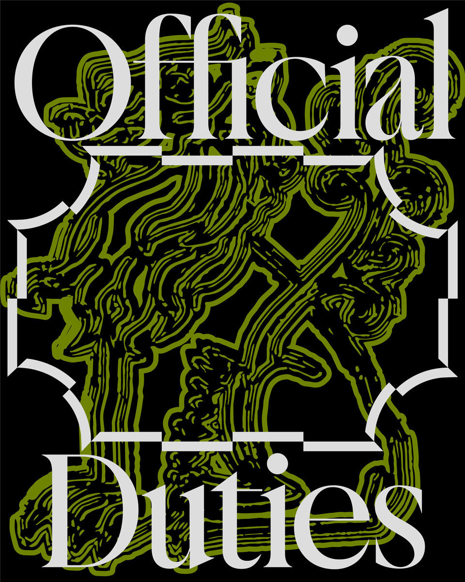
To no surprise, “Jubilee” was not the only project Piero and Valerio have worked on together. Published by Off Type, “Rayuela” is a condensed, semi-gothic font with stencil-like features. As the name implies, the stackable font takes inspiration from the traditional Chilean game.
The collaboration between the duo was instantly harmonious and “smooth sailing” Valerio says, and Piero adds: “It feels good when you’re working together in sync.”