
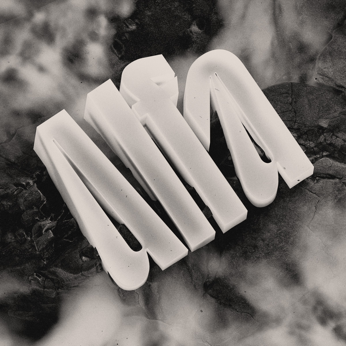
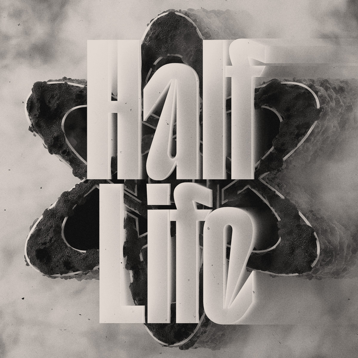
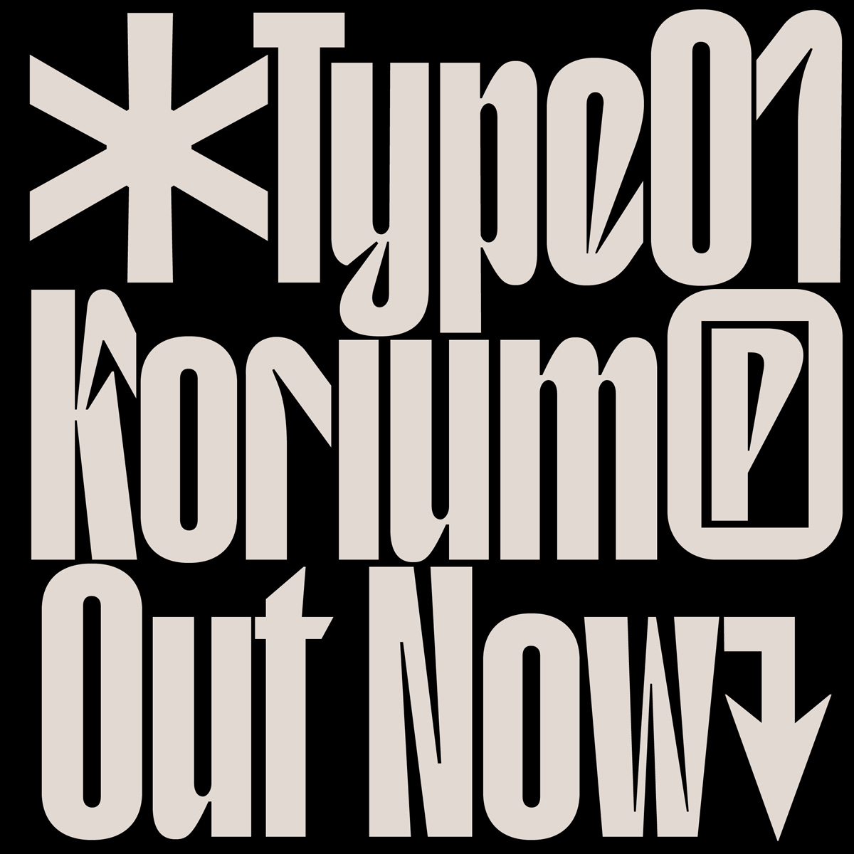
The collaboration between type-focused platform TYPE01 and designer Valerio Monopoli, also known as Morula Type, on their brand new typeface Korium was a rather spontaneous one. After they featured his work in the first issue of TYPE01 magazine, he reached out to them and proposed designing a font together. Luckily, it was one of those rare cases of perfect timing, since TYPE01 intended to operate more as a type foundry by releasing their own typefaces, alongside their type-distribution department. The result of this collaboration is quite spectacular: Korium—named after the material Corium which evolved during a nuclear reactor meltdown—is an aggressive, angular take on the condensed humanist genre, arousing a feeling of chemical hazard. Hosting gentle, humanist-touched glyphs, its juicily condensed forms are soft on the outside and sharp on the inside. Valerio has recently collaborated with designer Serafim Mendes to turn the typeface into 3D renderings, giving it a dark, mystic look.
Born in Rome, Valerio moved to Barcelona a couple of years ago—“a blessed condition I never fail to boast about”—where he immersed himself in type-related projects, often in collaboration with the type foundry Pangram Pangram. “I’ve been having nightmares about kerning ever since,” he admits, half-joking, half-serious. “ I still get to live a good life though, and I wouldn’t make a living out of chess or guitar playing anyway, so let it be type!” It was during his studies at ELISAVA when he was introduced to the relevance of typographic treatment by one of his professors while designing a book for the course. “ The more I worked with letters, the more I grew interested in the boundless range of expressions type is capable of channeling through its plain self. By the time that project was presented, I already made up my mind about dedicating the following time to the exploration of typography,” he remembers. “Two and a half years in, I’ve only scratched the surface, but I’m glad I made that choice. Not sure Frutiger would think the same, looking at my work.”
In the following interview, Valerio talks about his collaboration with TYPE01, how Korium will evolve in the future, and how the most striking revelations can be found in the least expected places. Let’s go!
What or whom would you name as the biggest influence in your creative life?
I firmly believe creativity is all about diversifying one’s sources of inspiration, so it’s hard to point my finger at something or someone in particular. *Points a cheering glove at Radim Pesko, Adrien Midzic, and Alex Slobzheninov*
Direct influences aside, I believe inventiveness arises from relentless observation: at its most abstract, it’s arguably a repurposing of patterns we can spot in nature— something I try to monitor carefully through photography and random hyper-textual trips (You know rabbits don’t close their eyes when they sleep? You can find more information like this on the World Wide Web). I’d say this constant mimesis is not just a posture, but rather a condition in which any curious mind (so, every mind) indulges, and it’s hard to keep track of all the meaningful inputs. Ultimately, the most striking revelations can be found in the least expected places but realizing this took me quite some time.
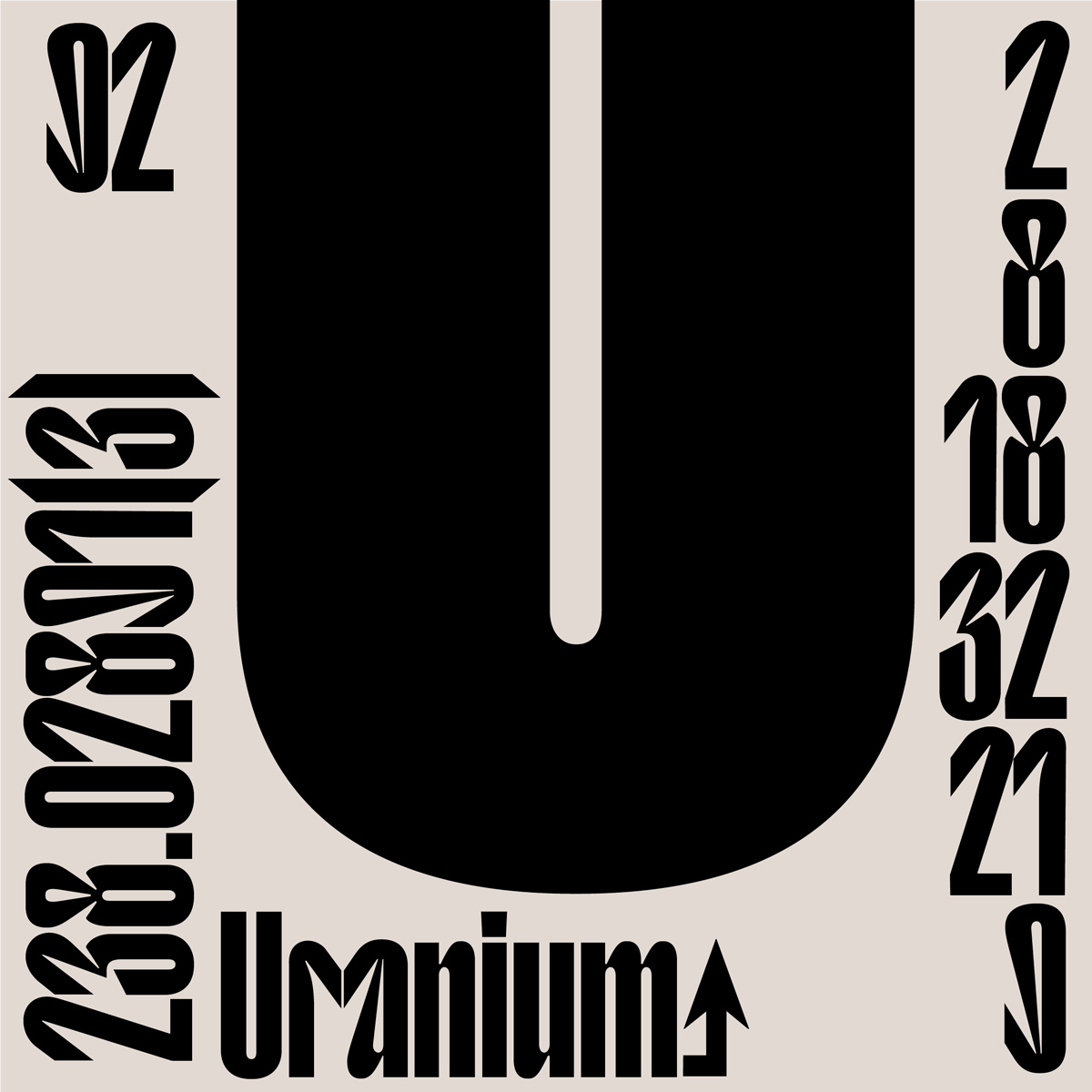
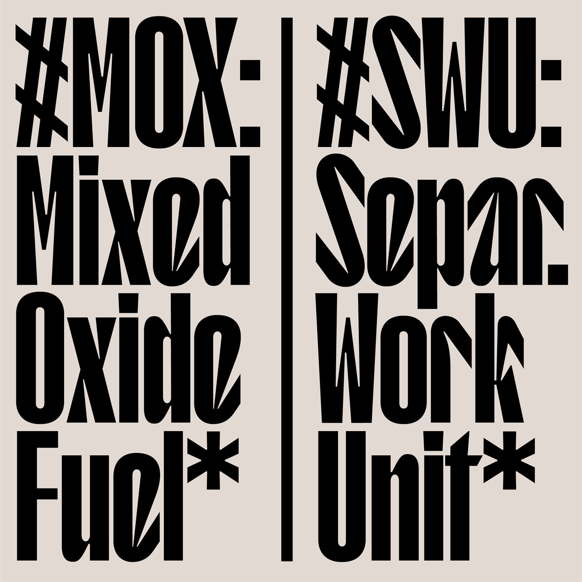
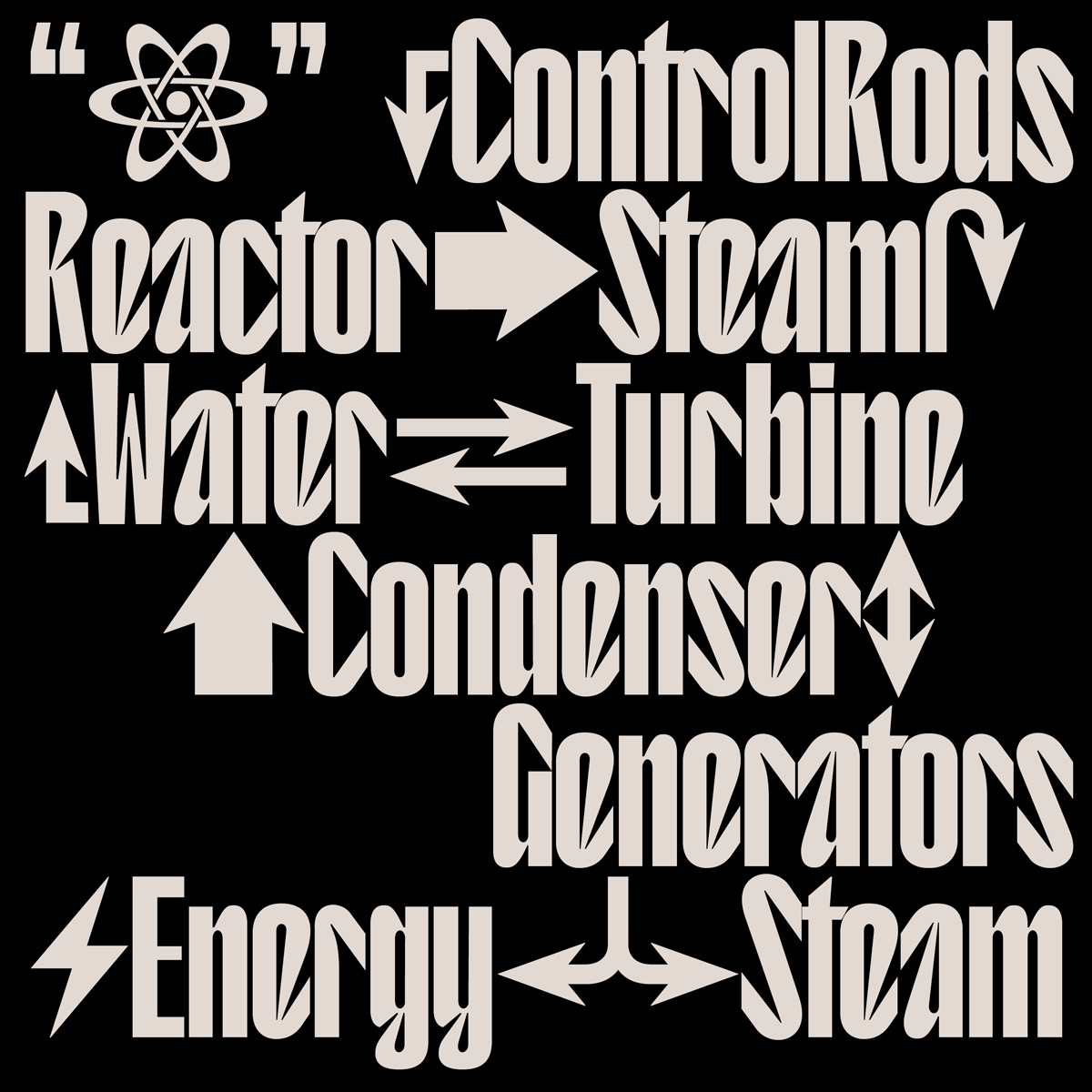
You have collaborated with TYPE01 on the typeface Korium, inspired by the material Corium which evolved during a nuclear reactor meltdown. What are its distinguishing characteristics?
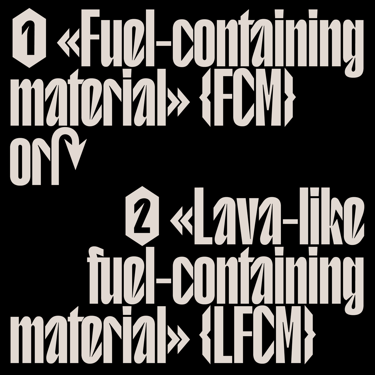
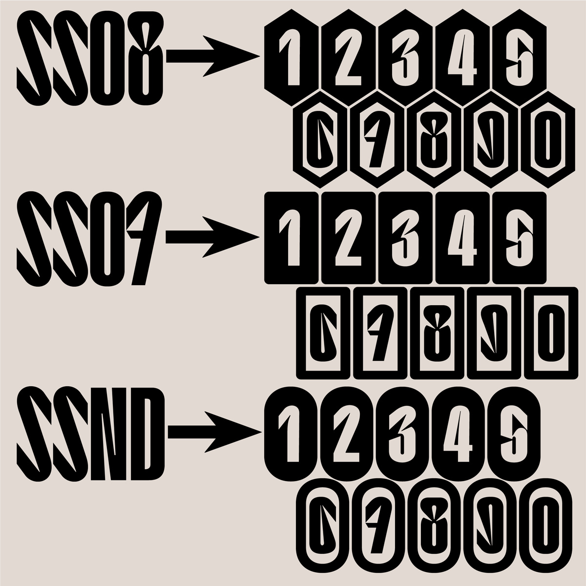
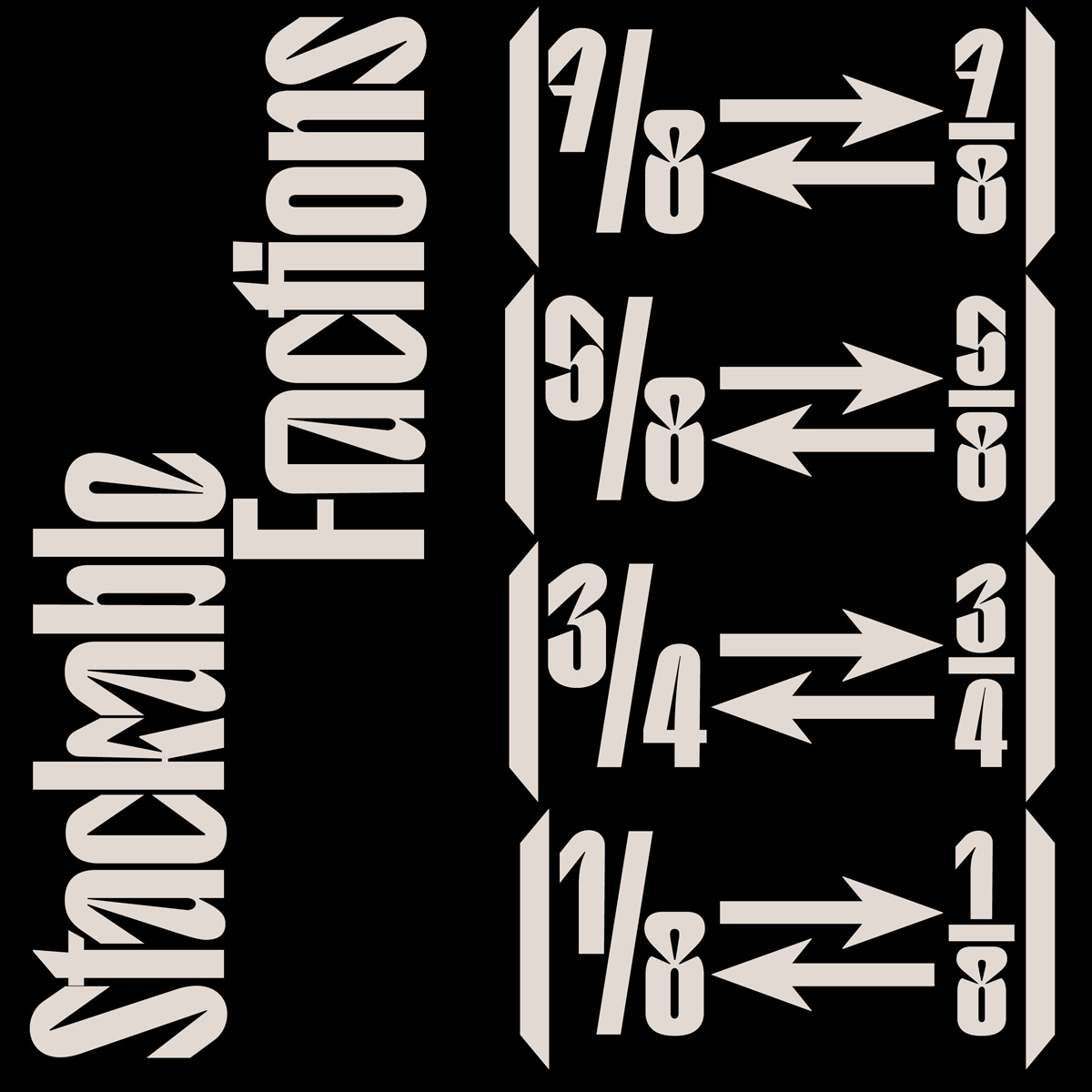
Korium’s bones are the ones of a bold sans serif, but its main features are the bent terminals in letters like ‘a’, ‘r’, ‘k’, etc at equal heights in both the uppercase and lowercase letters. This creates a fragmented yet legible texture. Following along the concept of a “dangerous chemical compound”, Korium will include some very uncommon Unicode characters and symbols like the atom and radioactivity signs, benzene rings and scripted containers for chemical formulas—if I can get the OpenType code straight, which is NOT a foregone conclusion. (Unicode even has a character for an “Alembic” sign. Who needed that in the first place? Cute tho.)
How would you like people to use the typeface?
My dream is to see a nuclear plant use it as their corporate typeface, but they tend to prefer functional grotesques (in the worst-case scenario, you want legibility on your side). As for more mundane applications, I’d love to see it on some industrial product design, drug packaging, heavy machinery logos, brutalist fashion magazines headlines… Anything that hints at artificiality and/or possible danger.
Are you building upon the typeface in the future? Any updates in planning?
Lately, I’m experimenting with how to get Italics and Reclined cuts right, so I might end up slanting this one in both directions just for the sake of the challenge. That being said, I think the most natural evolution of this typeface would be across the weight axis. Being a custom font though, the expandability kind of depends on the financial and emotional response we’ll get after the first release: at any given moment, I’m one flattering comment away from turning this into a variable ordeal.
What do you see as being the biggest challenge when designing a typeface?
As I mentioned, I still have logistical and physiological issues whenever I approach the spacing and kerning phase, especially with text-oriented typefaces. Due to my tendency to mind-wander during repetitive tasks (laser-focused concentration is arguably the most important skill to have when trying to ensure consistency throughout thousands of punctual decisions), I’ve come to the conclusion that kerning is simply not a task for humans, at least not when its scope is to encompass each and every combination. Many designers I’ve talked with share this belief and I can’t wait for the time an intuitive, parametric spacing & kerning tool will finally be democratized.
What made the collaboration with TYPE01 so fruitful?
Good communication is at the core of a collaborative endeavor, and with Amber from TYPE01 I had very good exchanges from the beginning. Her direct and open approach made the whole experience a pleasure, and I’m confident the personality and quality of the final product will speak volumes about the mutual trust we’ve achieved through this collaboration.
In the next few months—or years?—Valerio fully concentrates on updating his first products at Pangram Pangram to make his fonts more consistent and usable, while planning the release of a new serif typeface this summer. “On the other hand, I’m working with old and newfound friends on projects that I can’t wait to release, especially Sagittaire, an elegant Deco typeface I’m designing with chess-pal and BlazeType’s top dog Matthieu Salvaggio; or Sinopia, a custom serif for what I think will be the best platform for academic orientation in the field of art history”, he tells us. With so many versatile and experimental projects in the pipeline and his unfailing enthusiasm for type, the results are sure to impress.
Valerio Monopoli (Morula Type)
Website
Instagram
COLLABORATIONS TO LOOK AT:
Kalista by Floriane Rousselot and Alain Papazian


