
Disruptive type is a new virtual exhibition space showcasing eleven contemporary (collaborative) typefaces of talented type designers. Because of his deep fascination for letterforms and their variety, Copenhagen based designer Jonas Baun Andersen initiated the project in order to create a new community amongst designers highlighting the disruptive nature of contemporary type design. “I felt this urge to do something different”, says Jonas, who currently works as a designer for the Danish type foundry Playtype, “I noticed all this great work being produced by contemporary type designers. All of them working hard to push the boundaries, to be innovative and re-define what type design could be.” The exhibition is meant to be an open creative playground to collaborate and connect with other designers. Amongst the participants of the first edition of Disruptive type are Bureau Brut and Julien Priez, Peter Bushuev, Ines Davodeau, Michele Galluzzo and CAST Foundry, Enrico Gisana, Fazekas Istva, Jérémy Landes and Anton Moglia, Viktor Pesotsky and Lena Weber.
“In my eyes, we are in the middle of a disruptive shift within typography. Never before in its history has type design developed at such a pace – and at the same time, it evolves in so many different directions. Letters turn from being a functional resource of basic communication into an artistic expression”, Jonas explains, reflecting on the current type design landscape, “These new approaches on letterforms are celebrated and showcased, but in a very traditional and conventional way – printed matters, posters, specimens etc. Not that I don’t love them, but I felt the typefaces deserved a new way to be presented. To be shown in a different environment with no direct link to the long legacy of typography.” Exploring this idea, Jonas teamed up with Louise Holland to design and develop the exhibition space.
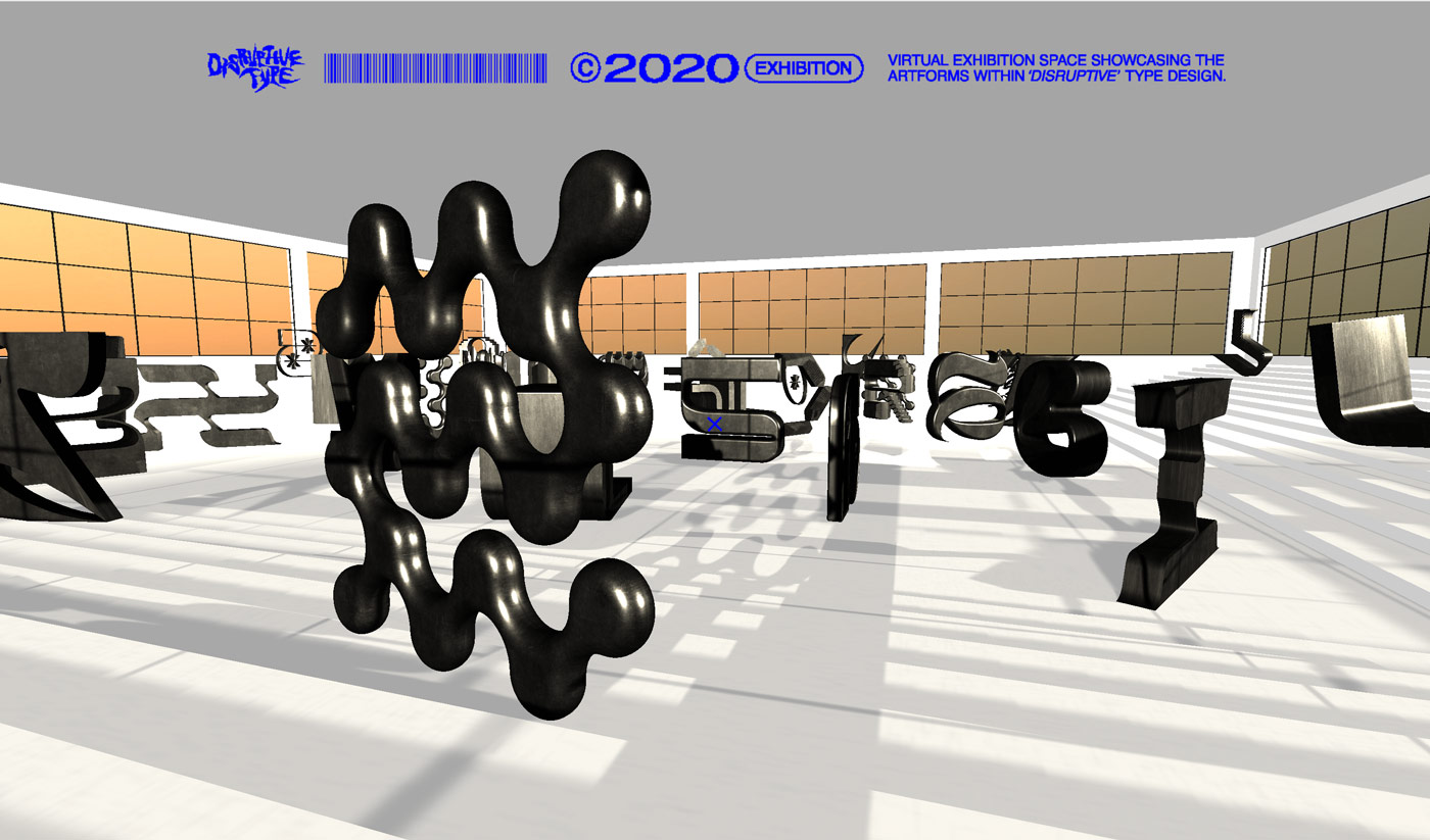
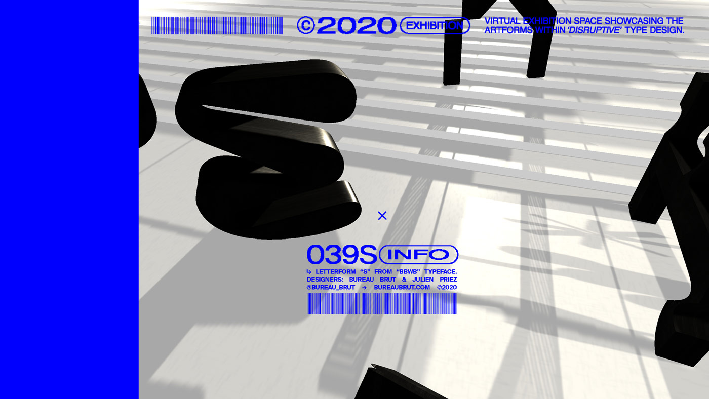
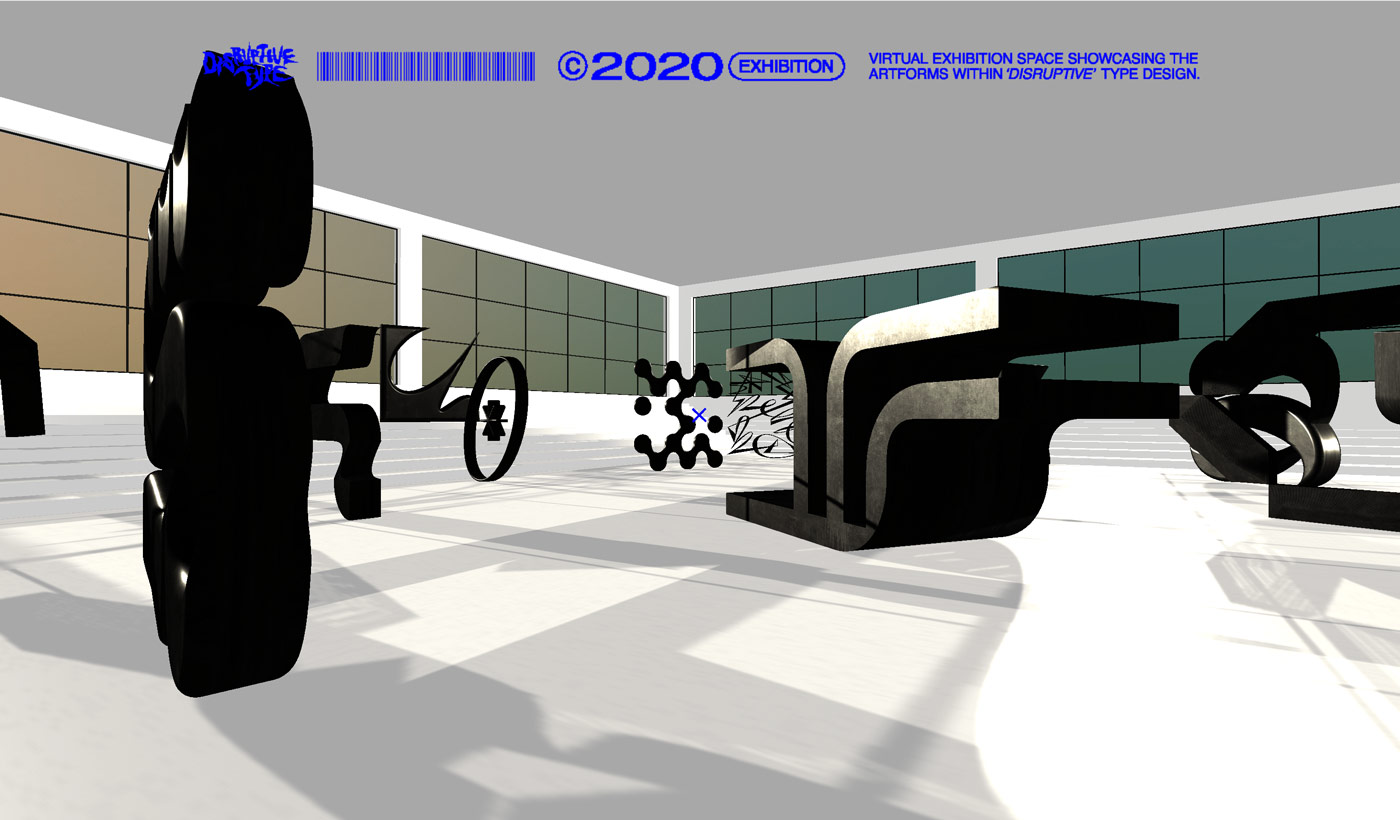
To make the exhibition accessible for everyone around the globe, the exhibition takes place virtually in an abstract, almost surreal setting. The different letters of the presented typefaces were extruded into big iron 3D sculptures, celebrating them as artistic artifacts. When approaching a sculpture, a tag with more information about the typeface and the designer appears. “Exploring the exhibition almost feels like a shadow-play. The huge windows light up the space, the light reflects onto the sculptures casting shadows. When moving amongst the sculptures their appearance changes depending from which angle you look at it”, Jonas explains, “It’s possible to jump higher than usual, giving the user yet another perspective and way of interacting with the shapes.”
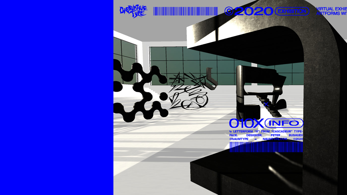
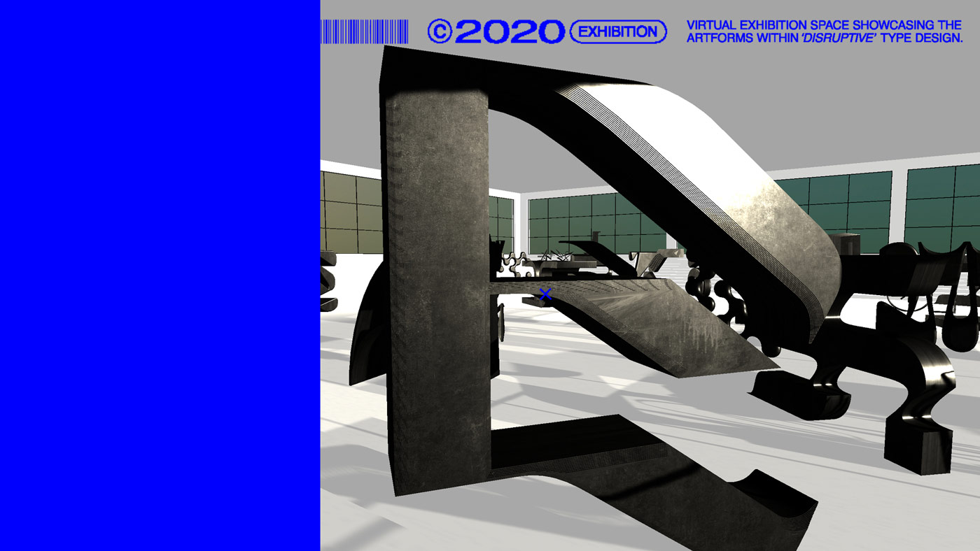
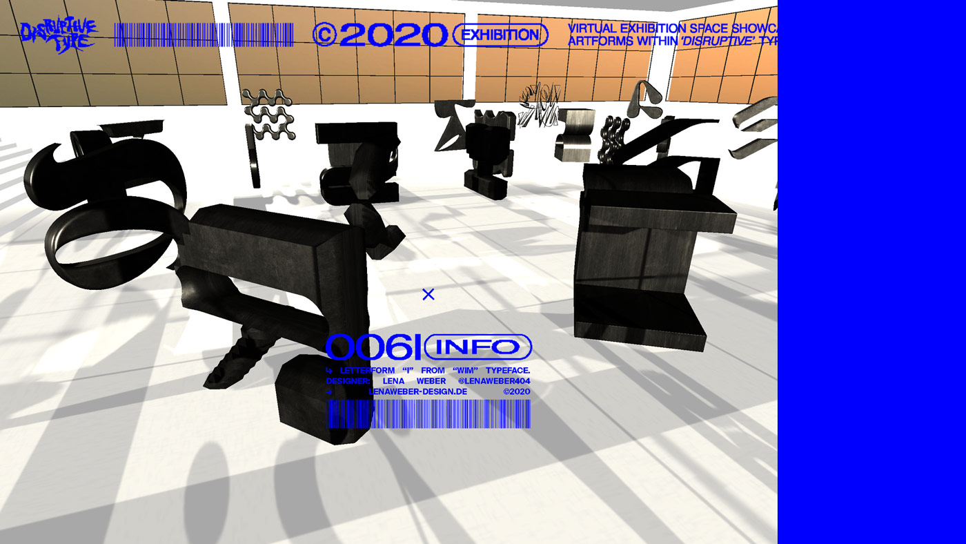
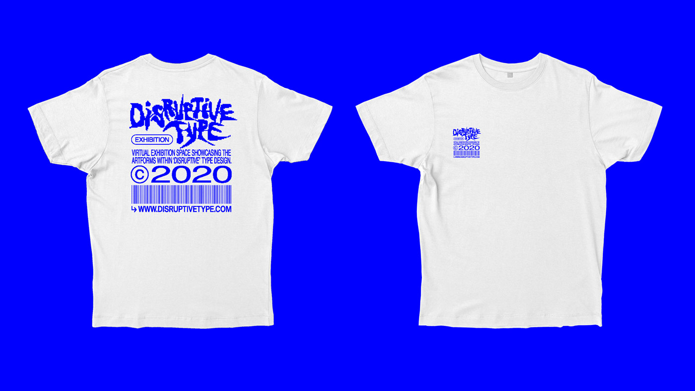
With its bitmapped appearance and the bright RGB blue, the identity of the exhibition seems to be inspired by old video games, but still comes with a contemporary twist. “The logotype is intentionally drawn quickly without thinking too much about the shape of each letter. It is created following Leah Maldonado’s 20 minute tutorial on how to create ‘Low Impact Typography’”, Jonas tells us, “It was really important to me to work with typography that was either distressed, bitmapped, squeezed or stretched, in order to add to the ‘disruptive philosophy’. At the same time it was a fine line between creating a coherent visual identity and trying not to overdo it.”
While the presented typefaces are all very different from each other, they still seem to have something in common: They all challenge the conventions and norms of the process behind type design. “All the exhibited typefaces are different approaches on how a certain shape of a letter could be. Some of the shapes are more legible and some are more abstract”, Jonas says, “They’re all connected in the way that they are created with methods that are not necessarily perceived as ‘great craftsmanship’ by traditional type designers. They are all trying to push boundaries and create a new norm.”

Before getting in contact with the designers, Jonas established some criteria for the presented typefaces first. “First of all, the typefaces had to be fully functional and accessible. It was important to me that people could actually acquire them if they were inspired by them. Secondly, I wanted to make sure that they represented the variety of the contemporary typographic landscape, so the selected typefaces shouldn’t look too much alike. The third criteria was to create a solid mix of people that wasn’t already backed up by 20k followers.”
Apart from designing and curating the exhibition, Jonas was actually faced with quite a challenge to manage and coordinate the project. “I had this naive idea that once I sent people a mail regarding the project they would get back to me almost immediately. But of course people are busy or maybe not interested, so I actually had to remove some of the typefaces I’d initially picked out because they just never got back to me”, he reflects, “This was a painful lesson that next time I’ll have to reach out and establish contact way sooner! And I shouldn’t assume that everyone wants to participate. So in short: be more humble and plan ahead!”
As a designer, Jonas is always driven by the urge to “do things differently and not to be limited by other people’s expectations” – an important message that he wants to spread through the exhibition. “The overall message is that you should always try to do things that feel right to you – even if nobody else shares your vision. This is the most important mindset, whether you’re designing typefaces or trying to create a virtual exhibition space.” With the exhibition, he aimed at creating a new community amongst creatives. “I believe it’s more important than ever to build a network of likeminded designers to collaborate with, especially when you are trying to go against established systems and rules”, he states, “Together, we are stronger. A powerful network of likeminded designers helps us grow as individuals and as a community, to push each other forwards.”
With this resolution in mind, Jonas hopes to build upon this project further in the future. “I would love to put a team of different designers together to keep pushing this concept forward”, he tells us, “This is me taking the first step. It could be an annual collaborative event aiming to highlight the ‘best’ disruptive typefaces of the year or something entirely different. Hopefully this can be the start of something amazing.”
Jonas Baun Andersen
Website
Instagram
List of all Participants and exhibited typefaces:
ASFEN by Ines Davodeau
Boogy Brut Wild White/Black by Bureau Brut and Julien Priez
Cascadeur by Peter Bushuev
Cemer by Michele Galluzzo and CAST Foundry
Eskos Display by Viktor Pesotsky
Pilowlava by Anton Moglia and Jérémy Landes
Poster Mono by Lena Weber
Predator by Enrico Gisana
Strikt by Peter BushuevSONIC by Fazekas Istva
WIM by Lena Weber


