
Among all the various and different disciplines that the design world has to offer, type design often gets treated with a certain respect which is perhaps down to the fact that it is not merely an aesthetic discipline, but demands a range of different skills. Even if our understanding of typefaces has clearly evolved in the last years giving more and more way for experimentation, type design stays a practice that only a few designers have the confidence to try. In the attempt to make type design an accessible practice for everyone and change our perception of what a typeface can be, Portland (OR) based graphic designer Leah Maldonado has worked on several projects that have pushed the boundaries of type design in the last months. During her internship at Future Fonts Leah continued to immerse herself in experimentation and has now occupied a unique space in the typographic sector due to her self-initiated projects.
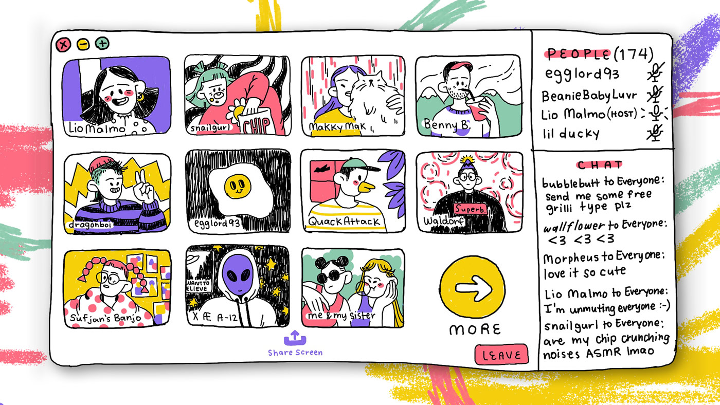
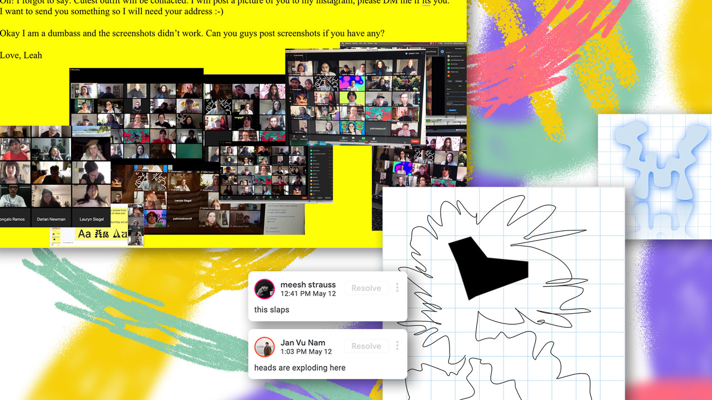
One of those projects was her typeface “GlyphWorld”, which met with universal approval among other designers and creatives. The contemporary typeface included nine different fonts and was set in a mythical alternate font-world made out of nine landscapes, using letter form to make an emotional connection to our environment. Now, Leah Maldonado is back at it again with a digital and highly experimental playground, called “Drawing a Letter Up in a Tree”. The live workshop which was part of a series of digital events hosted by the non-profit multi-format platform “House of Maricas”, took place on May 12th this year and had over 100 participants.
In our conversation, Leah talked us through the experimental workshop, her ambitions for the future of type design and how “expressionist type design” will certainly play a role in it.
How would you describe expressionist type design?
Expressionist type design is a movement within the practice of letter making that uses the medium of a typeface or a font to express a sentiment that has narrative value for the reader. An expressionist type designer uses the letters to tell a story rather than the other way around. The movement rejects the idea that a typeface is just a tool that services a designer. While a typeface will always remain a tool for someone, using an expressionist typeface feels more like a collaboration between the user and the artist that created the typeface.
What or who were your early passions and influences?
I am extremely influenced by alpine forests. It seems cheesy to say this, but I feel a deep connection with the earth and land that I grew up around. Hiking as the land goes from a meadow to a forest to rocky mountain and then finally a glacier feels like time traveling. And if you stop at any point in the journey you can be infinitely fascinated by the micro ecosystems around your feet. Have you ever looked closely at a little bit of moss? If I was smaller maybe moss would seem like a forest.
I also have a passion for looking for four leaf clovers. Once you find one you can find a lot. If you are exposed to seeing one it’s as if your brain hires a little worm who lives in your head and just specializes in finding four leaf clovers. I definitely have a task force of worms in my brains that look for clovers. I have found 1000s by now (I am not kidding). I think that this is mother nature teaching me a lesson about patience and not giving up haha. If you want to find something all you have to do is look even if it seems like a metaphysical endeavor. And once you find it you will continue to find it. There are actually a lot of things in nature that are like this—like looking for morel mushrooms or looking for hummingbirds. I swear it’s not just a hippie dippie thing, it’s a human thing. There are so many lessons embedded within the human condition that can be uncovered through a relationship to nature.
You have currently organized a digital workshop, called “Drawing a Letter Up in a Tree”. Do you have an overall goal concerning this project?
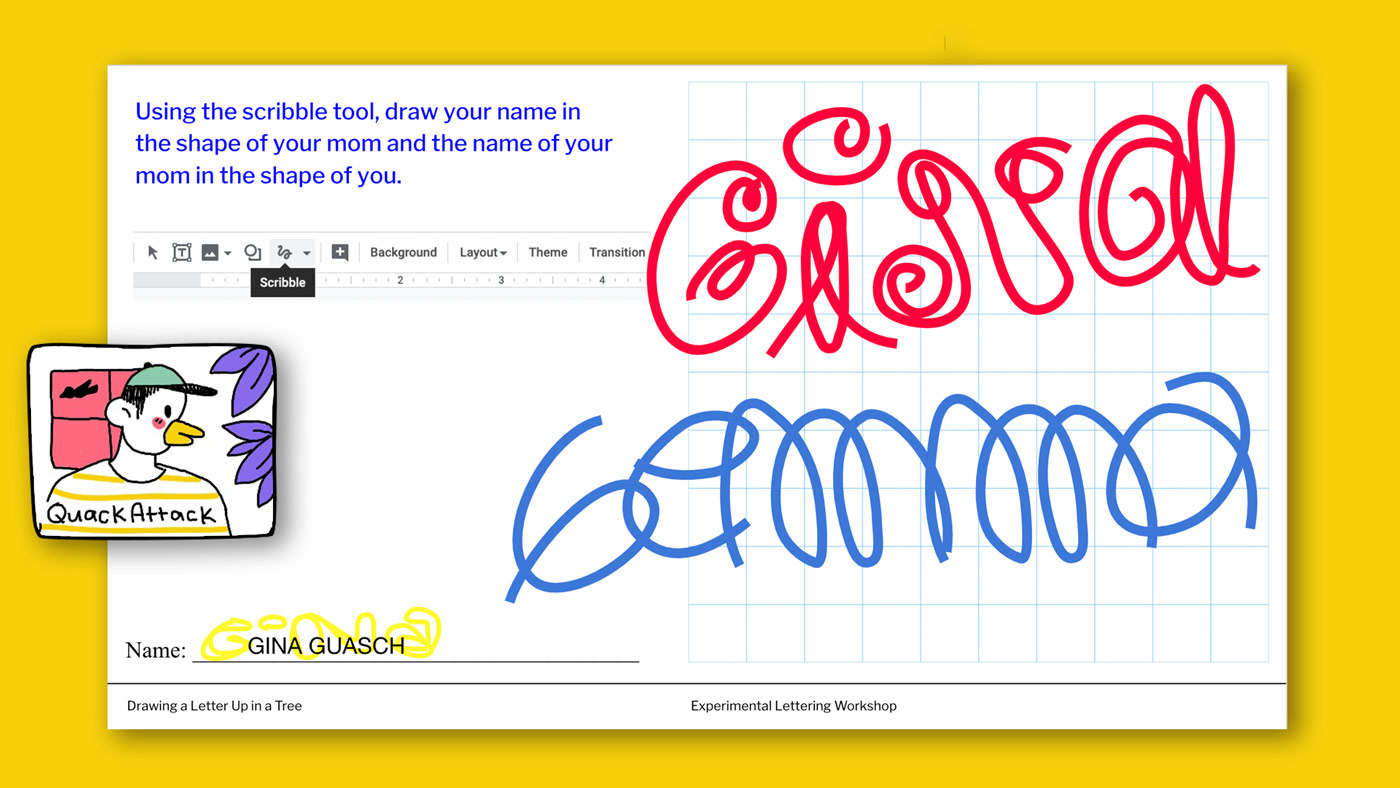
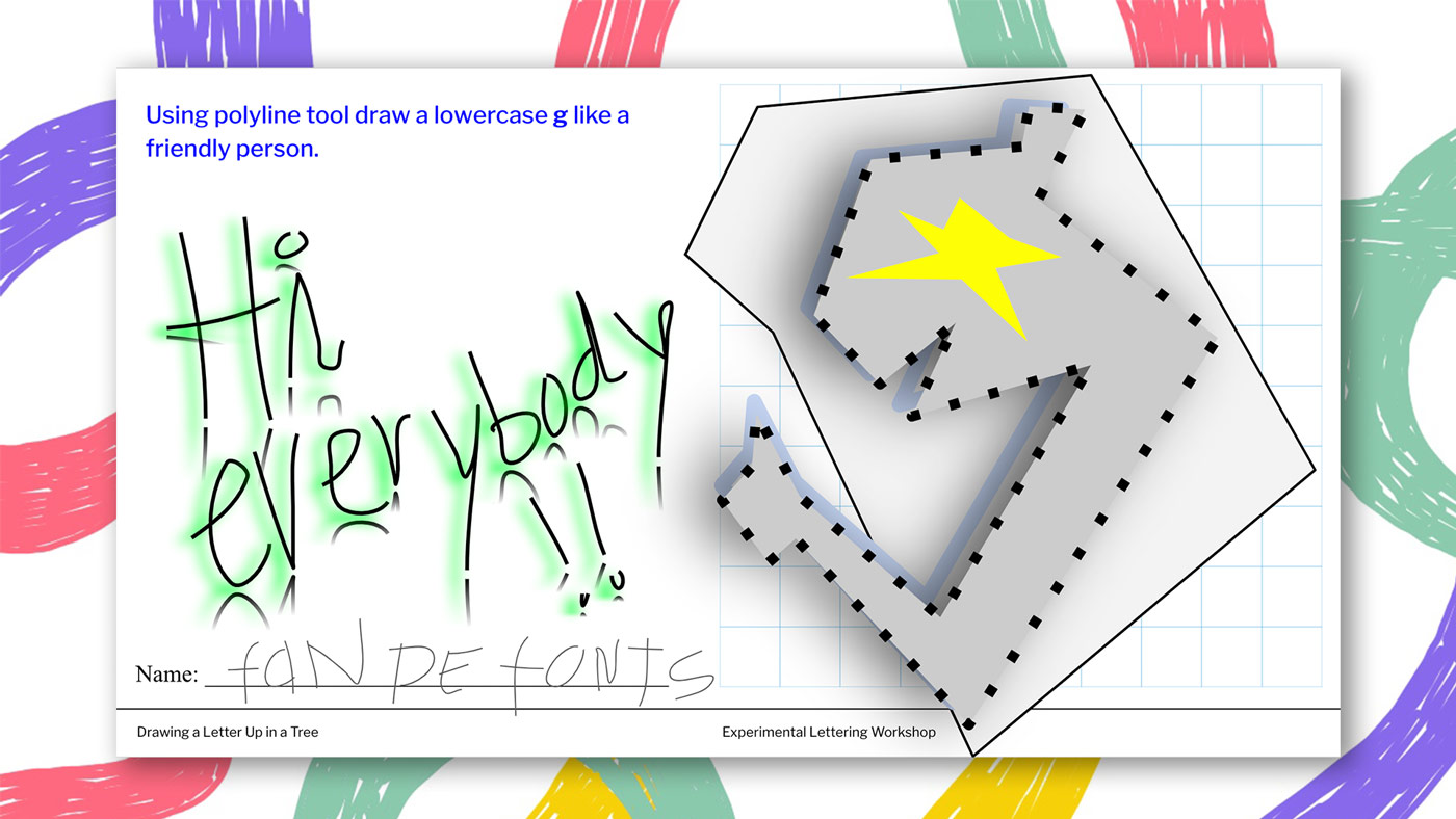
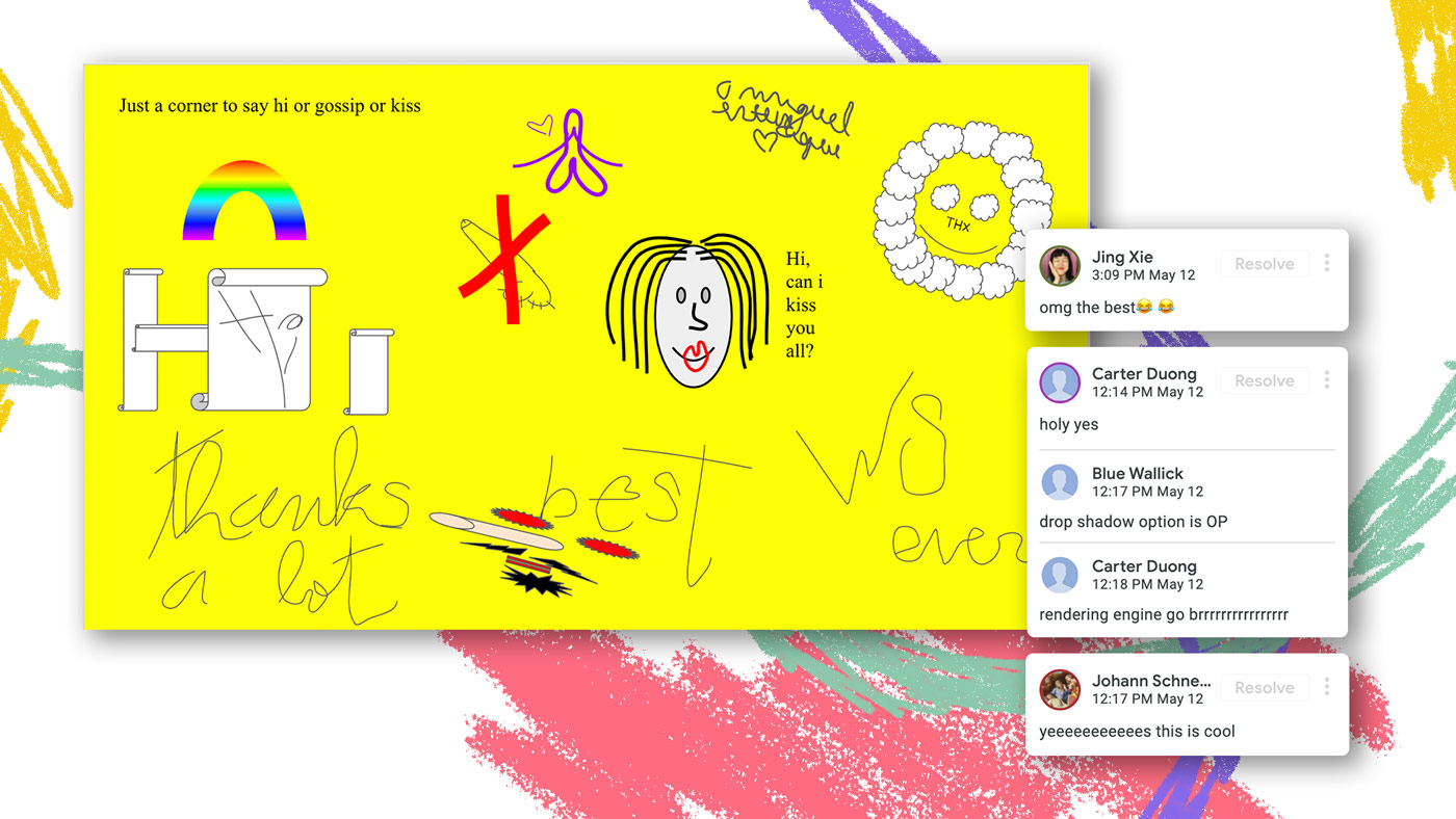
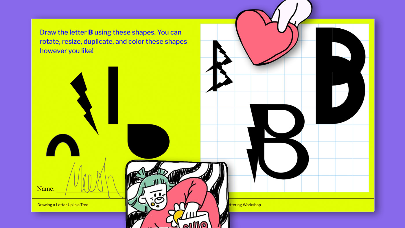
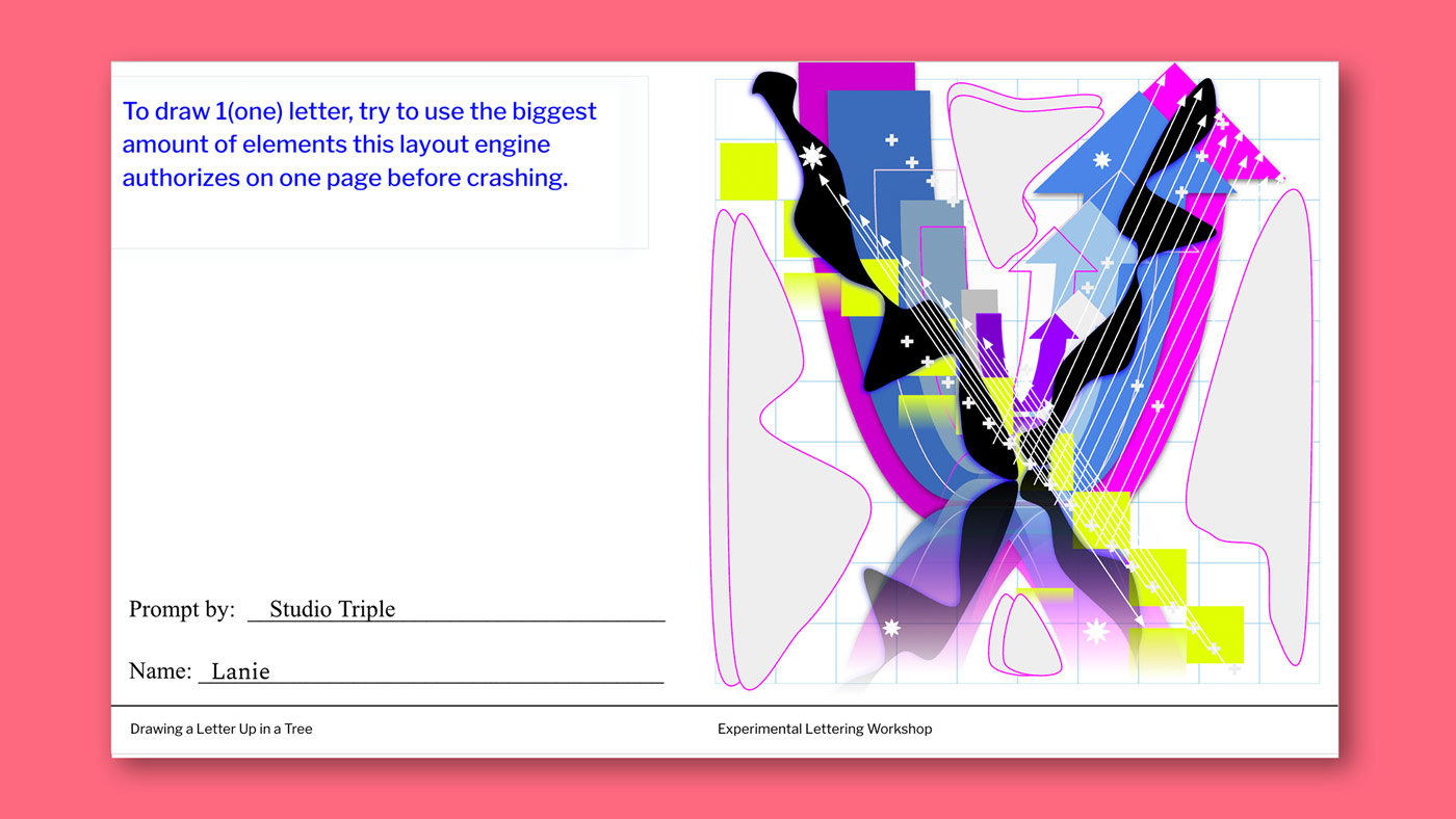
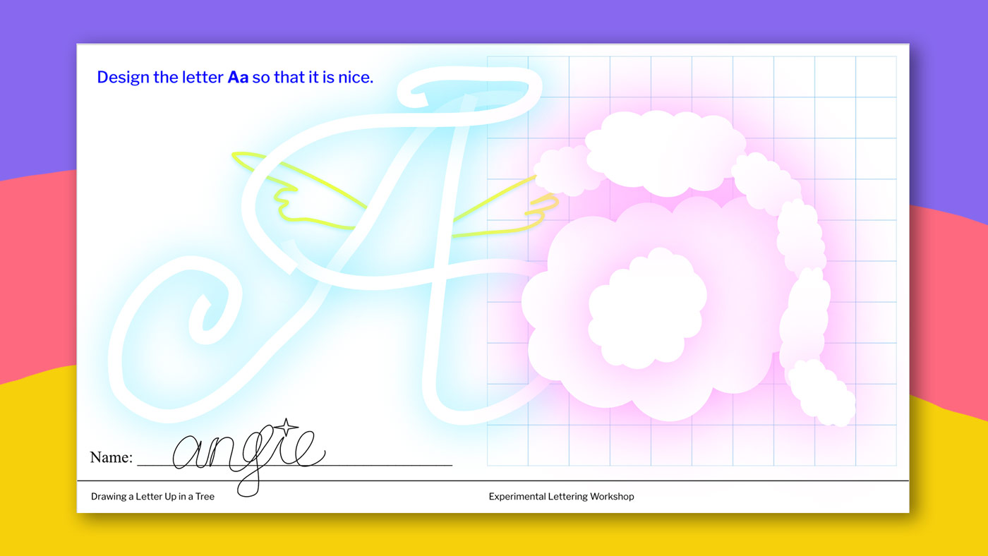
“House of Maricas” reached out to me after I released these printable “worksheets” I wrote for an informal workshop I held at the closing reception of my GlyphWorld installation in February. The worksheets were meant to entertain children with prompts like, draw a letter with your left foot but they entertained a lot of adults too with prompts like draw the letter Y in the shape of your earliest memory. My idea behind these prompts was to give type designers, artists, and just the general public the pleasure of using a letterform as a medium to tell a story with. I threw this workshop before Covid19 so it was really easy to just print them out and provide crayons. When House of Maricas reached out to me I had to search my brain for what a digital crayon might look like. And after some thinking and procrastination I had an ah-ha moment that I could just use Google Slides.
Why did you choose a Google Slides Document as the basic medium for the workshop?
The toolbar has a lot of the same features of Illustrator. And it has a particular tool called: scribble. I was very attracted to this tool because it felt very powerful. It’s the most interactive tool on google slides to me because it’s completely open ended… you can scribble anything you want. It felt like exactly the digital crayon I was searching for.
Google slides is also a public space. It’s like choosing a public park to throw a birthday party. There is no fee to get in! Growing up I didn’t have very much money and if my friends ever invited me to a party at like an amusement park or a movie theater or anything else with an entry fee I would struggle to go. I time travel to my past by changing the future for others. If I can provide more free and accessible opportunities for people it’s a way for me to speak to my past self and comfort her.
Why is it important to you that the workshop and its results are freely available to the public?
We all know that it’s boring to be trapped inside. And this boredom can be found anywhere else you get trapped… physically or mentally. When things aren’t open and accessible to everyone there is no growth. Expressionist and experimental type design is practiced by a relatively small amount of people. If I only engaged those people (who I love very much) I would become bored after a while and so would they. Instead, I think if something is fun and only a few people do it, our goal should not be to keep things insular but to grow the practice so more people can party with us 🙂 Have you ever been to a stuffy party where only “cool” kids are invited? Have you ever actually had fun at something like that? Personally, I have not.
Which piece out of all contributions surprised you the most?
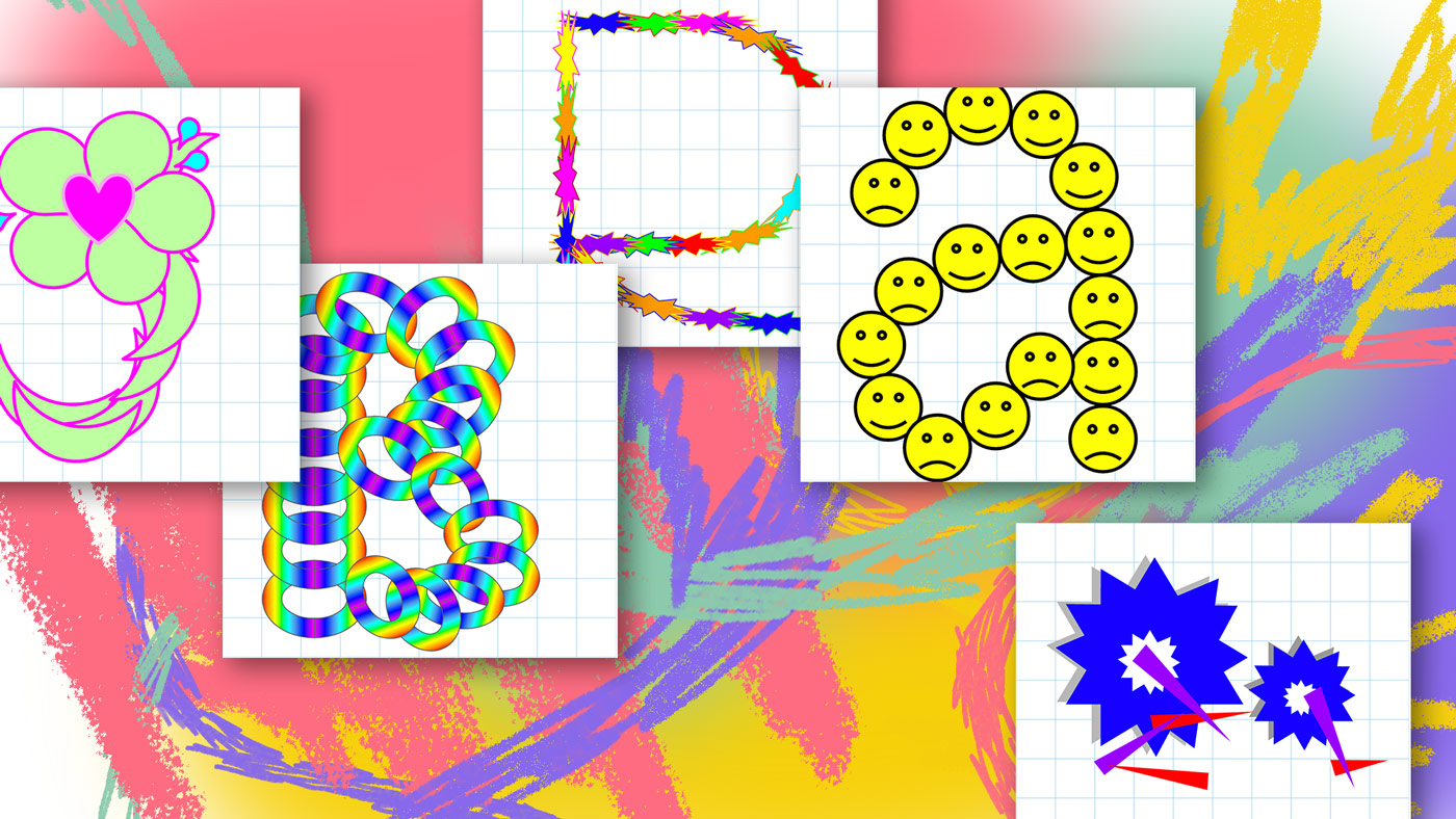
Someone named K Lee put a prompt into the workshop that said, Draw a Chinese character even though you don’t speak Chinese. All of the responses to this prompt were really cool to me. It impressed me that this workshop which was only in English evolved to include more writing systems through interactivity. If I didn’t allow the participants to interact by adding their own prompts, there would be no Chinese characters in the slides. That exposed something really cool to me: when you give trust to others, you give them creative control over themselves. And when they have that, they will make something way cooler than you (as an individual) could ever think of. I wish type design as a practice was more like that.
Do you have any plans regarding the future of the workshop or its results?
I plan to use this workshop as proof that you can engage a large group of people to be creative with free tools and with letterforms. Type design and free are not usually in the same sentence. I’d like to help change that. I think that the engagement this workshop received can teach us something about the value of play and the importance of making play like that accessible.
How would you describe the role of typography in design? Do you see it more as a functional or graphical element?
Now that I’ve spent time getting to know letterforms intimately it’s really difficult for me to see even functional elements as non-graphic. I get really distracted by things like the lowercase letter a in subtitles. And if I’m reading a novel sometimes I begin to get sooo distracted by the letters that I stop reading the story. I think this is a common condition for a type designer to have, it’s like a funny little curse.
But to truly answer the question, I think that typography is both. It’s very similar to writing. Is all writing functional—just a way to communicate a thought? Or is it always stylized no matter how neutral it tries to be? I was very charmed by the copy on the exit signs in the tube when I visited London. While, Way Out may seem very neutral to a Londoner it felt so charmingly British to me. Even when the typographer or type designer aims for something neutral, they are doing something stylized and therefore graphic.
What could be the role of typography in the future?
In the 21st century we use our keyboards to write to one another, and our keyboards use our typefaces. Type design needs to produce way more typefaces. There are so many languages that use writing systems that do not have any typefaces. Imagine not being able to text your mom that you love her in with your writing system. Now imagine something even more difficult: imagine writing your textbooks by hand, writing your newspapers by hand, writing your street signs by hand. For some people that is the reality. Those writing systems not only deserve typefaces so they can participate in the digital world equally, but they also deserve the ability to be the authors of their own typographic cultures, they too should have movements like Expressionist type design! The best way to do this is to let go of the idea that only formally trained people are allowed to practice, and make education both localized and way easier to access.
How important is collaboration to you as a design practice?
As a type designer everything is a collaboration. I may make a typeface alone in my room but it isn’t done until I give it to someone to use. A typeface is not a diary, it’s a book that needs to be published and read!
What can we expect to see from you in the next months? Any projects in the pipeline?
I have a dream to create a tool to help type design become a practice of the people rather than a practice of the few. I want to help decolonize type design. I’m not sure if I will create this tool in the next few months, but the dream of this tool is swirling around in my head and driving me crazy. I’m dizzy. I read somewhere that you can become sick with an idea and I feel very, very sick. I need to get it out of my body. It’s the way I felt before I made GlyphWorld and the way I felt before I made Drawing a Letter Up In a Tree. The ability to create a typeface should be as easy as singing. Everyone can sing if they let themselves, same thing with type: you can design a typeface if you let yourself, and I’ll help you if you’re shy. I’ll also help you crawl over the wall that selfishly keeps you from doing what you want, but I need a ladder. I am searching for that ladder like I am searching for my four leaf clovers. I promise I’ll find it, and if you want you can start looking with me.
Leah Maldonado
Drawing a Letter Up in a Tree
Website
Instagram
glyphworld.online
COLLABORATIONS TO LOOK AT:
Sister Corita Kent
Illustrations by Sarah Nason


