
“Good Work” – a term often used to define the quality of a certain project, artwork or creative output is often hard to grasp. For that matter, what does it mean when we say a work is good? Are we talking about how good it looks? Or how functional it is? In order to create an identity for the exhibition “Good Work” of the 3rd year KABK Photography students in 2018, the designers Yacinth Pos and Jordy Ringeling had to find answers to these questions. “Along with the students, we sought out to find a physical form for this ungraspable measure. We speculated the answer lies in subjective elements like emotional value, individual experiences and other personal definitions”, the Haarlem, The Netherlands based duo tells Collide24. In order to visually represent the 33 participating artists who were still in early stages of their projects at that time, Jordy and Yacinth generated content by documenting their processes. The sketches and drafts were later edited, sampled and archived as archaeological findings: A visual exploration to find “Good Work”.
In the beginning of their process, Yacinth and Jordy had to draw on the initial question and explore the true meaning of “good work”. In order to find an answer to this question, the couple put a lot of time and effort into research. “Since we are a couple and live together, developing concepts comes quite naturally, because we can talk to each other the moment an idea comes to mind. This can be while getting ready for bed, folding laundry or during cooking”, the duo tells us, “A thorough research is always the starting point of our projects. Only when we feel confident with the concept, we start designing.” For the logo, the duo came up with the idea of writing down “Good Work” in a repetitive way that both questioned and answered the quality of the term. “This principle became apparent to us after looking into the book ‘Principia Ethica’ from George Moore. He introduced ‘naturalistic fallacy’, the failed act of trying to define ‚good’”, Jordy and Yacinth explain, “This is what we ended up applying in all forms of communication: by exaggerating attempts of measuring something that is so fluid, we show that this will always result in a mere attempt.”
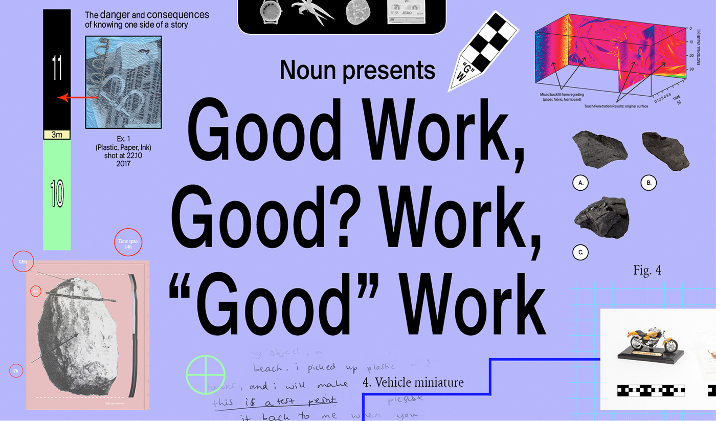
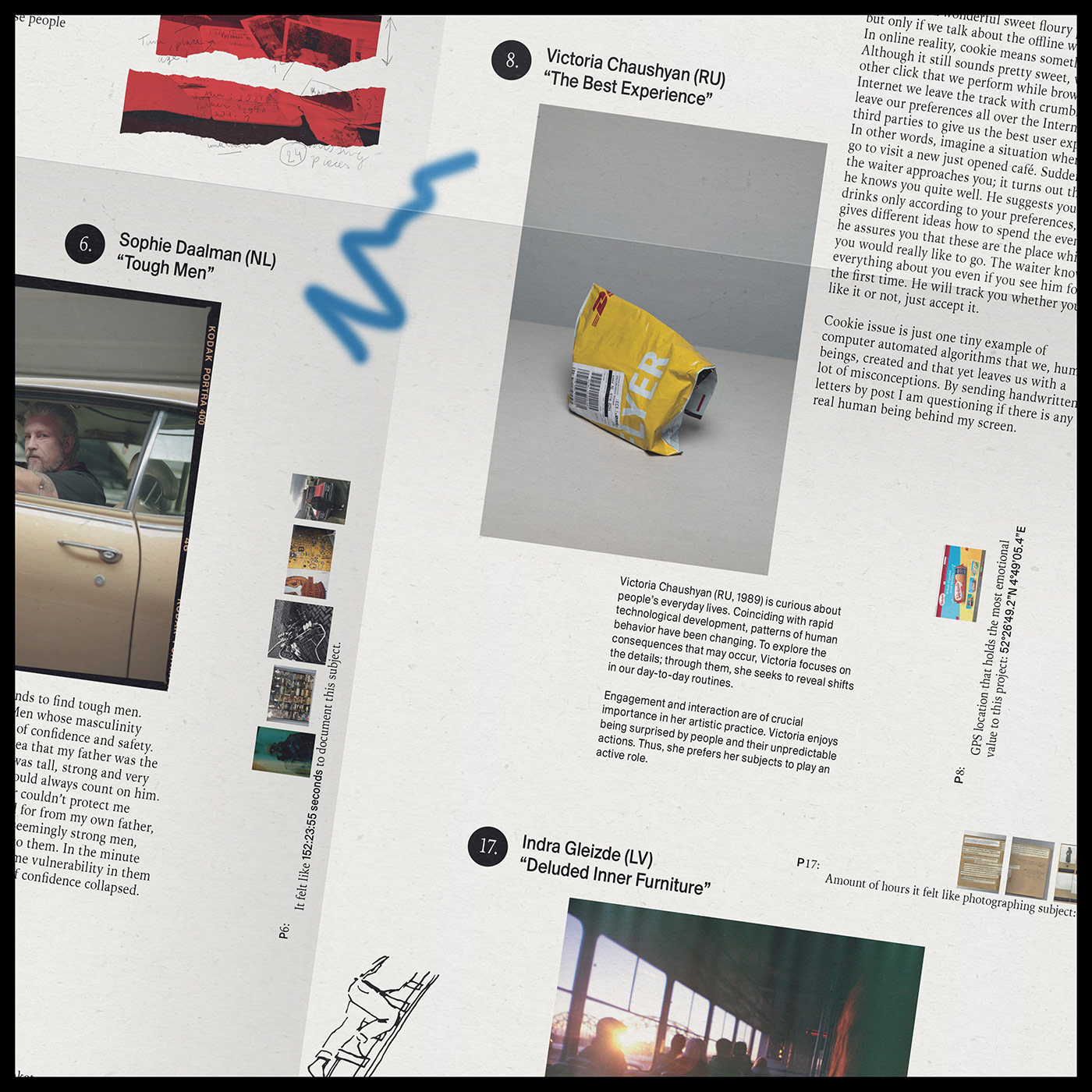
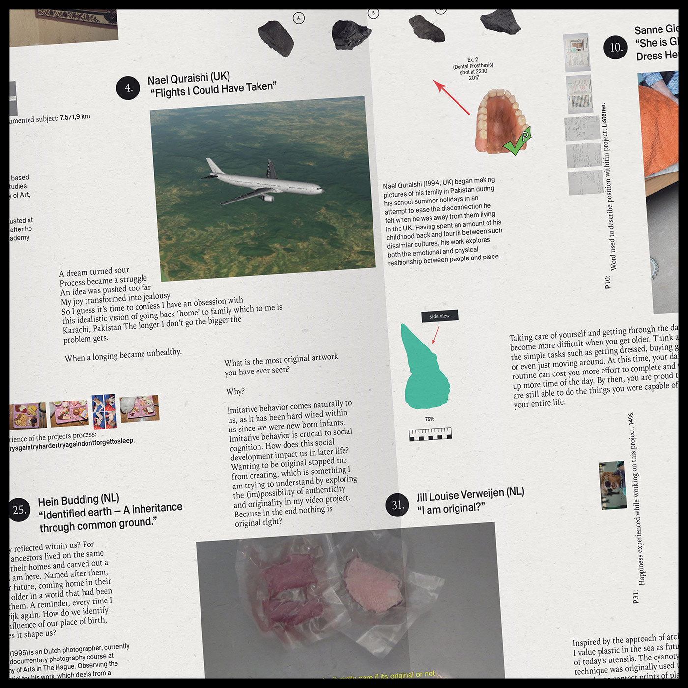
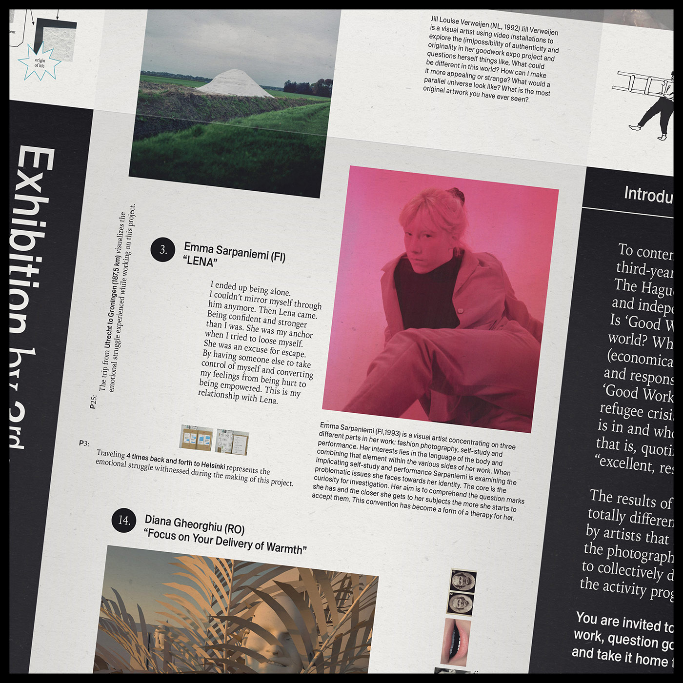
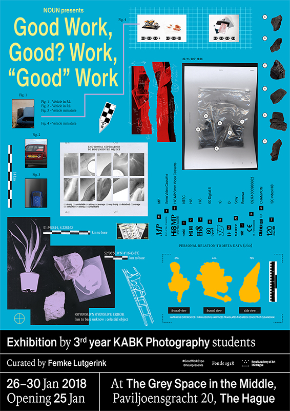
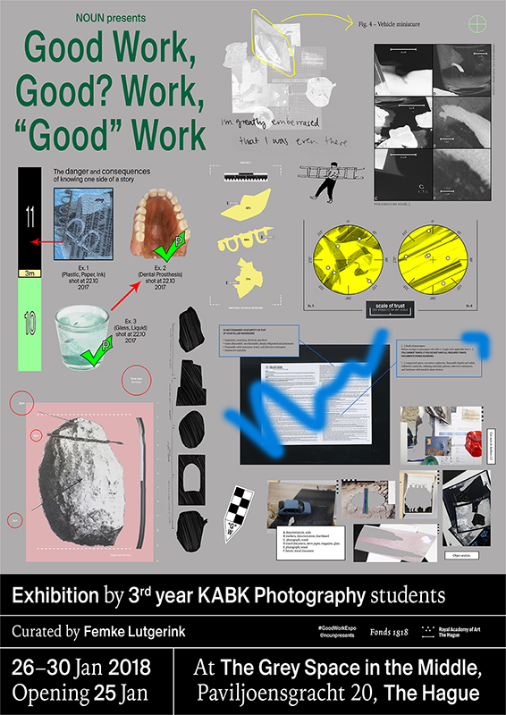
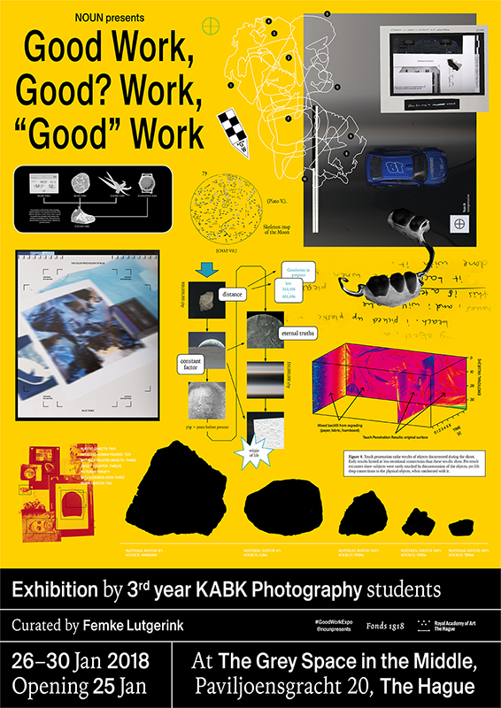
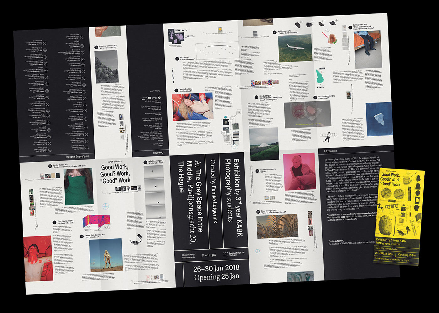
One highlight of the identity became the catalogue which unfolds to a double sided A1 map, perfectly fitting to the recurring theme of “discovering”. “As the client was expecting a traditional book as documentation of the exhibition, it was quite a challenge to sell such an unconventional medium”, the two designers say, “Once we found the form, it made perfect sense to us. And luckily, the client trusted our vision.” To create the content for the map, the duo conducted a survey among all participating artists, asking them to measure undefinable qualities in their project, like the depth of conversation held with a portrayed person or the happiness experienced during the making. “We scattered this ‘meta data’ throughout the map along with sketches, final works, and project texts. Visual interpretations of tools and measures often used in archeological digs and archiving tie all elements together.” The brochure folds out to a double sided A1 poster, inviting the reader to dive into an “excavation” by revealing the process, personal conflict and visual output of the exhibiting artists. “This underlines the idea that the end result is not always the full body of work. The process and everything that happens during that, makes a ‘good’ work.”
Apart from a certain set of deliverables, there were no set requirements regarding the visuality of the exhibition. “It’s pleasant to work with people from the creative field that respect your strengths and have trust in what you do. Since there is also a better sense of understanding the practice, people can be more critical towards your ideas”, Yacinth and Jordy conclude, “This can be a good thing and generally creates an interesting in-depth dialogue, often resulting in a better outcome. A few of the 33 to be represented artists were involved in the process, which on some occasions led to a ‘too many cooks in the kitchen’ scenario. When this happens it’s important to consider their voice, but also stand behind your ideas. Otherwise you lose vision, which can result in more and more concessions. Luckily, this didn’t happen during this process. However, we had many meetings because it’s important to us that an identity grasps the feeling of what the exhibitor has in mind. This means you need to talk a lot. It was a long road we walked together with the client, not just by ourselves, and we are very happy with the end result.”
The couple has met during their studies at the Royal Academy of Art in The Hague and has already collaborated on some projects during that time. “It was in this period that we recognized a similar drive in our ways of working. We kept a close eye on each other’s work, talked about it a lot and eventually also became a couple”, Yacinth and Jordy tell us, “When opportunities rise and there is a possibility to collaborate, it feels very natural to share this creative process. Next to the shared enthusiasm of doing so, we know each other’s strengths and influences. We aren’t afraid to critique or discuss design choices, this helps create a very nice environment to generate ideas in.”
Before she turned to graphic design, Yacinth has devoted herself to education in the art of cooking first. “Food and thinking about the way we eat, treat and cook food is a really big passion of mine”, she tells us, “The dedication of cooks working within fine dining is exceptional and super inspiring to me. The fast pace in which the culinary world explores its values is incomparable to how design evolves. Cooking is an environment of pressure, but also incredible passion where thousands of hours are spend to refine the practice and dissect and analyze the core of the profession. This is a very big influence in my practice, both in cooking and design.” After her first steps into the graphic design world, she now works predominantly for the cultural and social sector, focussing on projects that correspond with her beliefs and interests. “Politics and social issues have always been a strong interest of mine. Talking about these topics is something I grew up with. I also drew a lot as a kid and at a young age, I discovered that visual communication is a very important tool to convey ideas. This made me drawn to graphic design in the first place. In socially engaged projects, it feels amazing to be the person that can shape this layer of visual information”, the designer says. While she usually puts functionality before form, she began to work more and more on experimental projects – often in collaboration with Jordy.
This playful and expressive approach seems to be at the core of Jordy’s practice and person. Video games, movies and Science fiction were his first introduction into graphic design and he has drawn inspiration from these sources ever since. “I’ve always been interested in storytelling through visual design. Science Fiction adds a speculative aspect that allows the exploration of new grounds, yet it always encapsulates the timeframe in which it was conceived. Even if it’s way ahead of its time. This mix is super interesting to me”, Jordy tells us. It was only after his studies that he learned more about cultural and social responsibility we bear as designers. “The ramifications design can have on people and the ideology you can push through visual communication are not to be taken lightly. It’s challenging but super rewarding to be the person responsible for guarding this process”, he concludes. Apart from his full-time job at Amsterdam based design studio Vandejong, Jordy has worked on a bundle of new collaborations and self-initiated projects in the past, exploring more and more digital techniques.
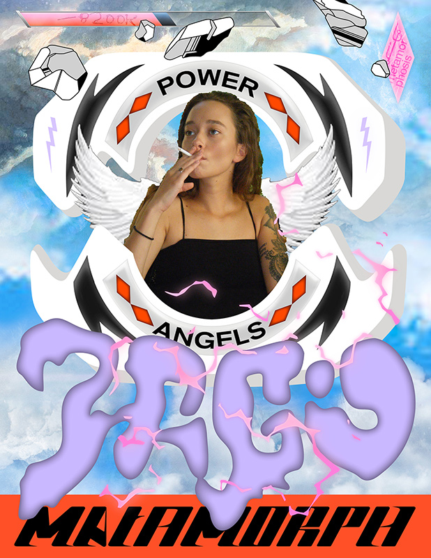
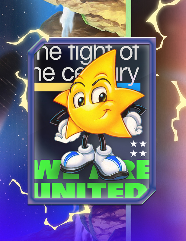
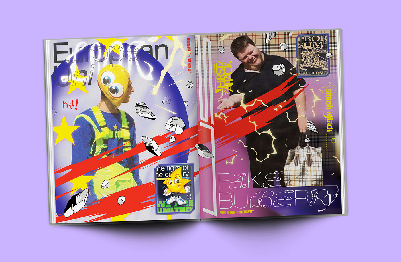
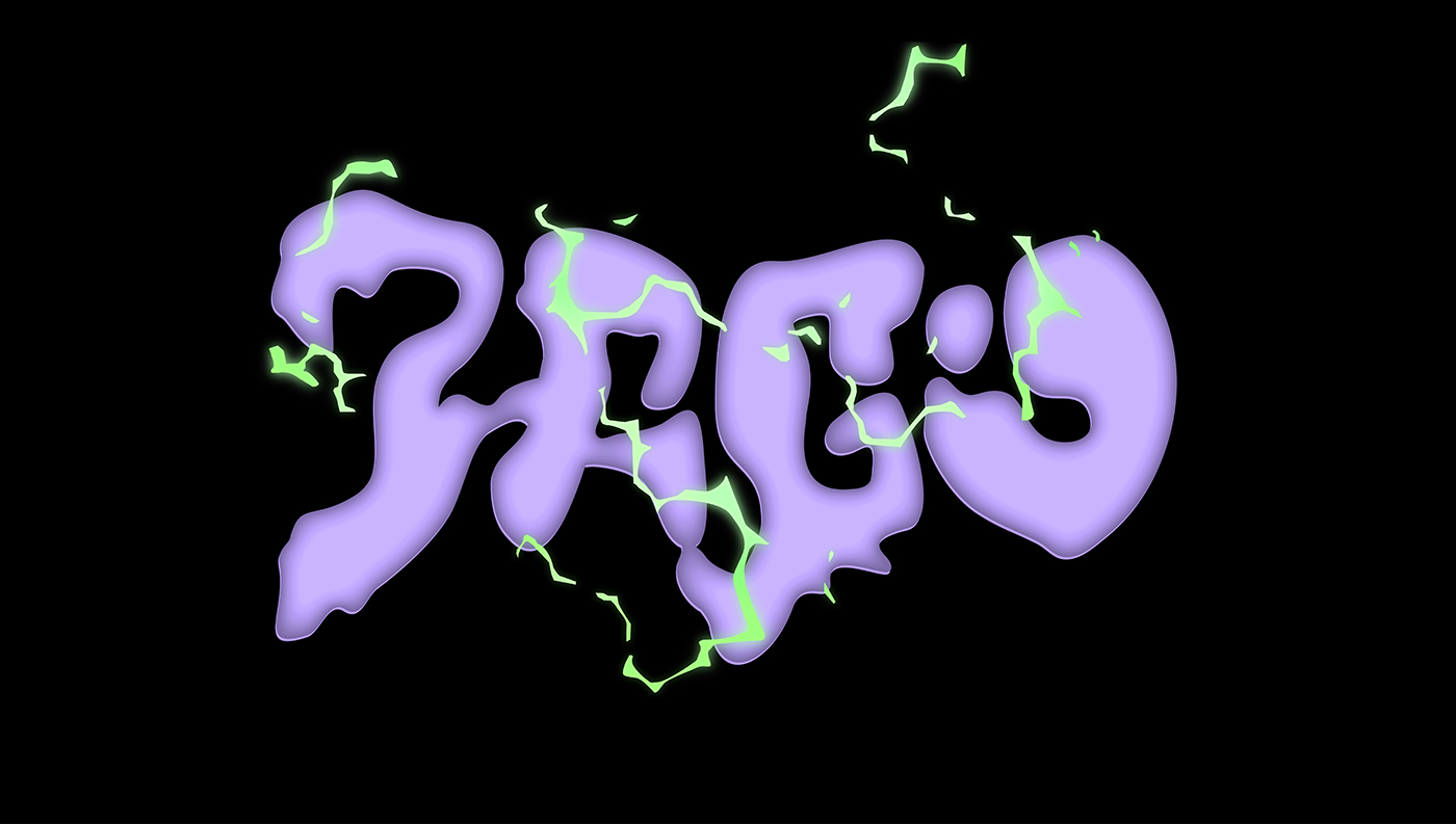
One of the most recent collaboration the duo has worked on in the last couple of months were some spreads for the third issue of “Clifford Jago and The Sunflower Children”. After being contacted by Clifford Jago to interpret one of their outfits in an own artwork, Jordy decided to team up with Yacinth and work together on this project. “It seemed like such a fun ‘go crazy’ project that I couldn’t pass the opportunity to collaborate with Yacinth on this one. We immediately started exploring different visual languages to match the ecstatic source material”, Jordy tells us, and Yacinth adds: “We try to work on projects that match our ideologies. Clifford Jago’s way of breaking walls within fashion by creating and capturing these bizarre looks was really intriguing to us. We thought their use of found materials and their visual interests were very exiting.” In the end, the duo came up with the idea to pay homage to Clifford Jago’s fictional characters ‘European Union’ and ‘Fake Burberry’ amidst a mix of different elements like interpretations of the Street Fighter character selection screens, power effect sprites and forgotten video game mascots.
“I always joke that a good collaboration feels like cheating. You suddenly have multiple brains, each with their own frame of reference diving into a research or topic and coming up with ideas. In this setting, the most challenging part is communicating your ideas to each other”, Jordy says on the subject of collaboration as a creative practice, “If your partner isn’t able to understand your chain of thought, neither will your client or the receiving audience.” After so many fruitful collaborations, the two of them are clearly well attuned to each other. “When collaborating, you have a critical counterpart that can immediately eliminate thoughts and suggestions that aren’t worthwhile. This makes the process a lot faster”, Yacinth concludes, “The other fun part about collaborating is that you create a small staircase of thoughts. One sparks an idea and the other uses it to elevate it to the next step, creating a common pool of thoughts. Ideas that you wouldn’t have come up with by yourself suddenly emerge. This makes collaborating super liberating!” Apart from several upcoming projects in the pipeline, Jordy and Yacinth are slowly working towards founding a studio together, taking their time to define what the studio’s signature language and principles will be. One step at time, on their way to truly “good work”.


