
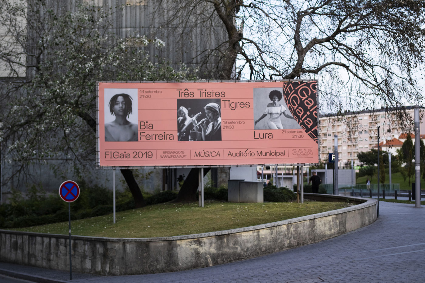
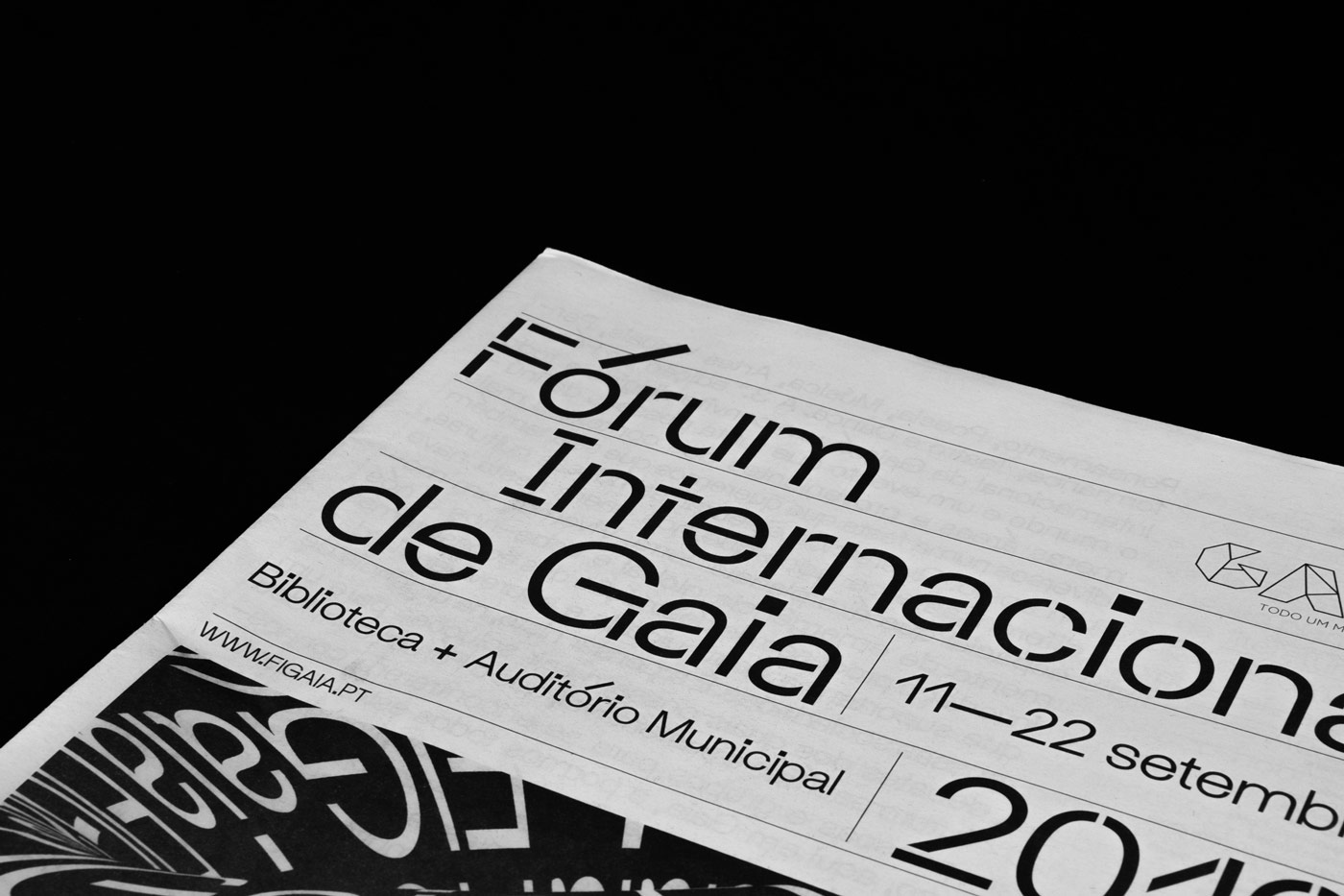
The Gaia International Forum, or short FIGaia, is a multidisciplinary annual forum in northern Portugal which took place for the third time in 2019. It aims at representing the city of Gaia as a cosmopolitan centre by debating contemporary issues and hosting events, like debates, theatre and poetry shows, in a festive and exclusive atmosphere. By inviting artists, creatives, academics and activists, the municipality of Gaia encourages the exchange between different disciplines. As theme for 2019, Art Director Ana Carvalho chose to focus on collaboration in order to build a cultural program that could bring together different ideas and perspectives. To make sure the visual communication would fit the theme, she invited Porto based graphic design Maria Ruivo to jump on board. “We already knew each other but we had never had the opportunity to work together, and this project seemed like the perfect time to do it”, Maria tells Collide24. Since then, three other designers have joined the team, including Oliver Ellmers, Diana Ferreira and Serafim Mendes.
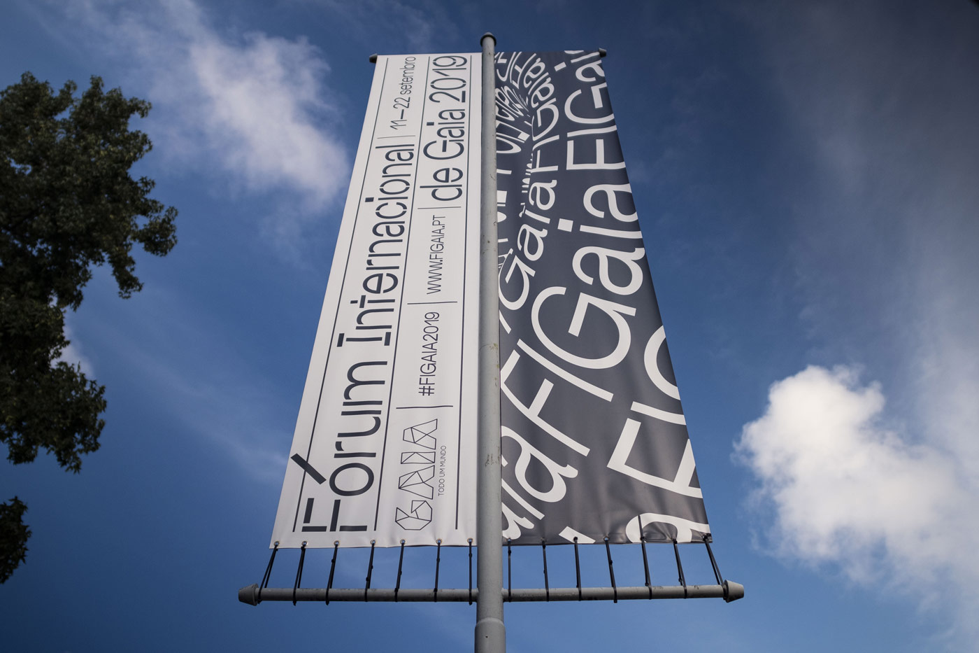
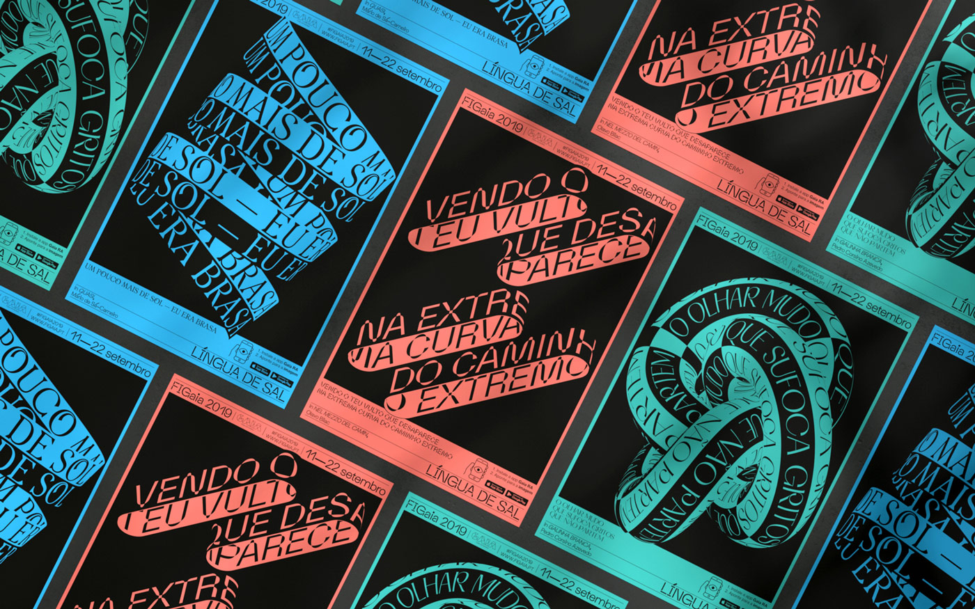
In order to represent the rich linguistic culture in Portugal, Maria came up with the idea of creating some sort of “visual poetry”, giving particular importance to the written word. The identity which was created by Diana and Serafim Maria’s creative direction made use of several typefaces, giving the identity a contemporary and expressive look. “By emphasizing the written word, it was up to us to think about how it becomes relevant in the times we live in. If poetry is the maximum exponent of a language, and if the word is the medium that frees and fills it, the graphic identity created for the 2019 edition of the Forum appeared as the perfect place to animate, visually, both poetry and the written word”, the designers explain, “We found that presenting poetry in its traditional form would not be enough.”
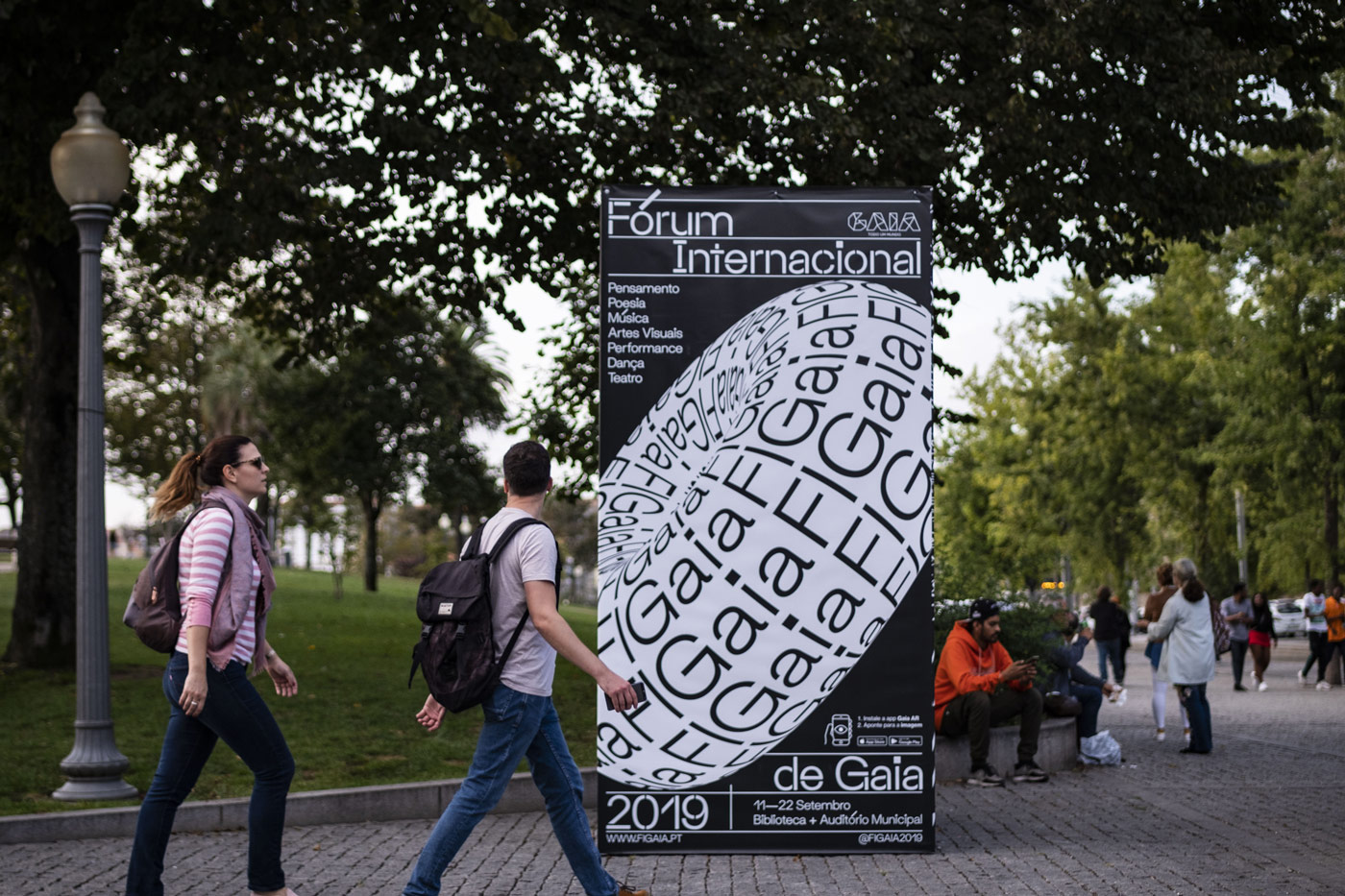
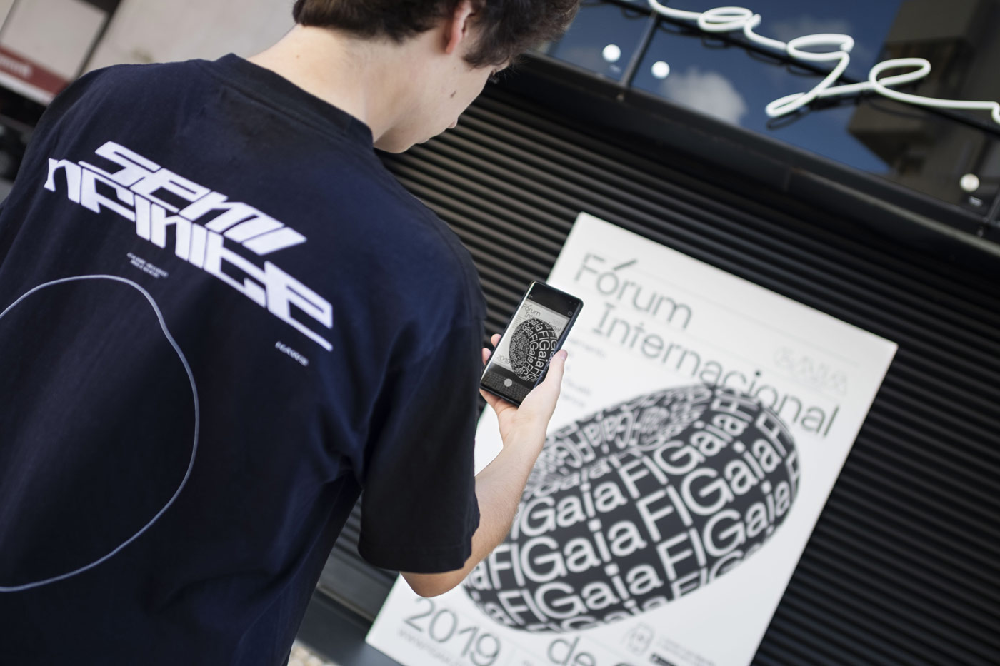
Based on this assumption, the team developed an interactive AR experience so that the audience could interact with the posters, billboards and flyers, als well as share their experiences online. The Gaia RA app – RA is the Portuguese acronym for Augmented Reality – aims at conveying messages within a virtual space and giving the audience a chance to explore poetry in an unusual way. “Through this digital materialization, we were able to attract their attention and create meaningful and memorable experiences. With this innovative aspect, we wanted people to feel compelled to share what they were seeing in order to promote the poetry and the event itself, in an attempt to increase its reach to a wider audience. Using different typefaces for each poem was a strategy employed to provide them with varied tones and personalities. It was also a way to refer to the diversity of places and people who speak Portuguese”, the team explains. In order to raise awareness for the festival, the team implemented different types of AR content, ranging from scans on posters and flyers that activated an AR experience, to virtual content that could be placed anywhere using the App, as well as a face filter for Instagram featuring verses from different poets from Portuguese speaking countries.
“The reaction of the audience was quite positive. The average user gets in contact with AR only via social media apps, mostly through the use of face filters. The vast majority of these users don’t even realize that those experiences are classified as augmented reality”, the group explains, “Augmented reality applied to printed graphic design artifacts is even less common, and it really has an impact on the user. Their attention is immediately hooked once the experiences are triggered, and this happens across users of all ages. However, younger users are usually keener to try out new techy solutions.”
As AR is still a technology that most people outside of the design bubble are not familiar with, it was quite difficult to draw attention to these Apps and let the audience know about their existence. “We had a specific icon and instructions in every printed piece that included an AR experience, but it was often overlooked and people would only notice it if they saw someone interacting with one. It’s easier to get the AR through in a controlled environment such as an exhibition, where you can easily give clear instructions to everyone”, the designers tell us, “For design that lives ‘on the streets’, such as the promotional posters for this event, we found that having just the instructions in the corner wasn’t enough to make it known to the average user. Looking back, we believe there should be some sort of promotional campaign dedicated to the augmented reality content so that people become aware that it actually exists. As AR experiences become more common, we believe everyone will be more aware of their existence and it will allow easier integration in the day-to-day scenario.”
Despite being a quite innovative project on its own due to the AR component, the biggest challenge of this project had nothing to do with technical difficulties. “Our biggest constraint was actually having a very short time frame to execute everything. We didn’t have much room for error and that’s probably the reason we didn’t succeed as we wanted to in terms of communicating the existence of the AR content”, the designers tell us, “Working with a big client means we also had to deal with approval on different levels, which sometimes slowed down the process as we couldn’t move on before having ‘green light’. Although, in the end, we still think it turned out great!” In order to be more efficiently, the team decided to split up the tasks. Since the beginning, Maria was responsible for managing the project and applying the identity to certain media such as the website, foldouts and invitation. While Diana focused on the print materials and the editorial design and Serafim concentrated on the 3D and motion design, Oliver was responsible for the AR app development.
Even before joining the team of FIGaia as a creative director, Maria has always been very keen on learning and researching about the Portuguese heritage. After her studies at the Faculty of Fine Arts of the University of Portoa and finishing her post-graduate degree in marketing from the Pompeu Fabra University in Barcelona, she founded the graphic design atelier “À Capucha!” together with her friend Raquel Pais which has a strong focus on the Portuguese culture and its connection with graphic design. The studio has worked on a bundle of commercial, but also self-initiated projects in the past, including their own brand which reinvents the capucha, a traditional portuguese cape. “I come from a family of educators. My two grandmothers were teachers, as well as my mother and all my five aunts!”, Maria tells us, “Therefore I grew up surrounded by books, listening about Calligraphy, travelling all over the country visiting museums and old castles. I could have become a teacher too, naturally, but for me, it has always been more about learning than about teaching.”
Predominantly working freelance in editorial design and corporate design for the cultural sector, Diana has always been inspired by cinema, music and photography since childhood. “I grew up taking photos with my dad and listening to his old cassette tapes. My first graphic piece was a poster for a Beatles concert I made when I was 13 in a Visual Arts class”, she jokes, “But above all, cinema played a huge role in the development of my visual culture. My main graphic references as a teenager were old movie posters and film opening credits, such as Godard’s or Hitchcock’s. By that time I knew I wanted to work with images, but it wasn’t until college that I was able to channel my love for cinema into the creation of narratives in graphic design.” During her studies at the Fine Arts School of Porto, she began to work on more type-related projects and explore her interest in typography. Lately, she has been working with Lovers & Lollypops, a Portuguese record label and event producer from Porto.
Being born in New Zealand, Oliver has been interested in digital cameras and optic technology since his early childhood. Paired wth a slight computer hame addiction, he was eventually l led to investigating how to combine his knowledge of lensing and optics with glitzy fast-moving computer-game graphics. “I have always had a strong passion for dance music, and found myself involved with the club music scene in Melbourne, Australia working with DJs and musicians to develop unique and interactive lighting and projection content that audiences could interact with at a more engaging level”, Oliver explains, “I always tend to find myself pushing the technical limits of the day’s available technology, and therefore have self-taught to write my own software and bridge hardware limitations in order to create unique experiences where off-the-shelf solutions don’t yet exist.” Nowadays, he works for Pixel Artworks in London as an Interactive Developer and is currently in the process of setting up his new design and technology practice “Pretty Lucky”.
Serafim’s first steps into the creative world were taken when he was only seven years old, playing around with Adobe Photoshop. “I was the geek kid and I played a lot of online video games, and I used Photoshop to create images that I used for my digital profile in online communities (forums) as avatars and signatures”, he reflects, “I spent a lot of time learning from tutorials I found online, in GFX forums and DeviantArt, mostly. Creative software has been present in my life ever since then, and I ended up attending a Multimedia course in high school.” After finishing his studies, he now works as a freelance graphic designer and illustrator in Porto, specializing in 3D content and AR. “ Merging 3D content with graphic design and typography represents a big part of my work. Even though I don’t consider myself too advanced in technical matters, I like to employ new techniques to shake things up in my graphic design work. If the tools exist and may aid us in communicating our ideas, I think it can be worth exploring them”, Serafim tells us, “ I like mixing different fields and softwares in order to create something unique. I am influenced by everything around me and I try to draw inspiration from architecture, interior design, product design, and others in order to create my 3D illustrations and animations.”
The identity, the four designers created for the Gaia International Forum, is not only a great example for the use of AR in the cultural sector, it is also proof that sometimes typography is all you need to create a lively and expressive visual communication.


