
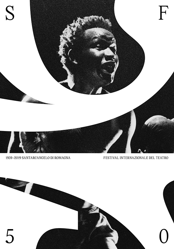
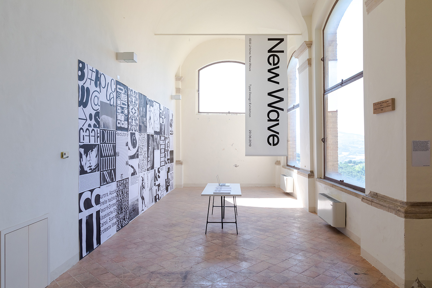
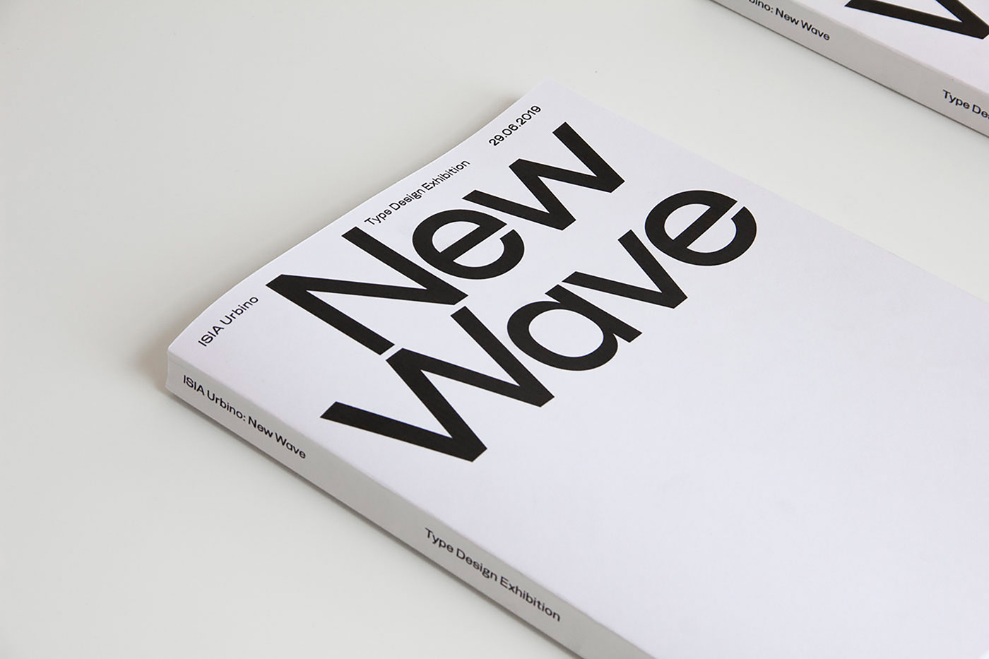
A few years ago, Emmanuel Rey wrote: “Type design is not a question of type but design (…) There is no right or wrong in type design: it works or it doesn’t – it’s interesting or boring.” Based on this quote by the well known type and graphic designer, fourteen young and talented students from Urbino, Italy, have organized an exhibition about contemporary and playful type design, called “New Wave”. Together, they aimed at exploring new and interesting forms, leading to a broad variety of typefaces. “Each designer worked with their own method and background, as well as with their own personal research behind each typeface”, Gianluca Ciancaglini tells Collide24, one of the thirteen designers participating in this project. Next to him, thirteen other designers have worked on their very own typeface during the process, among them Marta Adamkowska, Simone Allevi, Fabio Bacchini, Domenico Bellantuono, Giulia Boccarossa, Sara Ceradini, Giacomo Dal Prà, Gloria Favaro, Giorgia Florenzano, Alessandro Latela, Luca Longobardi, Cecilia Murgia and Nicola Narbone. The exhibition was part of ISIA Urbino Parade 2019, an event showcasing the students projects created during the semester.
Their experimental and refreshing approach has not only manifested itself in the eleven presented typefaces, but also in the title of the exhibition. Inspired by the term “Wave” which is used not only in the world of music, but also in various other fields to define a young and rising movement. “The typefaces are completely different from each other. Everyone has a different story, different designers and characteristics. The File Rouge is in the methodology”, Gianluca explains, “Each typeface wants to communicate something specific. The shape of the individual letters are a consequence of the process.”
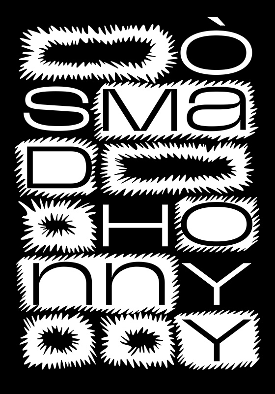
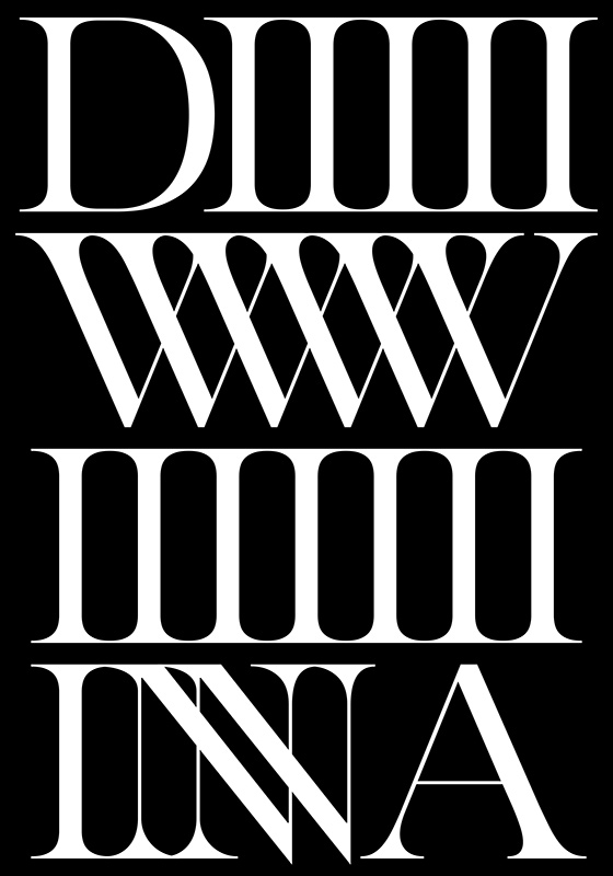
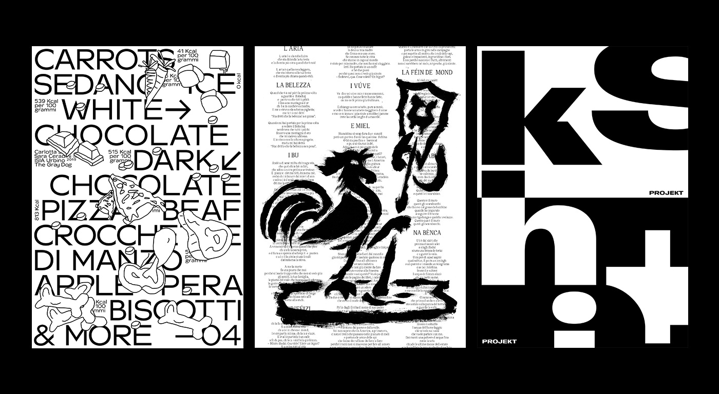
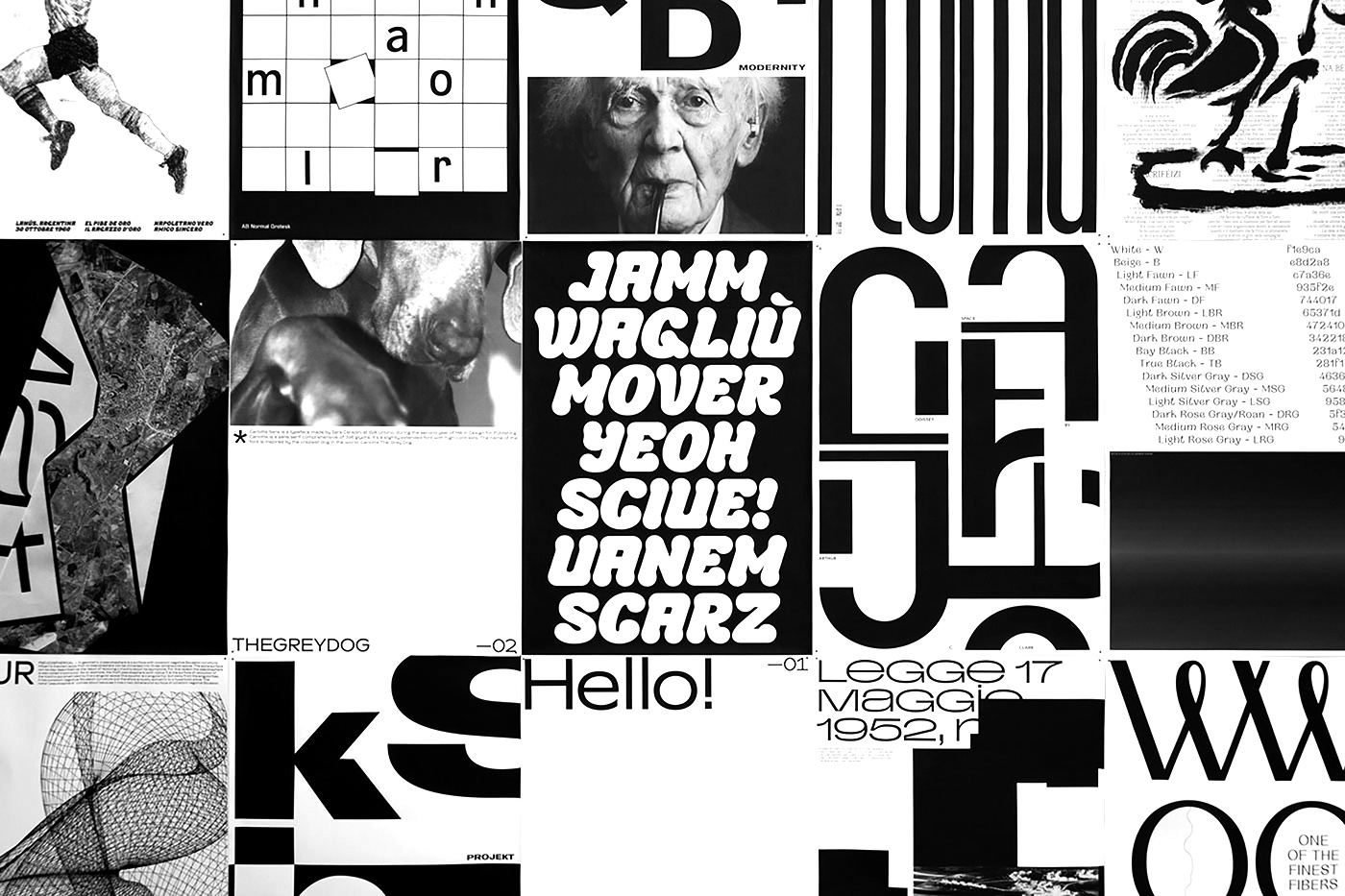
Inspired by the masters of Swiss and Italian graphic design such as Josef Müller-Brockmann or Massimo Vignelli, and contemporary type designers like Emmanuel Rey or Kris Sowersby, the designer has not only worked on one typeface, but five, some of them in collaboration with the other students involved. For each of the five typefaces, Gianluca has drawn his inspiration from different sources, always searching for new shapes and forms, immersing himself in the history of design and its culture. This sentiment seems to be at the core of his practice and person. “The illegible typeface ‘Odyssey’ is inspired by the glyphs of some ancient languages and from the study of Wim Crouwel’s New Alphabet, while ‘Pasquale’ comes from the writing of signs by Pasquale Di Stefano, the last ‘Numeraro’ of Naples. The interesting thing is that every story behind the typeface generates the process”, he concludes. In the beginning of creating a typefaces, Gianluca usually starts with the two letters, “h” and “o”, slowly adjusting their width and contrast, before proceeding with rest of the alphabet, including numbers and punctuation. “During the process of working on the exhibition, some of us preferred to work independently, while others rather collaborated in groups of two, three or sometimes even more people.”
Having so many different designers on board, it was quite a challenge to realize the project in time for the parade. “From the idea and the design of the typefaces, to the specimen and installation of the exhibition, we had about two and a half months. I know it seems like a long time, but when you have exams and courses to follow every day, the timeline got pretty tight”, Gianluca explains. During the time at ISIA, he clearly came to appreciate the benefits of collaborations, working on a bundle of projects with other students, including a book about Max Huber, a publication about Pasquale Di Stefano and “The Book that exploded”. “Based on the experience I gained at the ISIA, I learned the importance of relationships and collaborations with colleagues. In my opinion, the best way to learn is to collaborate. I have learned most of the things I know from the people I have had the opportunity to work with”, Gianluca tells us, “‘New Wave’ has been a collaboration that goes beyond simply working together. We are not just colleagues, above all we are great friends. We try to share as many things as possible between us.”
At the moment, Gianluca has several commercial projects on the go while also working on a new slab serif typeface. We are already excited to see his latest achievement – as well as the upcoming projects of all the other participants of “New Wave” in the future.


