
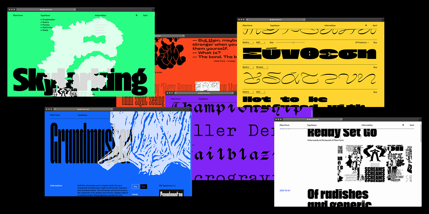
Established by Lucas Descroix in 2022, Plain Form is an independent typographic practice questioning the established standards of the industry. While drawing on the rich history of type design, the new type foundry is an open space for experimentation and collaboration with a passion for expressive and distinctive letterforms. “I enjoy developing unusual type families, but whenever doing so, I would always think to myself: ‘Who is going to distribute this?’ So, instead of trying to fit into a box, I built my own!” Lucas reflects. The idea to launch a type foundry has been simmering on the back burner for some time, as he tells us: “I wanted to be involved with every aspect of the production, from first sketches to the distribution. It gives me the freedom to pursue whatever project comes to mind.” For the launch of Plain Form, Lucas collaborated with his friend and fellow designer Benjamin Dumond on Ready, a collection of three experimental display styles—Active, Bygone, and Clouded—each coming in three different weights.
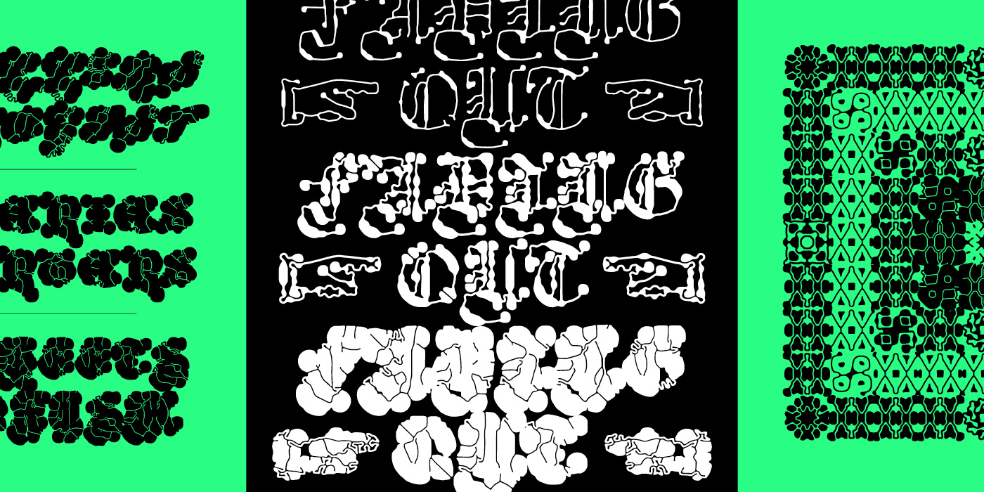
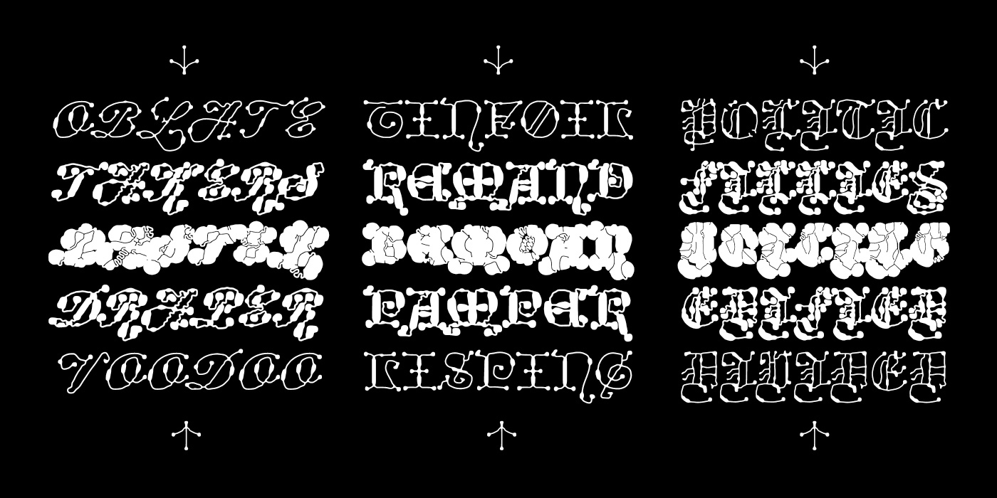
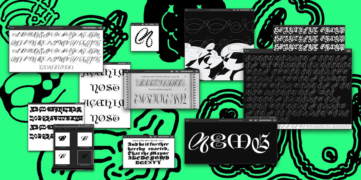
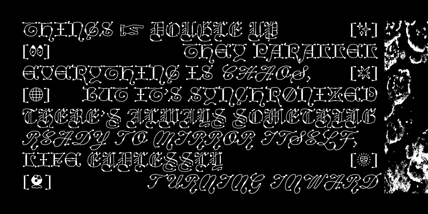
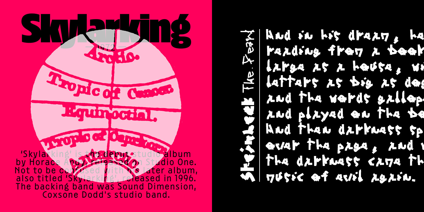
Born out of Lucas’ long-lasting fascination for ornamental title pages in books from the 19th century, Ready sits somewhere between a display typeface and an abstract set of symbols, gaining abstraction with each weight. It challenges the flexibility of our writing system and pushes the boundaries of legibility. “Despite the mesmerizing amount of curves and surfaces, the structure of the letters is still very much there. It remains untouched, nothing was added or removed,” Lucas explains. The idea for Ready arose after he found a book from the Club français du livre, a French book club founded in 1946. “It used a slushy, all-caps cursive for the headlines and the spine. I started digitizing it that same evening, losing myself in its letter-like shapes.” Later, Lucas reached out for support to Benjamin, who brought reaction-diffusion algorithms into the process—a state-based algorithm to generate visuals. “We would feed his script OTF files of the typeface and get an altered version back based on our predefined settings. The number of possibilities was overwhelming at first,” Lucas concludes.
Choosing from endless possibilities was not the only challenge the duo faced. “Running the scripts to generate the different variations of Ready and process the drawings took ages. Our computers were underpowered to handle such complex calculations, turning simple tests into laborious tasks. It felt like being in a dream where you want to run, but you can only move in slow motion,” Benjamin tells us.
Meeting at the design school in Lyon, Lucas and Benjamin moved to different cities after their first year at university and pursued different pathways. After completing his bachelor’s degree in graphic design at École Estienne in Paris and his master’s degree in graphic design at Haute Ecole des Arts du Rhin Strasbourg, Lucas received a post-master’s degree in Typographic Research at ANRT, l’Atelier National de Recherche Typographique of Nancy. Combining his experience in graphic design with his new training in typography and type design, Lucas has worked on several type families in the past, among them the extra-wide, monospace Nostra or the display sans Disc released on Future Fonts. Inspired by the work of SpMillot for the French publishing house Cent Pages and ’80s postmodernism, Lucas began exploring type design beyond its purely functional aspects, approaching each design with a unique perspective. “I started viewing type design as a member of the design ecosystem rather than an alone-standing practice,” he explains.
After completing his bachelor’s degree in graphic design at École Duperré in Paris, Benjamin entered a master’s program at ESAD Valence. During his studies, he found himself inspired by the work of Belgian artist Henri Michaux (1899-1984), best known for his poetry and prose chronicling his psychedelic experiments with LSD and mescaline. “To me, this added an element of the mystical to writing, and in a sense, typography as its contemporary form,” Benjamin explains. Today, Michaux’s work is classified as one of the earliest forms of asemic writing, a type of art focusing on intuitive, aesthetic expression with no semantic meaning. The combination of abstract, expressionist energy and mysticism in Michaux’s work fueled Benjamin’s passion for typography and type design leading him to found Grifi—a platform for theoretical articles, fiction, and essays on type design. Specializing in editorial design, experimental type, and illustration, he often works with scripts and open-source software.
Despite their geographical distance, the two designers kept in touch and worked on several collaborations over the years. After receiving their master’s degrees in 2015, they launched the design and research collective Bonjour Monde with graphic designers Raoul Bonnaffé and illustrator Arman Mohtadji. The group enjoys pushing the boundaries of contemporary graphic design by toying with alternative tools and software and running workshops to teach their techniques. These experiments led to the creation of the variable font Syne for the art center Synesthésie and a number of other unreleased projects. “Collaborating always pushed me forward, particularly when working with Bonjour Monde or just Benjamin, because it allowed me to challenge my preconceptions. Especially with type design, you can become dangerously comfortable with the rules and traditions that have been there for centuries. Collaborating with Benjamin prevented me from always going the easy route. We have long, obscure, sometimes absurd conversations about letters and language. Then, five minutes later, we giggle like kids on Christmas morning, playing with tools we can only half-understand and producing impractical objects,” Lucas tells us.
Next to reworking Benjamin’s typeface Michaux, the duo plans to explore a potential connection between their two platforms Plain Form and Grifi.fr.
Plain Form
Lucas Descroix
Benjamin Dumond
COLLABORATIONS TO LOOK AT:
Luuse
Boogy Brut by Boogy Paper and Bureau Brut


