
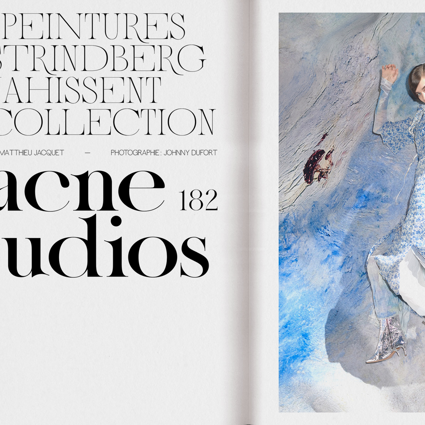
Named after Aliénor of Aquitaine, the Queen of France and England in the 12th century, the same-titled, collaborative typeface by Anne-Dauphine Borione, better known as Daytona Mess, and Lou Rainaldo irridates the same elegance and extravagance, truly worthy of this royal name. The collaboration was created as part of their master’s program at ECV Paris, where the duo just graduated from. “When the creative brief was announced, to imagine and design a font for a fashion magazine, we delved into this immense field of fashion press”, Anne-Dauphine and Lou tell C24. The two designers scoured through the pages of both classical and more experimental, contemporary magazines, such as Tunica or Mastermind – and settled on a fictive redesign of Numéro in the end.
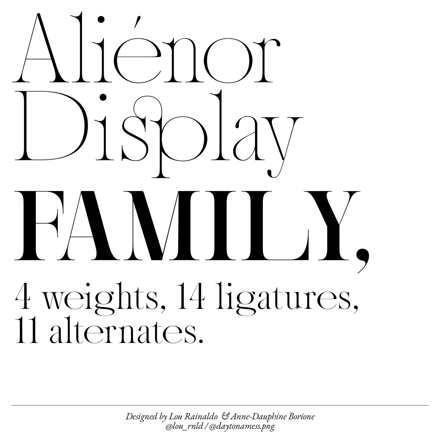
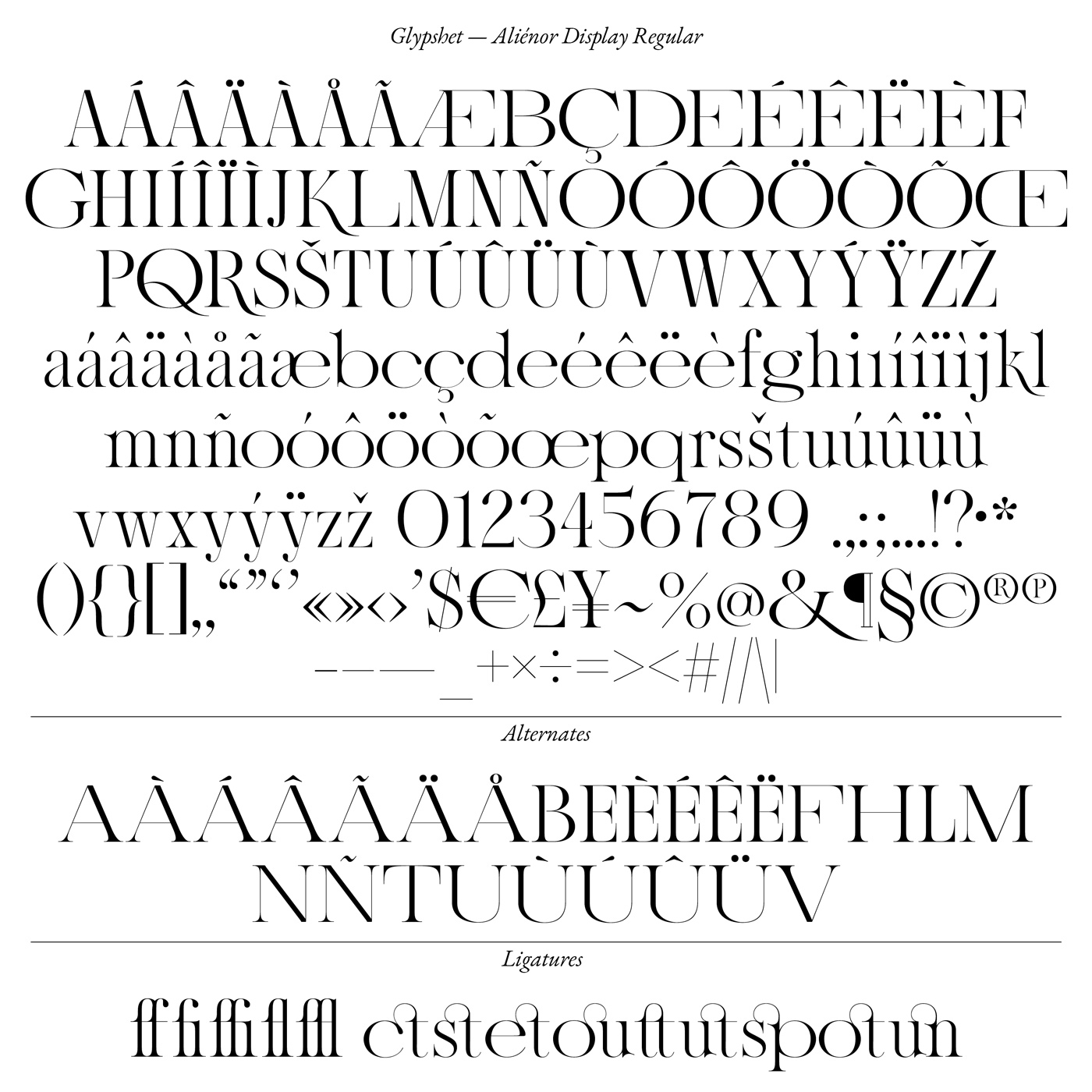
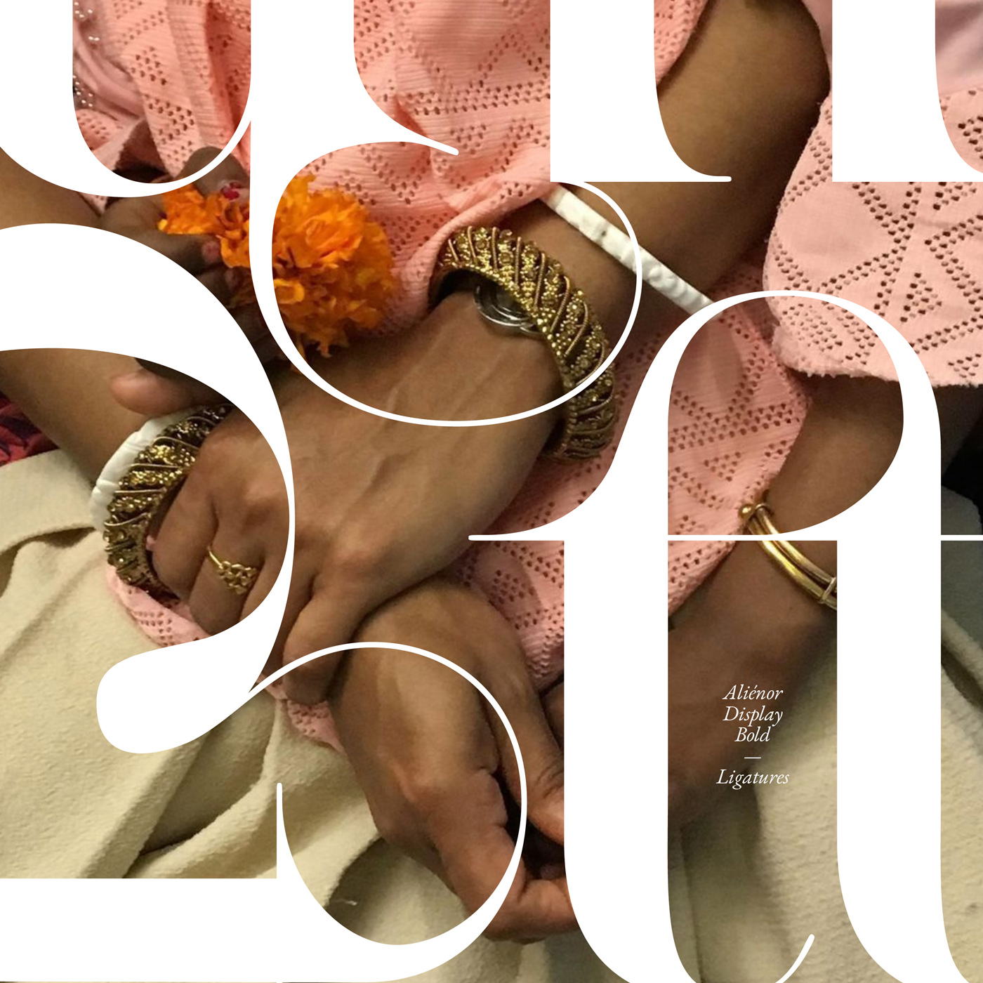
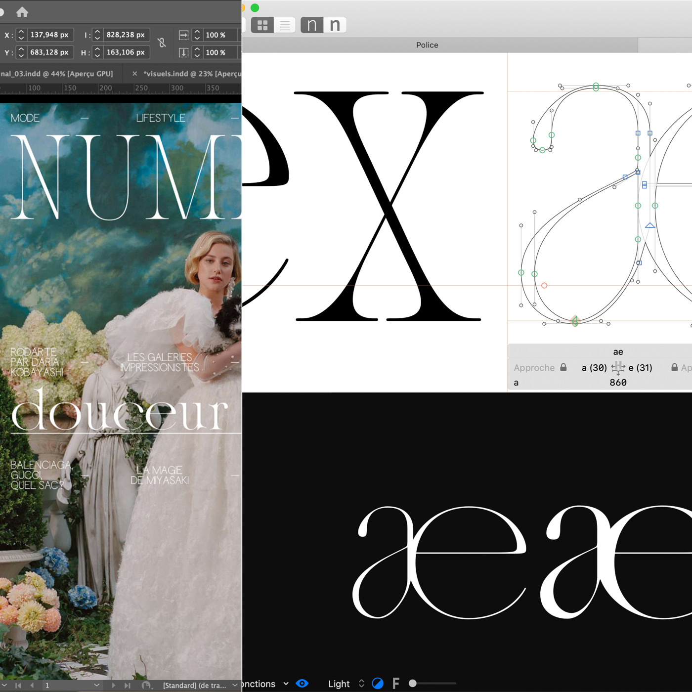
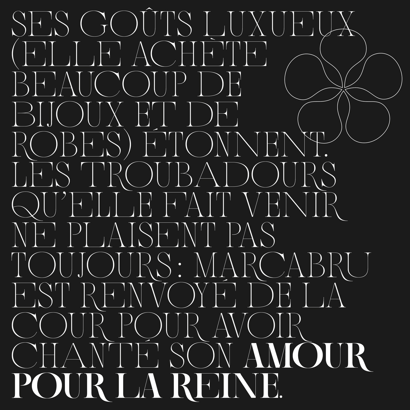
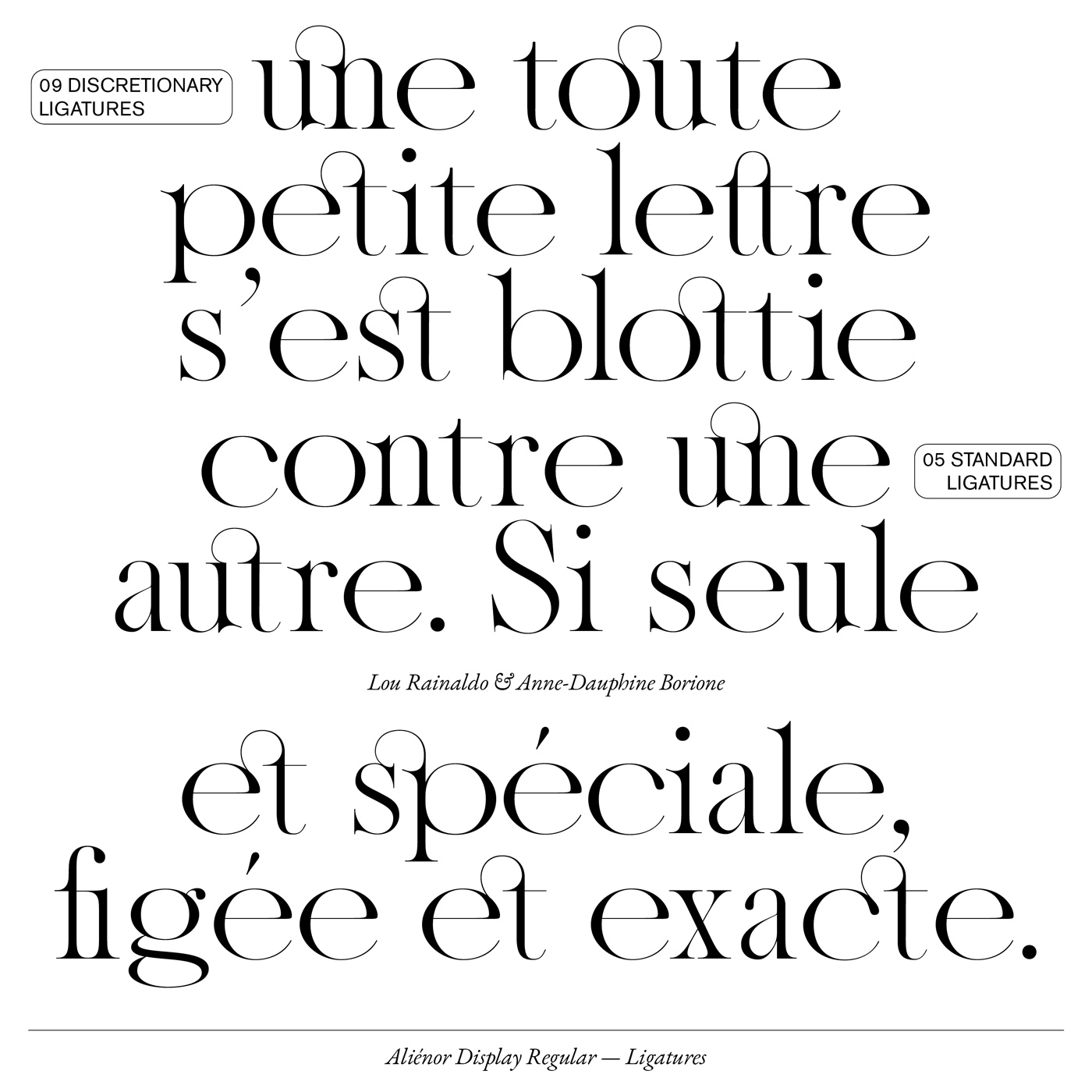
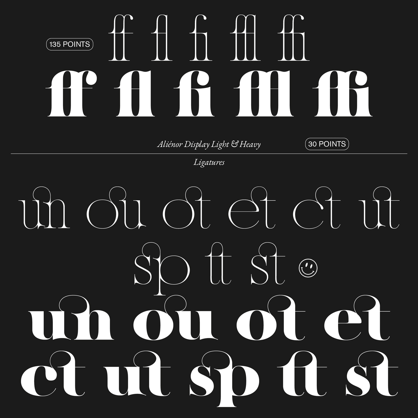
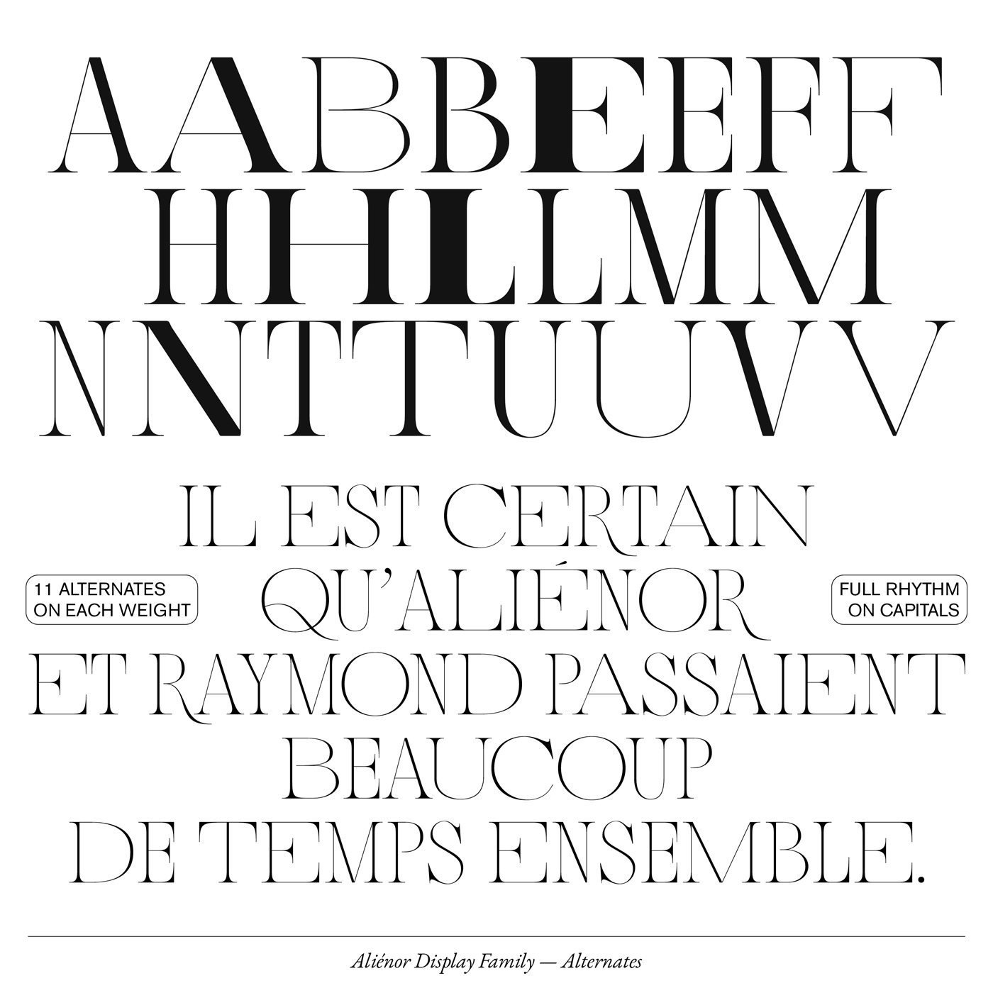
“Our first and in the end final idea was to draw a font with extreme contrasts in order to create a display alphabet with a strong personality”, Anne-Dauphine and Lou say on the concept behind ‘Aliénor’, “We wanted to introduce the new editorial line of the magazine, with ornamental serifs, glosses or swashes. A soft mixture of elegance and extravagance.” After defining those characteristics up front, a serif typeface was the only possible answer in order to achieve these kind of qualities. In order to create a dynamic, almost rhythmic visuality, the duo added eleven alternates to its glyphset, playing with greater and narrower widths of the letters. Additionally, the typeface includes an elegant set of ligatures, proofing once again their typographic finesse. In the recently released update on Type Department, Aliénor comes with full latin support, 200 more glyphs and a lot of diacritics. “We want to transcend the language barrier, to allow users to say ‘élégance’ in every latin language”, the duo states.
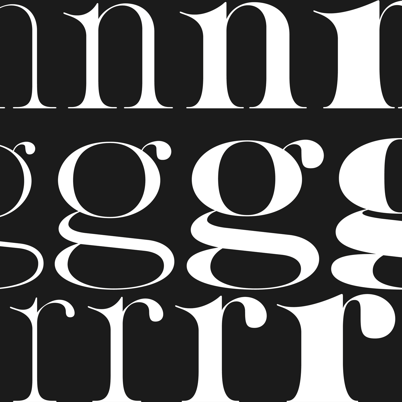
In order to create a typeface that could be used in different settings, Anne-Dauphine and Lou added three other weights to the family. By balancing out the contrasts between the different weights, which are a major aspect of ‘Aliénor’s’ overall visuality, they created a distinctive, beautiful typeface, sitting somewhere between didone and more contemporary tendencies in the creative landscape. “The biggest challenge is to get an harmonious typeface and even more an harmonious family with different styles”, Lou concludes, “It’s quite easy to end up with a confusing typeface if you don’t pay attention to all the little details of your typeface: that the serifs coincide with the terminals, that the punctuation matches the subtleties of the letters. That all the glyphs work as a whole. This is of course the basis of type design, but it is a work of precision that must be carried out to perfection. And it’s not easy.”
Anne-Dauphine and Lou have been fan of each others work, long before they first collaborated together. “Both being in the same class at school, we quickly felt the urge to do a project together when seeing our graphic and typographic worlds colliding”, Lou tells us, “We realized that we had the same way of working, both being very tidy and perfectionistic.” Sharing the same work ethics, the duo jumped on the opportunity to collaborate together, fusing both of their skills into their common interest for type design. “When I saw Lou’s diploma project on Behance when checking out the other students in our master class, I immediately wanted to have an opportunity to work with her, so I was super glad when Lou approached me in the second year, and not on any project, but on a type design one! Stars aligned, and the rest is history.”
Anne-Dauphine, who considers herself first and foremost a type designer rather than a graphic designer, actually comes from a background in fine arts. In her first year of studying graphic design, one of her teachers sparked her interest in typography and introduced her to the world of type design. “I think experimenting with different styles is the very core of my practice”, she tells us, “I’m avidly eager to learn and discover everything related to typography and design. Publishing and type design are the main fields I enjoy working in, but I’m open to all and am inspired by all.”
When it comes to approaching a new typeface, she usually starts with the letter A, a very important letter to her personally, before continuing with the other capitals. “I personally never touch paper, all the work happens on a screen, from inspiration to the final product”, she explains. Next to at least five different typefaces in the making and a number of projects under her belt, Anne-Dauphine currently works as a freelancer in Paris, but plans to spend the next two years in Montréal.
Just as Anne-Dauphine, Lou discovered her passion for typography at university, where she first planned to specialize in interior design. “I rapidly realized that typography had a very important place within my work. In fact, I’ve always liked to draw letters to transcribe my ideas, to convey my feelings and intentions through typography”, she tells us, “A word can be much more powerful depending on its design.” Therefore, she began to work on more type-related projects, learning both how to develop a typeface – and how to use it.
When she approaches a new project, she usually draws on various sources of inspirations, from references in similar fields to architecture and science, as well as public advertisement and street signs. “I always start with making some spontaneous sketches on paper, they don’t need to be too precise – even if I try do do that more and more”, she guides us through her working process, “Then, I draw the first letters necessary for the construction, to pave the way for the overall visual language – and after that, I just go on! Above all, I ask a lot of my friends for their advice and guidance, to look at it with a fresh eyes.” Next to freelancing, she works part-time at Paris based PoliceStudio and is currently in the process of setting up her own studio Groupe 387 with her friend Liana Korios.
For both designers, collaboration is a crucial part of their practice which leaves room for experimentation and new perspectives. “It’s a constant dialogue that constantly pushes the project forward. It’s also a great way to share references and inspirations, to broaden your network, to be open-minded and not to focus on yourself. Even if a collaboration goes wrong, it will always teach you something and this is the most important thing”, Lou concludes, and Anne-Dauphine adds: “There is always something to teach, and most importantly, something to learn, in every collaboration.”
Anne-Dauphine Borione
Website
Instagram
Behance
Lou Rainaldo
Website
Instagram
Behance
COLLABORATIONS TO LOOK AT:
Pierre et Gilles
CocoRosie
Charlotte Perriand and Le Corbusier
Boogy Brut by Julien Priez and Bureau Brut


