
In the summer of 2020, Studio Experimentelles Design of University of Fine Arts Hamburg organized the three-week online research festival “(How) do we (want to) work (together) (as (socially engaged) designers (students and neighbors)) (in neoliberal times)?”. Hosted by the Kunstgewerbemuseum Berlin’s Design Lab #6, the event invited experts and activists to question our understanding of design and discuss working conditions. Under the supervision of Prof. Jesko Fezer, Studio Experimentelles Design represents a problem-oriented design approach and offers free support to people who are otherwise excluded from design processes. This project format is called Public Design Support.
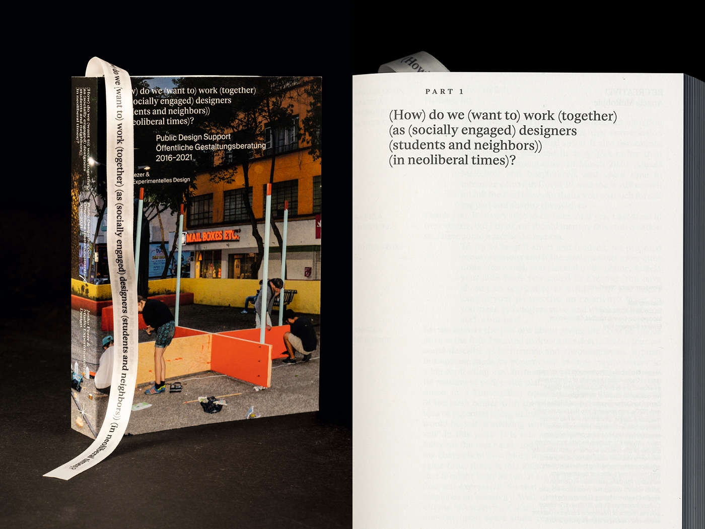
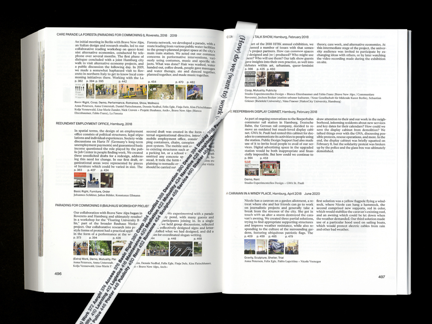
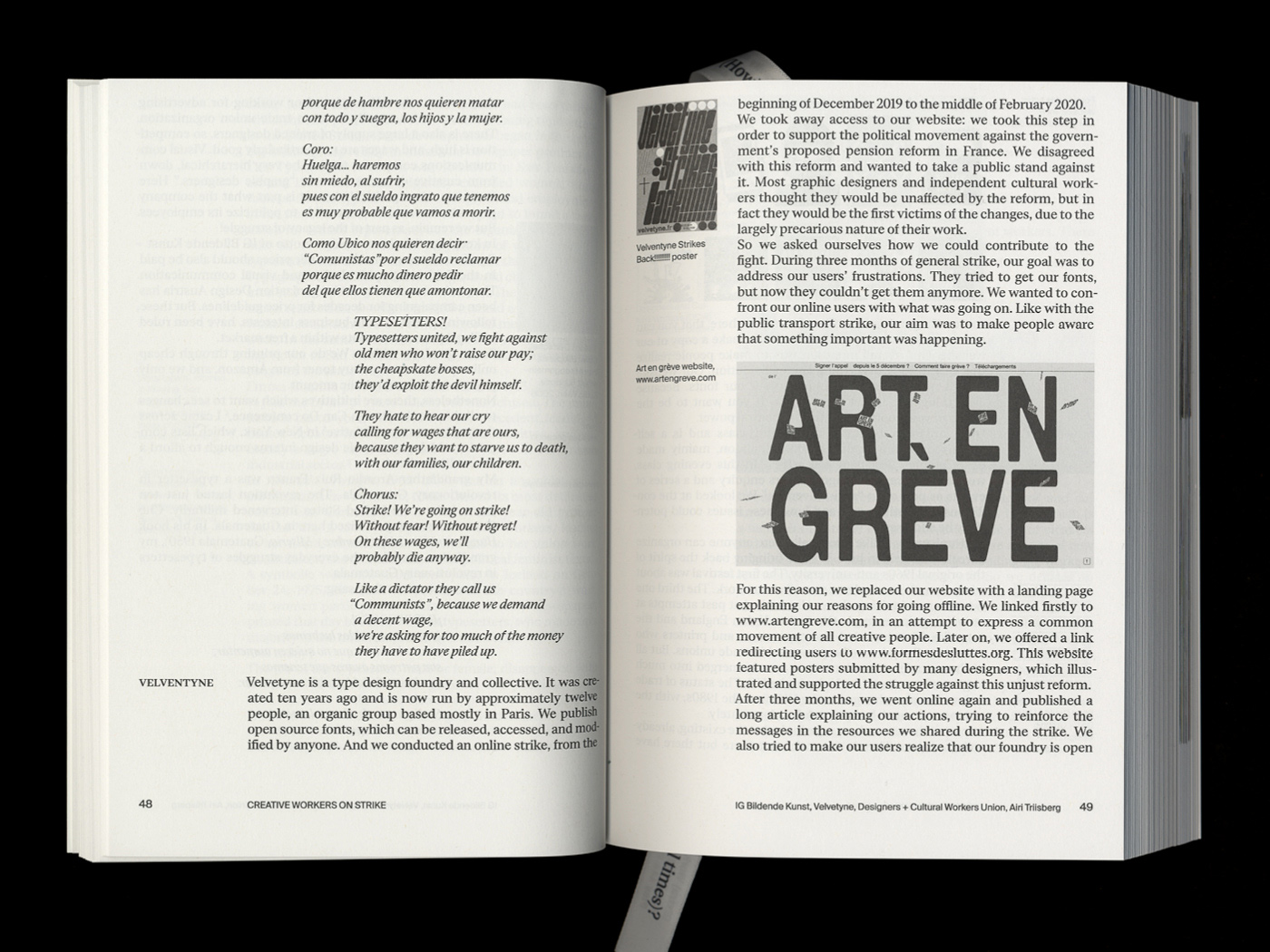
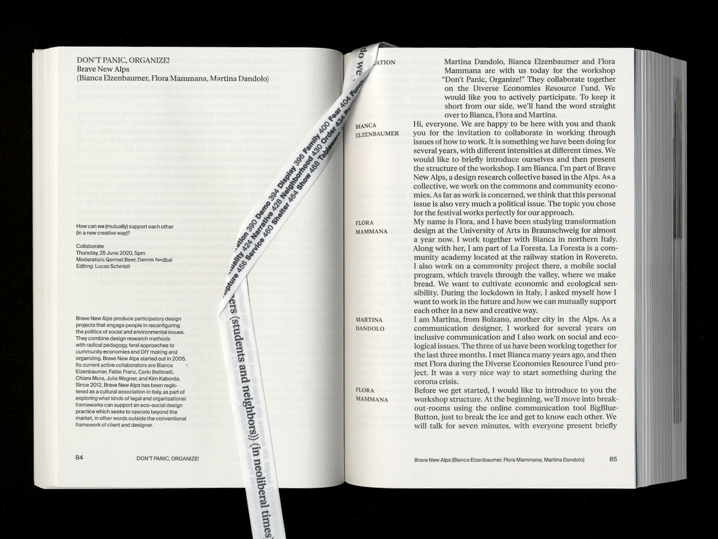
After the festival, Jesko Fezer and Studio Experimentelles Design published the same-titled 528-pages publication, in collaboration with Dr. Claudia Banz from the Kunstgewerbemuseum Berlin. The compendium chronicles the Studio’s approach through lectures, research, debates, and project documentation, including the outcomes of the festival, as well as five years of work by Public Design Support (2016-2021). Three students from HFBK Hamburg—Max Arff, Sam Kim, and Dokho Shin—took over the editorial design, resulting in an organized and thought-out layout.
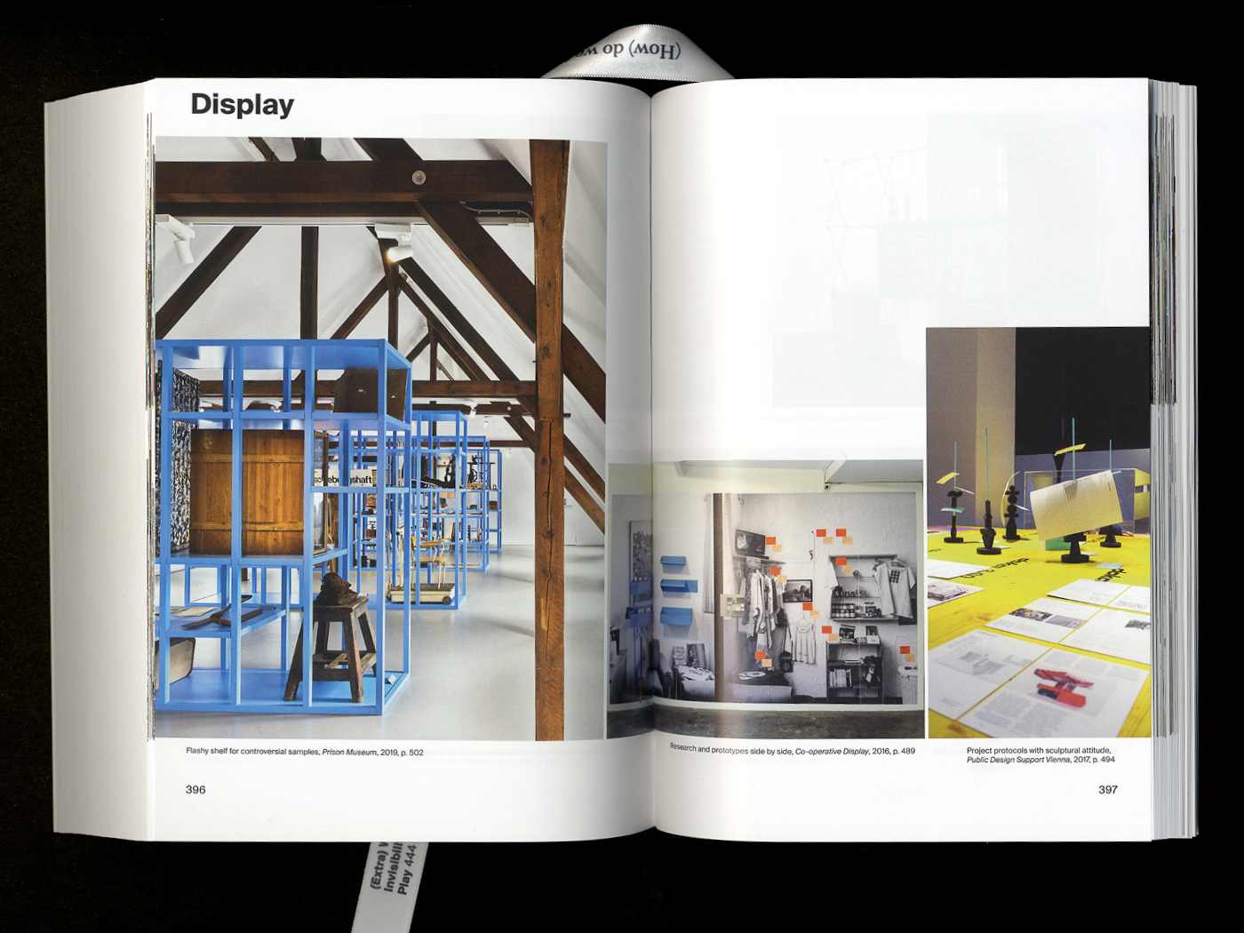
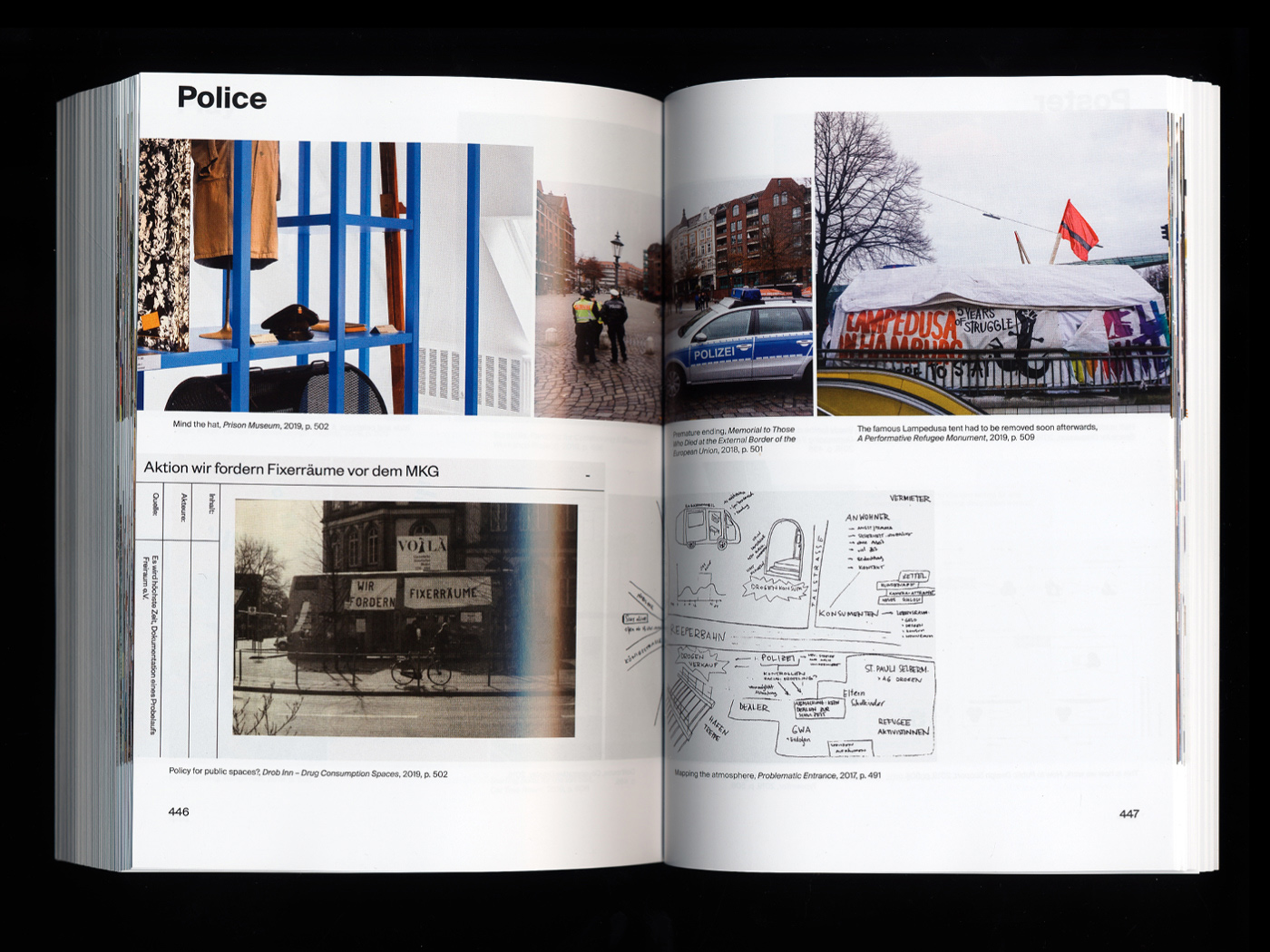
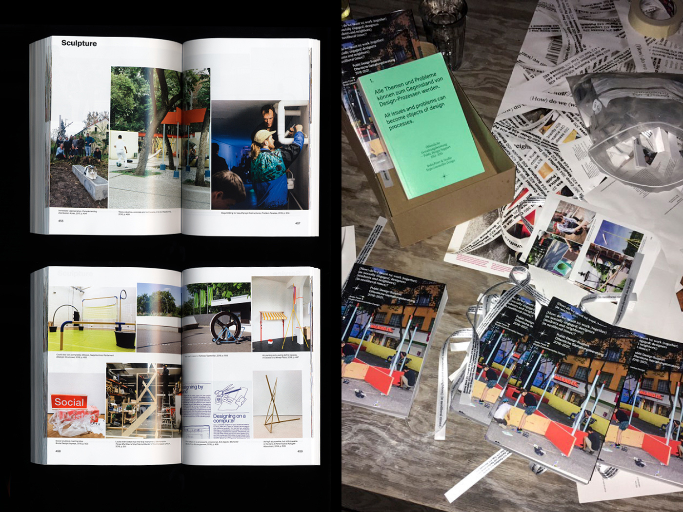
When asked about their collaborative process, the designers make sure to point out the impact that Jesko Fezer and the students from Studio Experimentelles Design had on the final product. “We had tons of conversation with them. With that many people involved, there were a lot of different expectations on the design of the book. We stuck to our initial concept but stayed open to suggestions by other participants, especially when it came to the archive of their works,” Dokho tells us. Ranging from photos taken by professional photographers to images from cellphone cameras, they had to figure out a system that worked for all different kinds of material. “It is meant to be an archive, so it was more important to give a candid impression of the process behind the different projects. Therefore, we included as many images as possible, regardless of their quality,” Sam explains.
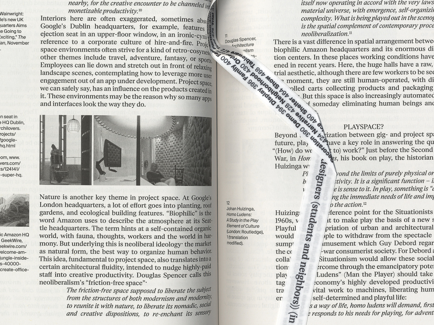
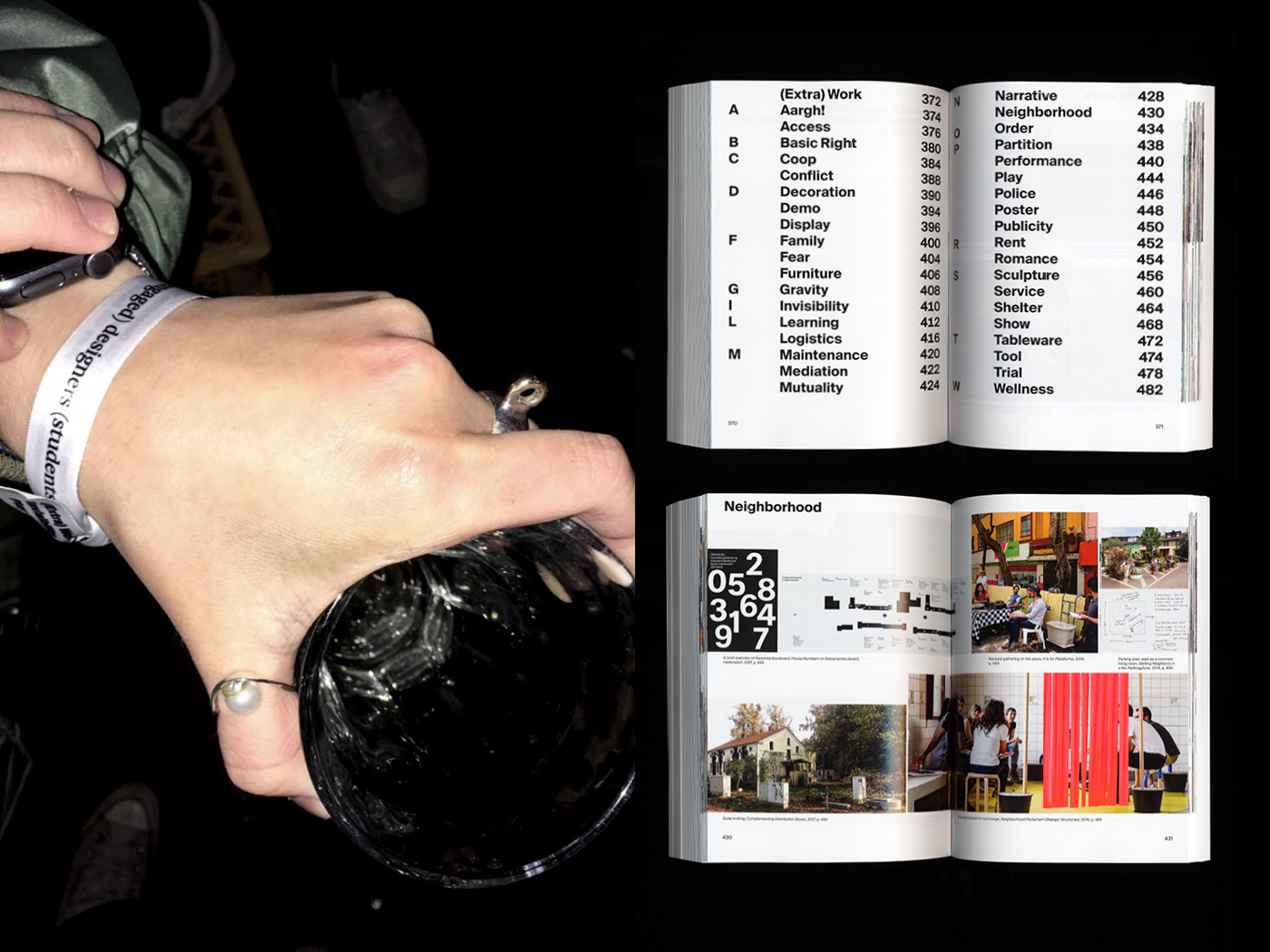
The highlight of the book is the unusual use of a ribbon bookmark which has all the important keywords from the texts printed on both sides to make navigating through the book easier. “The book consists of two big blocks of content which are independent but connected at the same time. To distinguish visually between the two parts, we chose a different type of paper and typography for each part. Since the book revolved around the events of the festival, the ribbon bookmark is reminiscent of the wristbands at festivals as a hint of our concept,” Sam explains.
As the book contains over 400 pages of writing, choosing the suitable typeface for this endeavor was challenging. For the first part of the book about the festival, the choice fell on ‘Eliza’ from Camelot Typefaces, a pixel-inspired serif with high readability and a modern twist. For the second part, the archive of Studio Experimentelles Design’s work, they decided on a clean sans-serif to provide contrast.
“Type-related works have always intrigued me,” Dokho tells us, “especially their subtleness and ambiguity. People interpret a specific word based on their experiences, even though it has a particular meaning in the dictionary. This really sparked my interest in typography.” His career started out with a focus on exhibition identities and book-making, predominantly working for clients from the cultural sector and art scene. Since moving to Berlin in 2017, Dokho collected a number of projects under his belt, while working towards his master’s degree at HFBK. “I have been working alone since 2011, and sometimes, it makes me stuck in a cycle of repetitions. Working with someone is very helpful, as I can take a step back from the own hole I have built. It’s a good opportunity to think in different directions”, Dokho reflects.
Since he can remember, Max has always been interested in typography and design, even if he didn’t plan on becoming a graphic designer from the start. After completing his studies at HFBK, he now works as a freelancer in Hamburg. “There was always a strong connection and feedback culture between all the students in my class which is why my practice evolved a lot during my studies. I tried out different things and learned a lot while working with others,” Max remembers. “When working in a group, you can always discuss your decisions and give feedback on your designs. A group of people sees the same design through different lenses, brings in more ideas, and has more working power. I love working collaboratively! And working in a group with Dokho and Sam makes it even better!”
Just like Max, Sam was drawn to art and visual media from a young age which led him to study painting in South Korea. After moving to Germany in 2016, he first wanted to enroll in a photography program but chose a career in graphic design instead. He moved to Hamburg to pursue his master’s degree at HFBK, after completing his studies at the Berlin University of the Arts. Over the last years, he has produced distinctive work for a range of clients from Germany and Korea, while pursuing another passion on the side: cooking. “I think it resembles the design process a lot!”, he says.
In the upcoming months, Dokho and Sam are working on the identity for the 23rd Jeonju International Film Festival in Korea, in collaboration with type-designer Pawel Wolowitsch, while Max is focusing on personal projects. However, after this fruitful collaboration, we’re sure this won’t be the last time you have heard about this talented trio.
COLLABORATIONS TO LOOK AT:
Shin Shin


