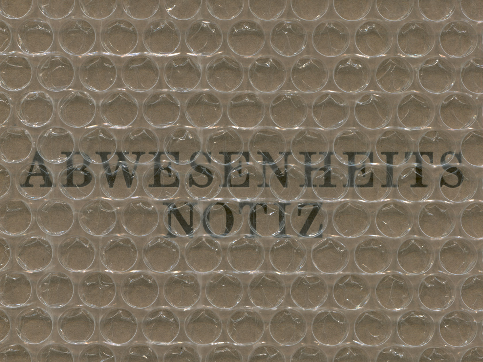
Translated from German to an ‘out of office notice,’ the letterpress title, “Abwesenheitsnotiz,” brings a presence of absence to the photography and literary work it encloses. “People are mostly not present here, and if they are, then at most in mental absence,” the founders of the publication tell C24. This intentional omission is a theme that can be observed throughout the first collaborative publication between the two graphic designers Natasha Adhiambo Okoth and Robin Christopher Körner, together with photographer Mascha Dilger and designer and writer Celine Radloff. In “Abwesenheitsnotiz,” Mascha presents a collection of her photographic works spanning from 2017-2021 alongside Celine’s texts. Each reminds us through the use of dynamic associations and an interplay of mediums that absence can also be an imperative to emergence.
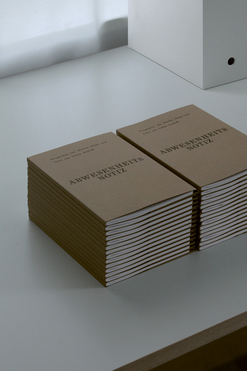
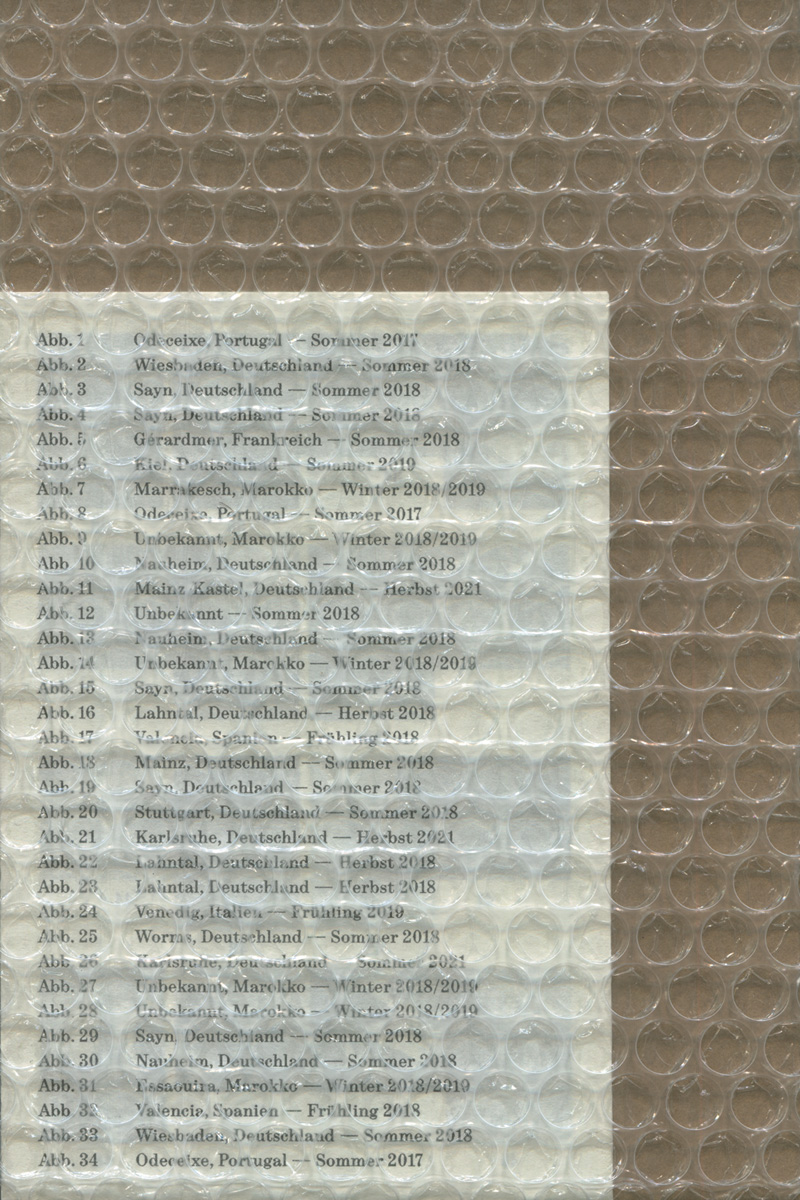
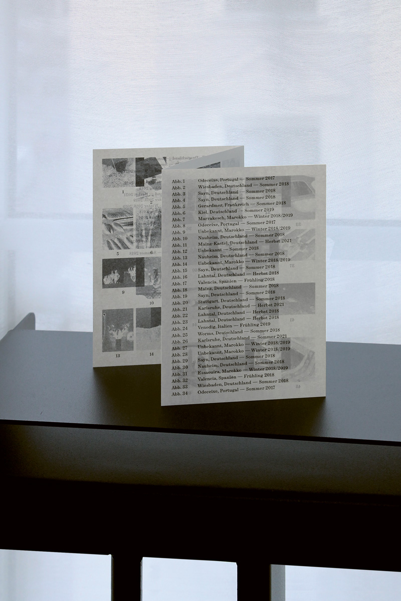
Printed in 2022, “Abwesenheitsnotiz” came about during the collaborator’s common period of study at the University of Applied Sciences in Mainz. Since their graduation from the university, the project underwent continued refinery from their respective places of residence: Munich, Karlsruhe, and Vienna. In the end, it was printed by Munich-based printery “Werkstatt Höflich” and riso-printing studio “Herr und Frau Rio.” When asked about their decision to collaborate, Robin explains to C24 that “In collaborations, multiple perspectives, approaches, and competencies come together that can complement and inspire each other. Questions come up that you wouldn’t normally ask yourself, resulting in discussions that make the project stronger visually and conceptually.”
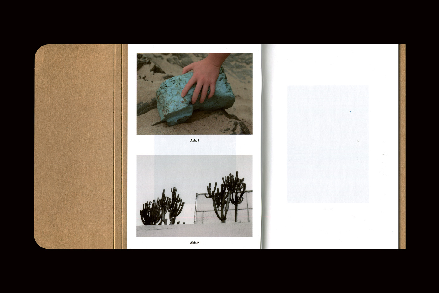
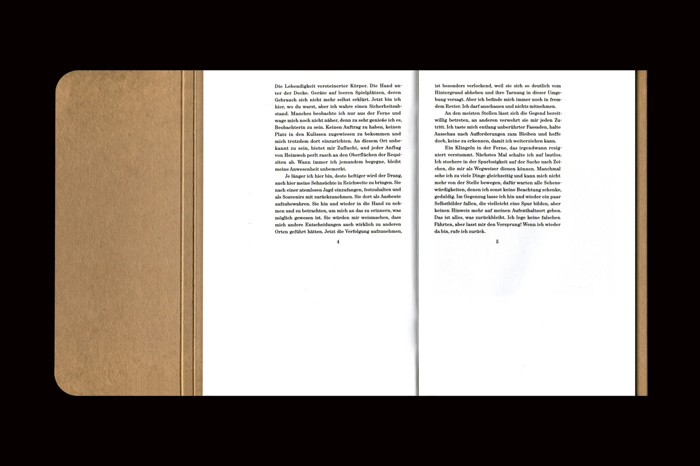
Evidencing a strong design sensibility, the publication is atmospherically reminiscent of leafing through a personal archive—evoking both nostalgia and contemplation. Regarding their design intentions, Natasha and Robin tell C24 that the enclosed riso-printed index nods to an earlier era which “finds its origin in the visuality of a negative envelope from analog photography” and thus, “highlights the analog connection to Mascha’s photographic works.” Further adding to the design concept, a sense of ‘being on the road’ was necessary for the design duo to communicate, “which is why the book creates a conceptual bridge to an envelope through its 100% recyclable, FSC-certified cardboard cover.”
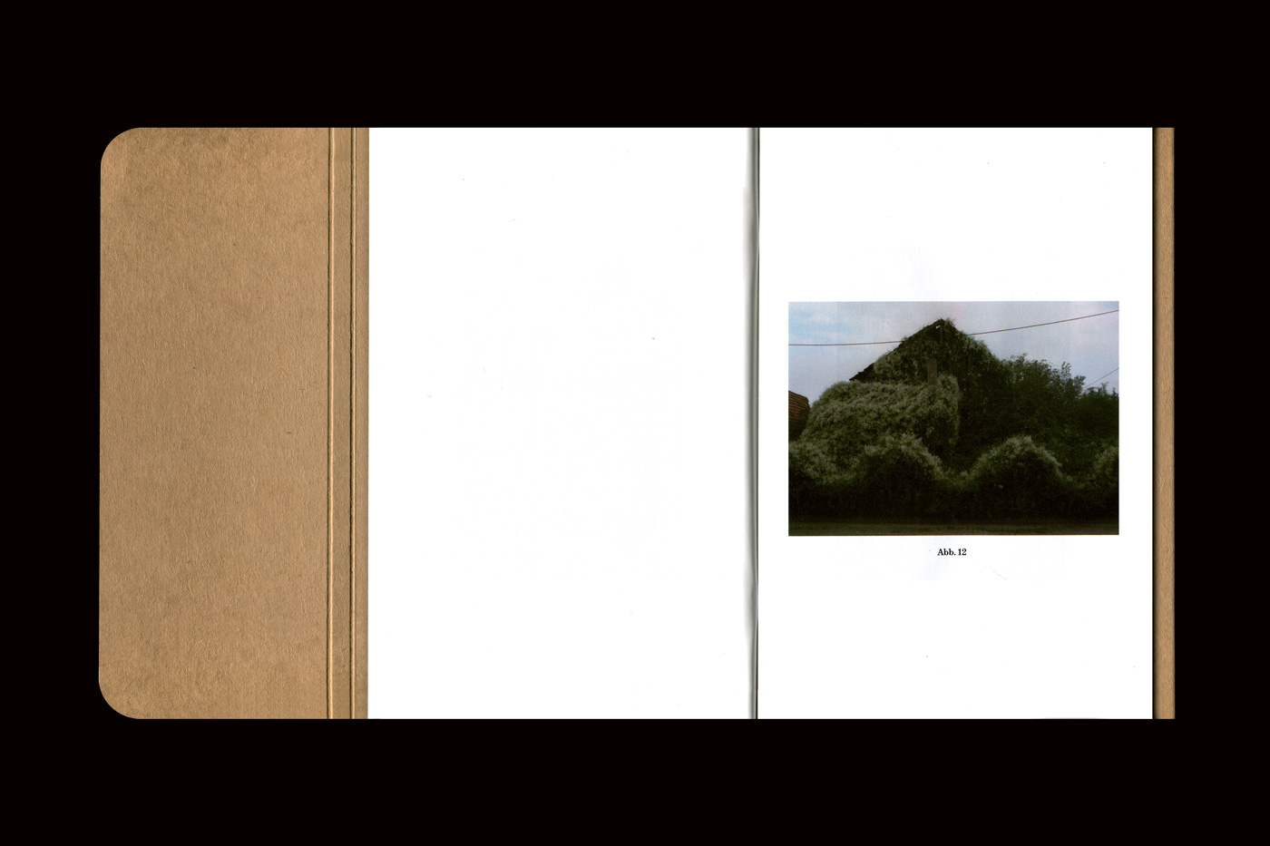
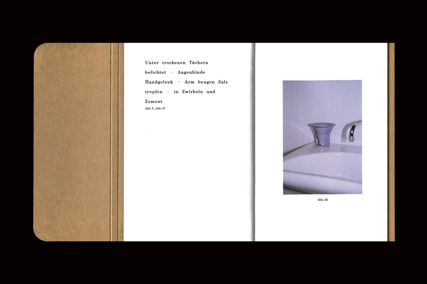
As the reader weaves through images and poems, they are permitted to associate freely from one medium to the other. “Despite their different formal languages, typography and photography harmonize with each other in terms of visuals and content. The same content can be communicated in different ways by the respective medium,” Natasha reflects. But in another reading of “Abwesenheitsnotiz,” the singularity of image or text is also possible. Celine’s literary works “stand on their own, but can also be linked to the images,” she explains. Meanwhile, “Mascha is in search, she collects, she lingers, she presses the shutter release, she moves on,” Robin tells us about his collaborator’s approach. Often inspired by abandoned places and the contrast between nature and human-made objects, Mascha reflects upon her role as a photographer through her work and the relationship between absence and presence.
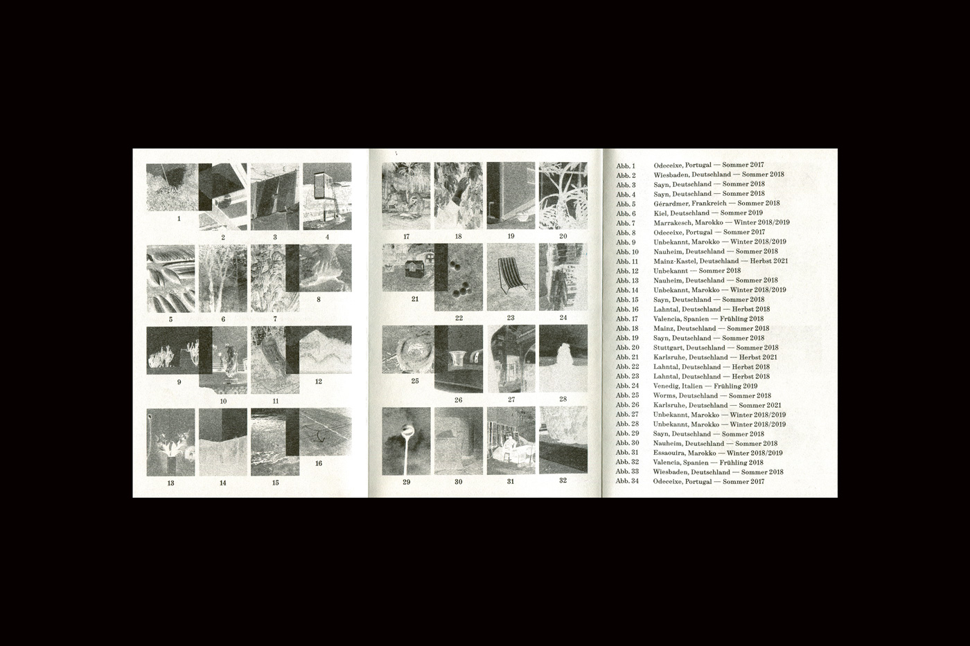
Effectively, “Abwesenheitsnotiz” is a synthesis of components that come together into a cohesive and deliberate work. It’s all about “visual characteristics,” Natasha reflects, “attributes that are also reflected in personal topics aside from graphic design. These include mainly properties such as reduction and simplicity, which we like to see in conjunction with asymmetry and irritation.”

