
The moment the artistic laboratory and cultural institution PILAR commissioned them to work on their identity was the start of an ongoing and fruitful collaboration between the two designers Lennart Van den Bossche and Corbin Mahieu. “I well remember the moment when I got an e-mail from PILAR. This is the first time I’m saying this but as my first reaction I thought: ‘No way, I can’t do this’. It just seemed like such a huge assignment”, Lennart tells C24, “But then I realized I should do this together with Corbin. He already had way more experience with bigger commissions and we just had a big potential working together. We never really put that to the test until then. But it payed off. The first weeks working together on the identity went flawless. We really were on the same level.”
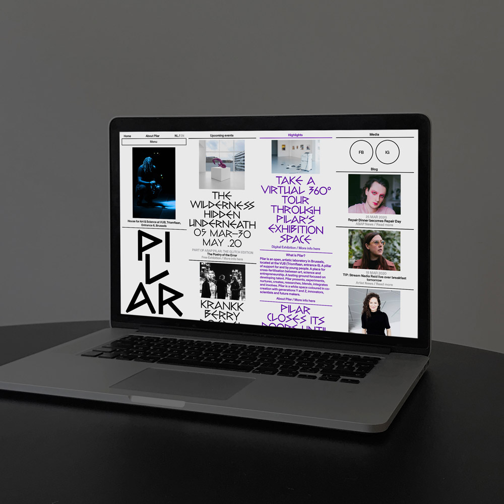
Since then, the duo took over the complete identity of the Brussels based House for Arts and Science, as well as their semi-annual, multidisciplinary festival PILAR ASAP. At the intersection of art and culture, PILAR serves as a platform for emerging and established artists, allowing them to express themselves in word, image and sound. It is located at the VUB, the Free University of Brussels. For the website of the institute, the duo teamed up with web developer Rein Van Oyen.
“It truly was our first big test. We had never worked that close together. It’s always a bit of a challenge to work creatively together with other designers”, Corbin adds, “You always need to find the overlaps of your visual preferences. With Lennart, I never needed to search, we were always on each others tracks.” Before collaborating together on the identity for PILAR, the duo met each other while working for the Belgian newspaper DeMorgen. While both designers studied at LUCA School of Arts in Ghent, they never actually got to know each other back then. “I guess we did cross each other in the hallways of school around 2010, but we never really met. Lennart was already in his last year, when I started learning about design programs”, Corbin explains. Nevertheless, the school definitely laid the foundation for their typographic and detailed approach.
While Corbin was jumping between his different jobs at Jan en Randoald and DeMorgen, and his internship at Zak Group in London, Lennart started his own screen printing atelier together with friend and fellow designer François Van Damme and continued working at the newspaper from time to time. “I don’t remember the specific day that I met Corbin, but what I do remember is that he always had this crazy drive for creativity”, Lennart looks back, “He was just new at the newspaper but would throw in so many ideas. I was really impressed by that! I was becoming too used to the comfortable situation at the newspaper but Corbin gave me that spark again. The rest is history.” Over the years, both designers gained a wealth of experience, building up longterm working relationships with their clients. Now, having a number of projects and collaborations under their belt, they finally founded their very own studio together in Ghent. “We would always laugh about the idea of having our own practice”, Corbin remembers, “Now… many laughs later, we work closely side by side.”
Working for PILAR has not only been their very first collaboration and therefore the first step on the journey to their own studio, it has also been a real learning experience. “We are very lucky that PILAR trusted our initial approach for the new institute in Brussels”, Corbin tells us, “We still function as art directors for the center and are fortunate to have room to experiment on our designs. Not many big art centers would have the guts to fully trust young designers for such an assignment.”
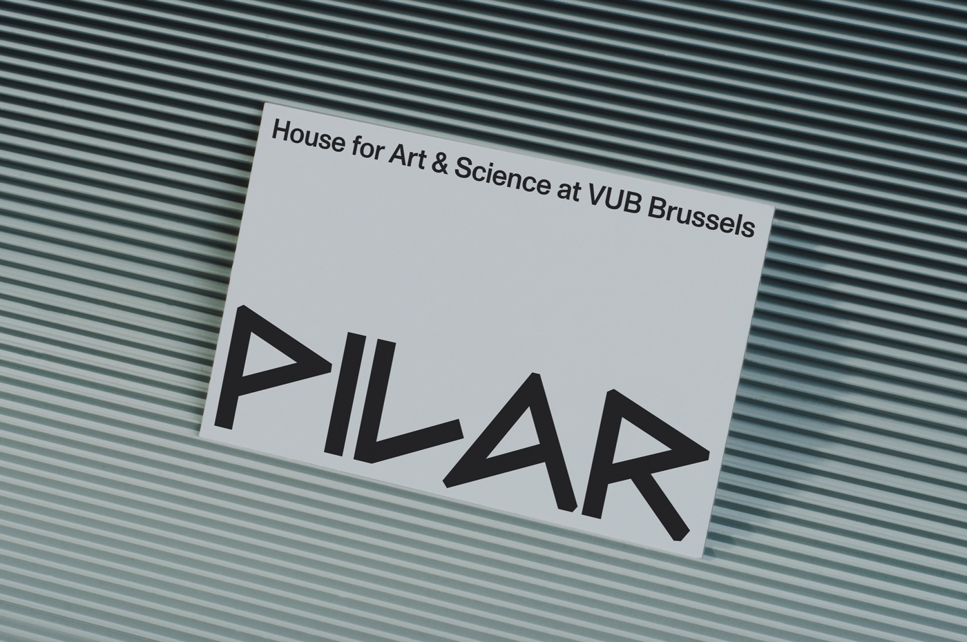
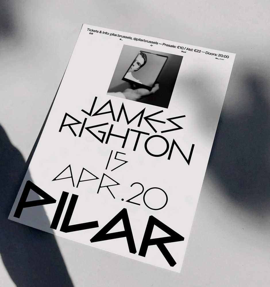
In order to shine some light on the long history of the university and its traditions, whilst still representing the young and emerging generation of artists, the duo decided to use the typeface Bill Display, originally created by Max Bill in 1950 and known for its straight-edged glyphs. “For us, the typeface is a reference to the intellectual side of PILAR as part of the VUB Brussels. Bill Display almost looks like an old stone cut typeface that could be found on a Greek temple”, Lennart and Corbin explain, “On the other hand it has something very modern and almost trashy, like a graffiti tag, resembling the rebellious and experimental mindset of the young artists and public represented by Pilar.” As a reference to the name of the institute, the duo came up with a centered layout, spanning across the different media of the identity. By stacking the individuals elements on top of each other, the design represents the form of a “pillar”.
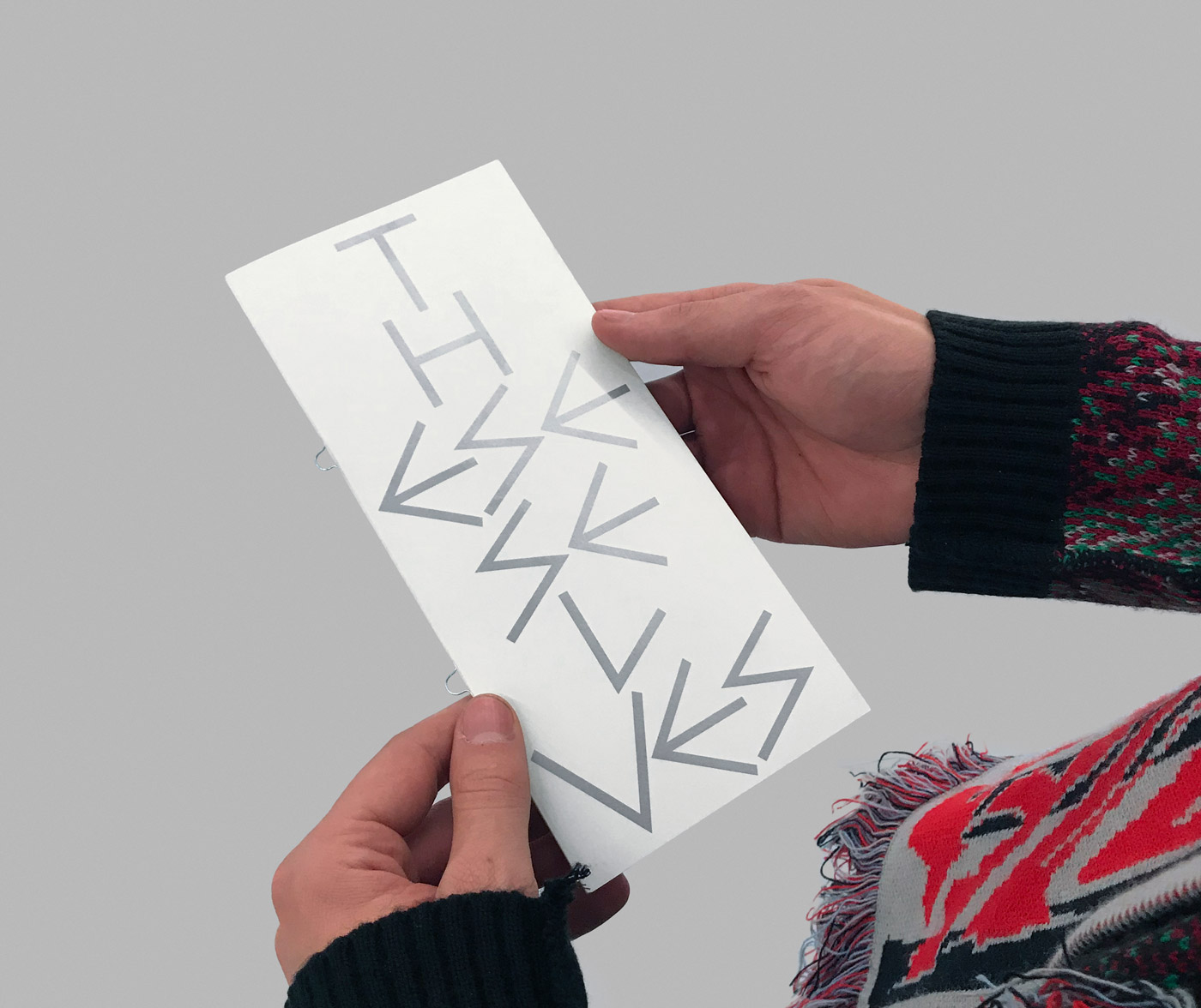
“From the start, we had the idea to build up the posters from bottom up, with centered typography. But we were using a different typeface back then which was not extreme enough. We sometimes use the expression ‘too well behaved’. And that is never a good sign!”, Lennart concludes, “Corbin had this eureka moment when he tried out Bill Display. I was even a little bit scared that it might be too extreme. But too extreme doesn’t exist. It means that it is exactly what we should be doing.”
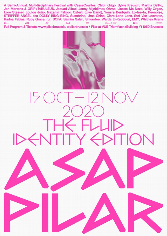
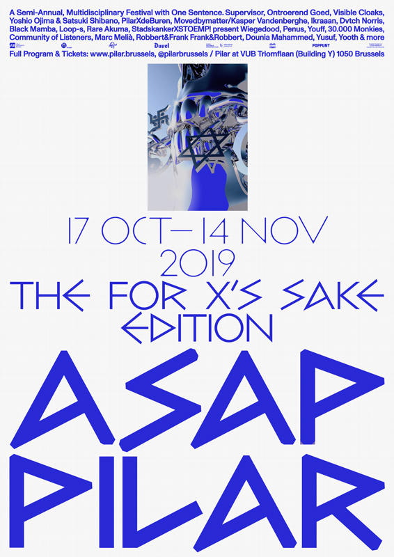
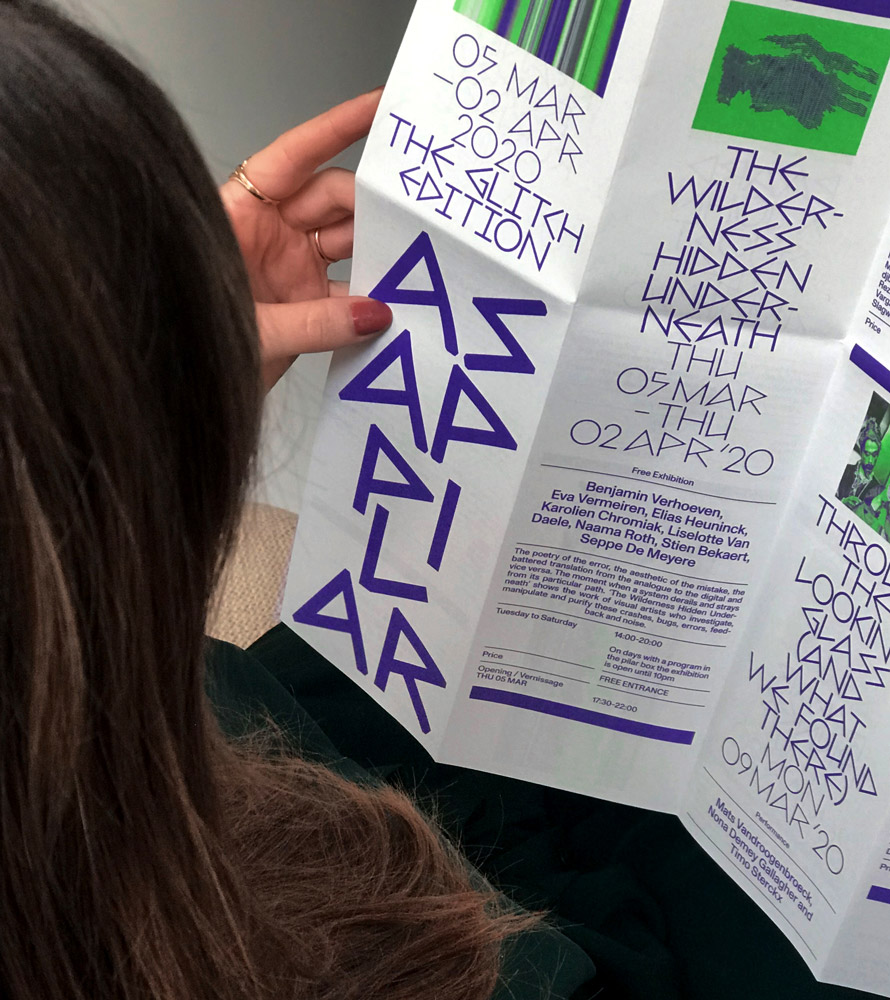
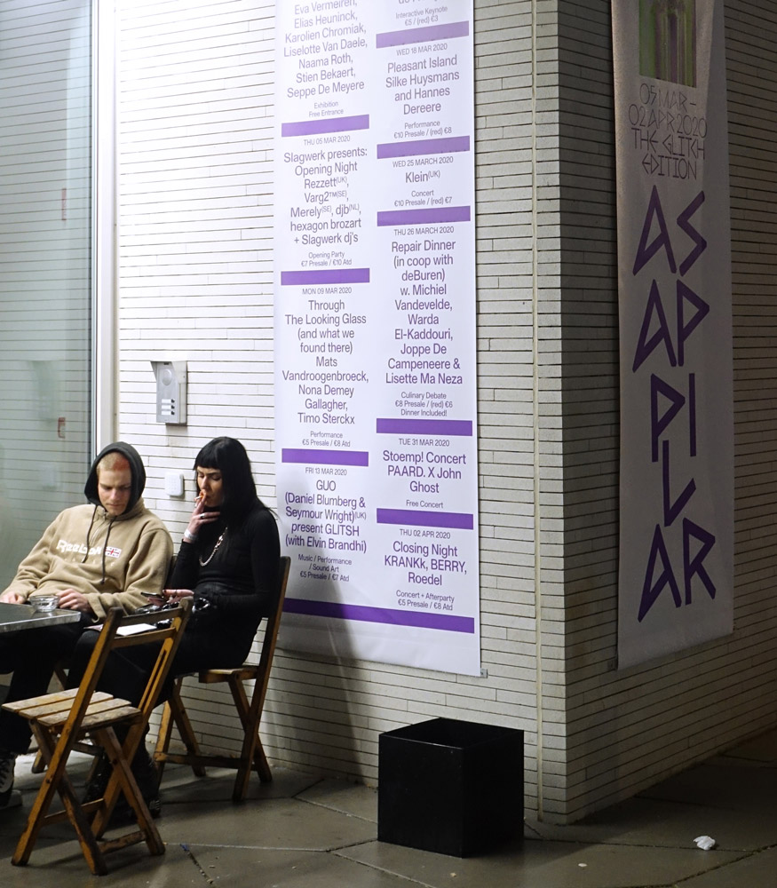
As a contrast to the black and white color palette of PILAR, the identity of the ASAP festival is always based on a set of two colors. For the festival in 2020, which went under the motto “The Fluid Identity”, the duo chose the combination of fluorescent pink and silver, challenging the concept of gender-specific colors. “It’s a ridiculous idea that pink is for girls only. It’s very interesting that even colors aren’t free of boundaries”, Lennart and Corbin state, “When we proposed the colors to PILAR their first reaction was: ‘Isn’t fluo pink and silver over the top?’ The question itself was the best argument to use them. They completely agreed.” By choosing this sensitive subject, PILAR aimed at encouraging the dialogue about the concept of identity and exploring it through exhibitions, performances, concerts and debates. “For the ASAP festivals we always use the Pilar identity guidelines and we create an image that represents the idea of the festival. For the Fluid Identity edition, we edited a picture of a face covered by hands. The face looks androgynous, symbolizing her, him or they. To make it more fluid we edited the picture in that way that it’s melting and so becoming fluid”, the two designers explain.
When starting with a new project, the duo usually takes their time to discuss different approaches and ideas. “We always need to talk and brainstorm, without touching a computer. At first we need to test ideas in our head. Then shortly after we find a unique concept and it doesn’t take a lot of time before we are enthusiastic about getting started”, Lennart and Corbin explain, while guiding us through their working process, “Overall we design with our guts. If we get excited by something most of the time we stick with that. It also really doesn’t matter whose idea it originally was. We want to make something good, and we do that together. It’s almost like we become one entity. Until now this working method always worked very fast. We can create the overall concept within a few hours. The fine-tuning of the idea takes the longest time. Our designs always need to pass each others tests.”
Since taking their first steps into the world of graphic design, Lennart and Corbin slowly learnt the benefits of building a network of like-minded designers and collaborating with other creatives. “At first I wanted to do everything myself. Later I realized that it is important for a designer to have a strong network so that they can take on bigger assignments and co-work in different creative fields”, Corbin states and Lennarts adds: “Sometimes, you just click. For me and Corbin it’s just like that. Our personal work is very different from each others but we both like each others portfolio. There is this mutual respect and trust. It’s like we understand each other on a visual level. I think it has a lot to do with ego. When designing together it shouldn’t matter who brings an idea. The only thing that matters is the outcome.”
For both designers, it’s important to see other designers or studios as colleagues, instead of competitors. “Alone, we cannot change the Belgium design scene and its relationship with future and current clients. It takes more than one person to establish and maintain the quality of the graphic design landscape. So instead of working against each other, think of the possibility your own studio can benefit from working side by side”, Corbin states, “The relationship between clients and designers in Belgium is completely different compared to our neighboring countries. In Belgium, the designer holds a far more executive role, compared to the autonomous and trustworthy status it holds in other countries. I would like to see that change in the future. As specialists in our field, clients should want to collaborate and co-create with us on an equal footing.”
While the next edition of the PILAR ASAP festival is already around the corner, Lennart and Corbin fully concentrate on the launch of their new studio at the moment. “Starting the studio will drive us to work on even bigger projects. We would also love the studio to be a creative hub in the future and are looking forward to seeing it grow.”
COLLABORATIONS TO LOOK AT:
Valentijn Goethals and Tomas Lootens
Jan en Randoald
Ine Meganck and Chloé D’Hauwe
Jef Cuypers and Michaël Bussaer
Vrints-Kolsteren
Mathieu Serruys and Joris Verdoodt
Tuft Agency
D-E-A-L
La Villa Hermosa


