
While figuring out the right balance between university and their time-consuming side-jobs, Andrej Barčák and Andrej Čanecký made the best of the situation and founded their own studio which is called, well, Andrej & Andrej. “We quickly realized that part-time work in a graphic studio or advertising agency is pretty much a full-time job, and with full-time university we basically worked day shifts and night shifts”, the two Slovakian designers tell C24, “We gradually discovered each other’s strengths and were able to divide our workload in two, so that it was done quicker and better. The studio basically built itself gradually.” Predominantly focusing on the cultural sector, the duo continued to go from strength-to-strength and has worked with a range of exciting clients so far, including Flaam Festival, Public Defender of Rights, Energy Manifest Conference and many more.
Since their early beginnings, the studio has developed a practice that always adapts to the needs of every project, while still pushing each brief to its absolute limits. It’s this playful and always collaborative design approach which seems to be at the core of their practice and person. “The design needs to be mainly functional, therefore, its form should be adapted to the content. However, it is important to adjust and often formulate the content itself. We do not want just simply mediate the client’s thoughts and messages, but it is getting interesting when we can work with the content and re-evaluate or co-create it”, Andrej and Andrey state, “Therefore with design, we try to help the client and encourage them to create a message or raise questions. It has to be fun for us. If we have to do a project only to make it happen, we feel that it takes twice as long.”
In the following interview, we talked with the duo about the (dis)advantages of working for cultural clients, their hopes for the future of the studio and their very first encounter. Let’s just say this: The story how Andrej and Andrej met, lets you believe in fate again.
Your projects often revolve around art or other cultural fields. What are the challenges of working for cultural clients? What are the main advantages?
The main advantage is that the designer works with a client who has taste, knows what works well, and understands the matter, which leads to better dialogue. On the other hand, this advantage can be a disadvantage. Sometimes a client in culture has a specific taste and knows exactly what he wants visually. Being an artist, he is used to being assured of his opinion and trying to convince others, so sometimes it is harder for him to understand our advice.
How important is collaboration to you as a design practice?
Totally and absolutely. I remember one of the professors at our university saying that during the years he taught, he learned that each brain works and sees completely differently which never fails to surprise him. Every designer thinks differently, has different strategies and different procedures in work and creation, uses different software or the same, but in a completely different way. All of this is something from which we can learn and be inspired. That’s why we try to work with other brains so that we don’t limit ourselves to our own brain.
Do you remember your first encounter?
It was during the admission process for high school. As Andrej (AC) says he had only one try. Otherwise, his future would be lost forever. The papers were handled in, and they have received the first assignment. He was stressed out, but then someone raised a hand and asked some absolutely irrelevant question. The professor’s face gave him some confidence because he thought the other guy that asked got no chance to get it and hoped there would be more like him. The guy with the question was Andrej (AB).
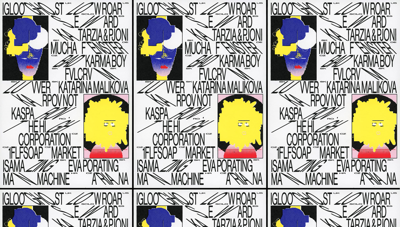
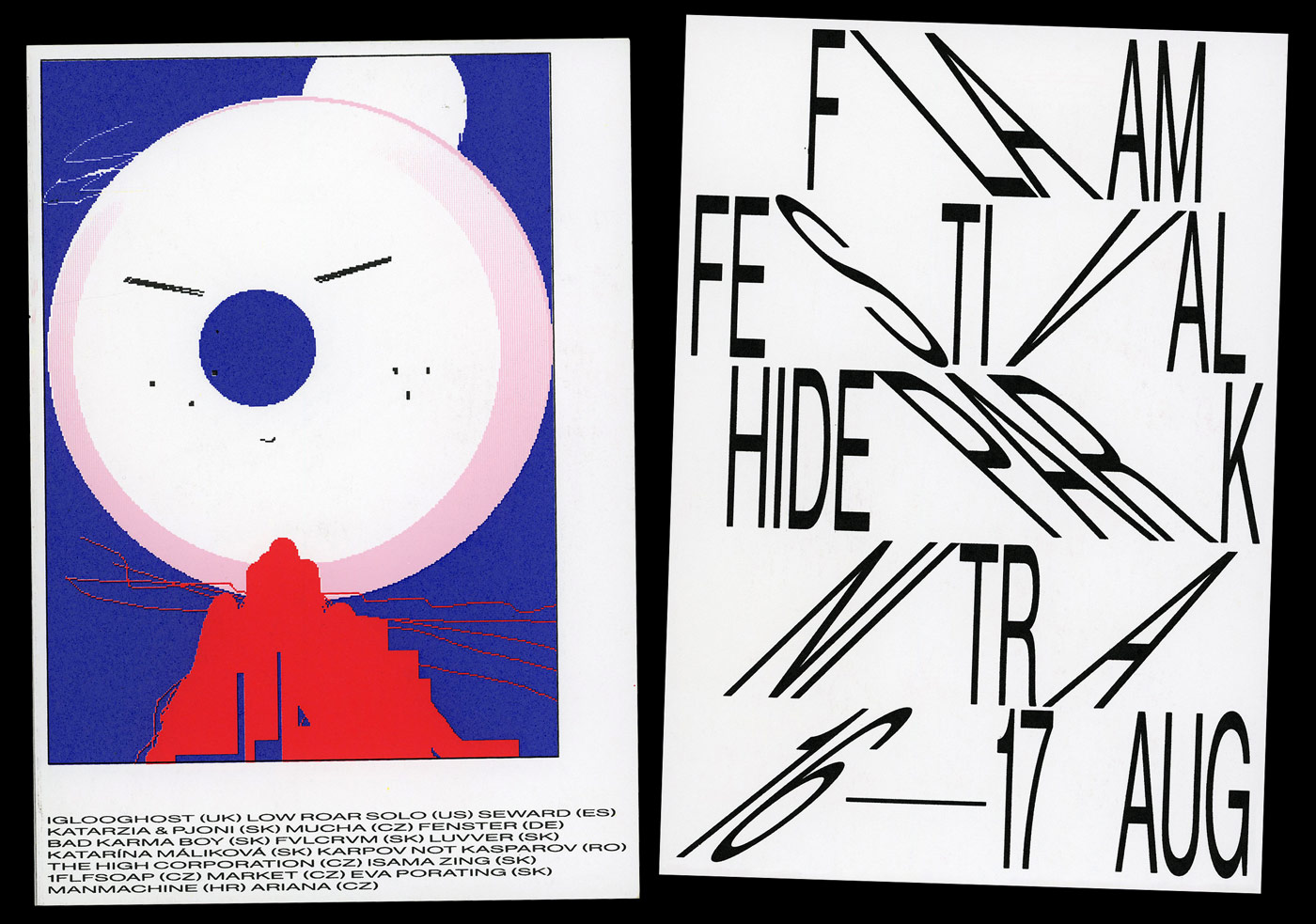
Since 2018, you took over the visual identity for Flaam Festival, a boutique music festival with a unique approach and atmosphere. For 2019, you came up with a very expressive and unique look.
Flaam is a boutique (mostly) music festival that we have been working on for 5 years, practically non-stop. For all the organizers, but especially for us, it serves as a playground, a place where we can try things and experiment. It is also due to the fact that, unlike with other projects, we see directly into its core here. We are a solid part of the organizational team, which is not very common at festivals. Me and Majo Tesák (Flaam’s captain and my neighbor) often talk all evening and come up with ideas to push the festival to the next level. It’s great fun and a solid base for weird ideas such as a series of 22 avatars/illustrations for 22 artists as the main element of Flaam 2019’s design. Each of them represents the name, mood, or musical style of the individual artists.
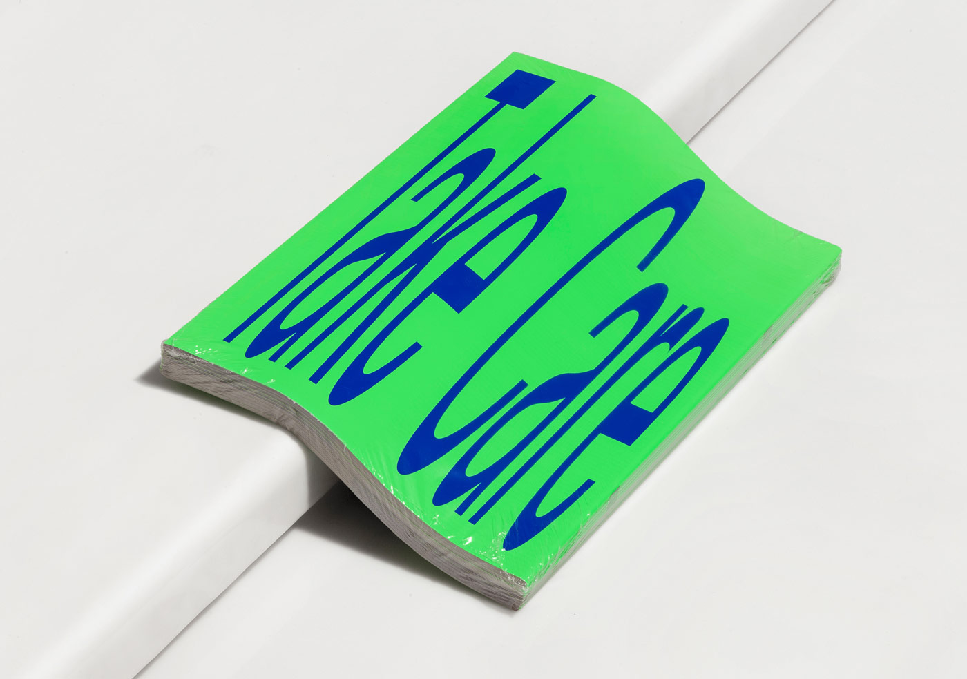
With Flaam, it’s always the question of what we can do, that big festivals can’t. As for the merchandise of the past two years, we printed out every visitor’s name on the back of the t-shirts, although we had to change all the first letters to F’s due to GDPR of course. Or we did tickets that were also scratch cards – people could win stuff such as an extra ticket, a beer, a lit cigarette from one of the organizers – or also nothing. In 2018, we replaced the traditional festival posters with tape, which had the entire line-up and info on it, and at the same time functioned as ordinary duct tape – a must-have item when putting together a festival.
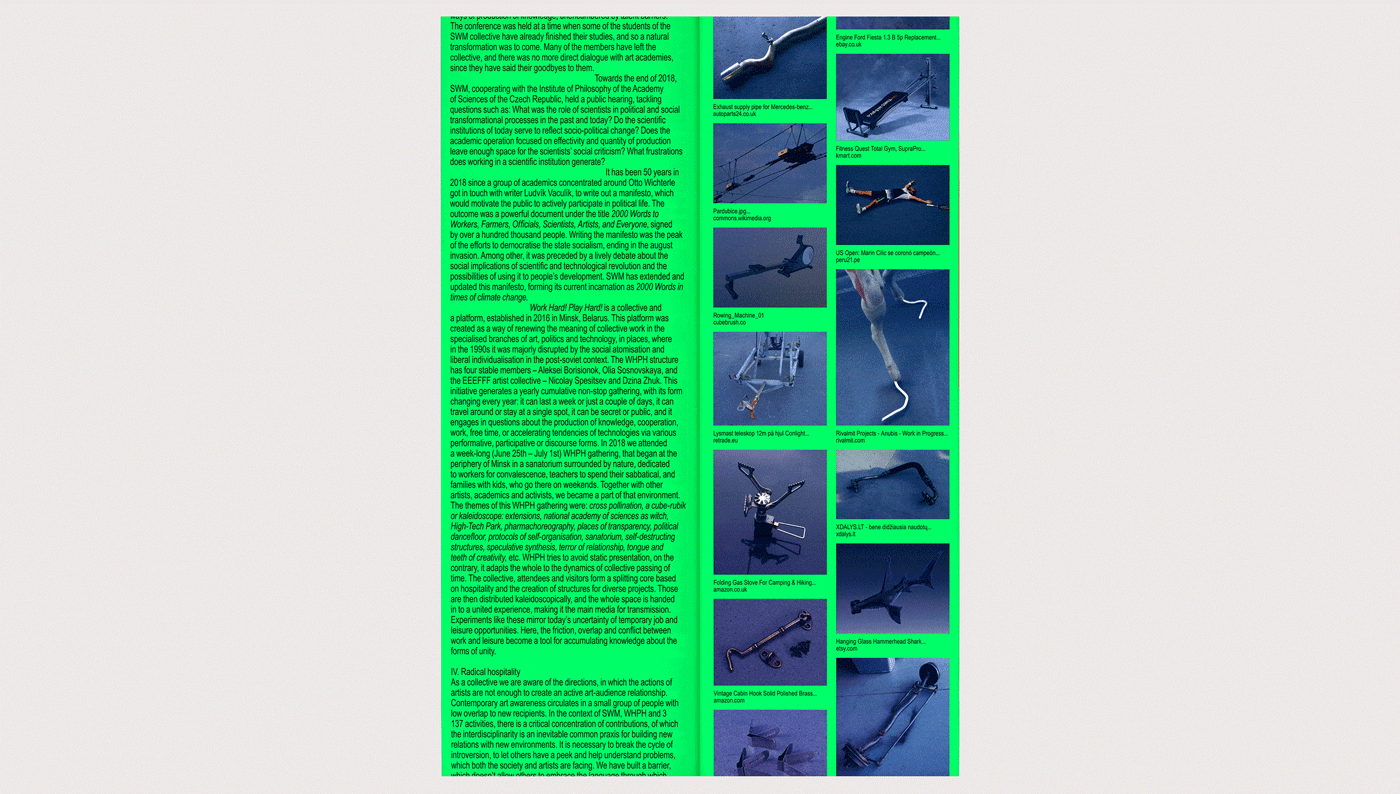
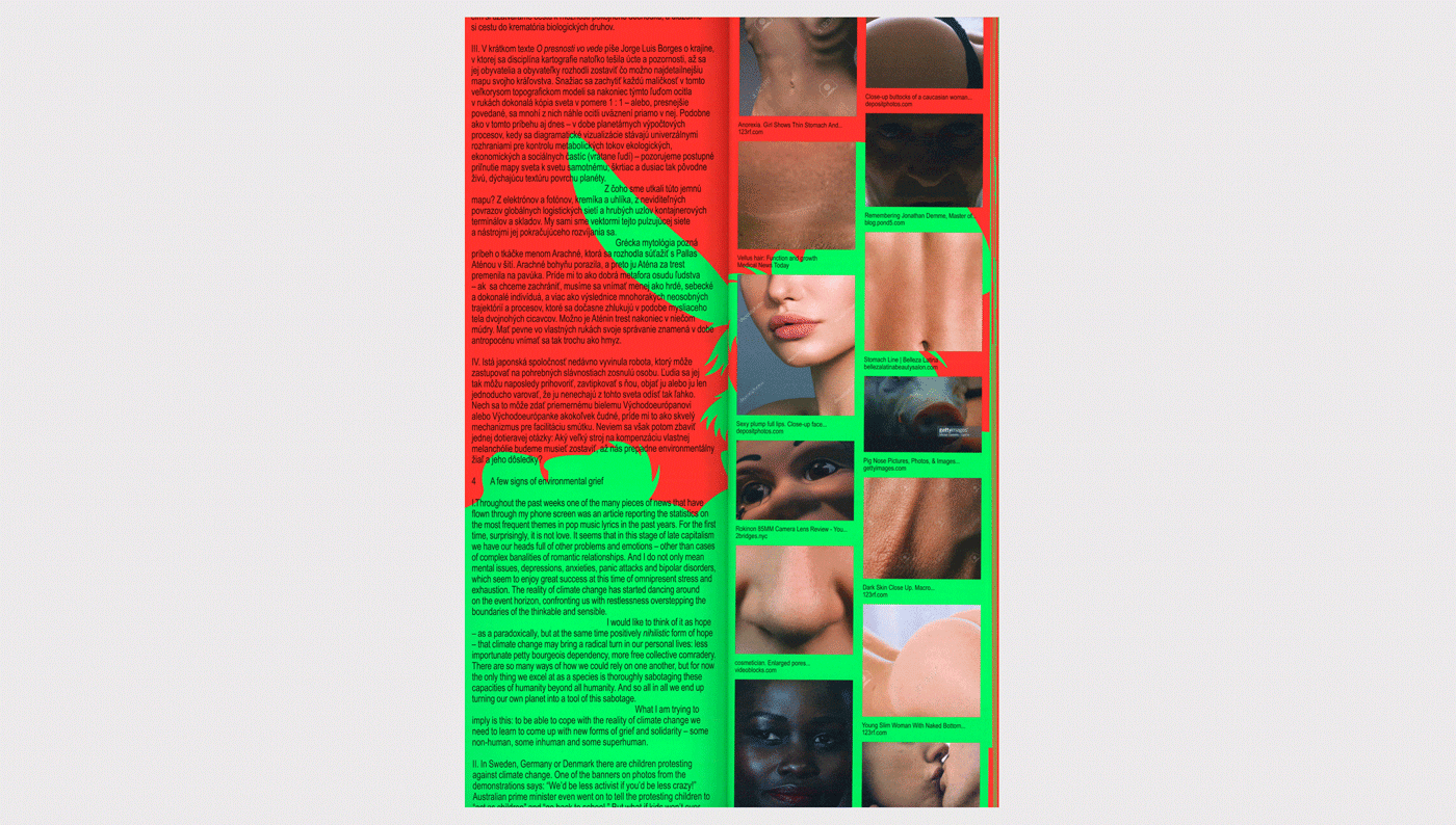
For the collective exhibition “Take Care”, dedicated to the seventieth anniversary of the Academy of Fine Arts in Bratislava, you designed a publication with images generated by Google Image Search. How did you come up with this unusual creative approach?
It was a school exhibition of students from various disciplines – millennials. An exhibition organized by this generation on the occasion of the 70th anniversary. The school approached us to create a publication that was not only a functional and clear catalogue of the students’ works but also part of the exhibition with our authorial approach to the topic. We wanted to present this generation by attributes or objects that represent them. Indecision, instability, laziness or TV screens, google, smartphones, endless scrolling on social networks. Therefore, the artwork shown in this publication is confronted with similar images generated through Google Search – Search by image. There are many possible dimensions of how this could be interpreted: the overcrowding of time, randomness, similarity, fake.
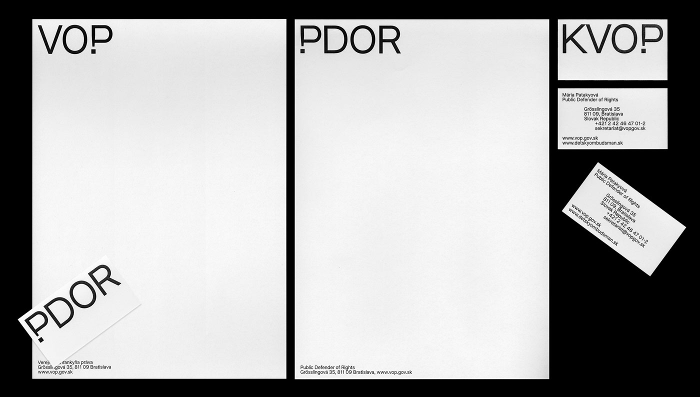
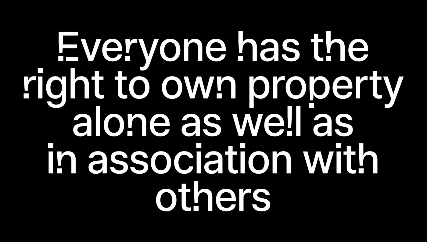
In 2019, you worked on the visual identity of the Public Defender of Rights. By creating a typeface based on the exclamation point, you built a tool for strengthening the voice of the public violation of rights and freedoms. How would you describe the role of the designer in supporting such important organizations and communities?
A designer’s job is to create an image of a given company, project or organization. Such establishments need to create a credible image of themselves for people. One of their main function is to build people’s faith in the state. The design can help a lot in this direction and shows its meaning. In this case, good design can help the organizations and show its purpose.
Which collaboration has inspired you in the past?
Martin Kahan, with whom we are currently sharing our studio. That guy is a robot. A machine. A walking office. He’s the kind of designer who has everything set up and calculated. He knows what to put where and how so that people read it correctly and clearly. Marián Tesák. He is not a designer but a screenwriter and cultural manager. He sees the context very broadly and can show us a non-design look which is always refreshing. Palo Bálik, who teaches at the Academy of Fine Arts in Bratislava and deserves a great deal of credit for the level that the Slovak design currently has. He’s like Gandalf, an inexhaustible source of design knowledge, wisdom and experience. He can always lead a person on the right path, even if it seems dangerous.
What can we expect to see from you in the next months?
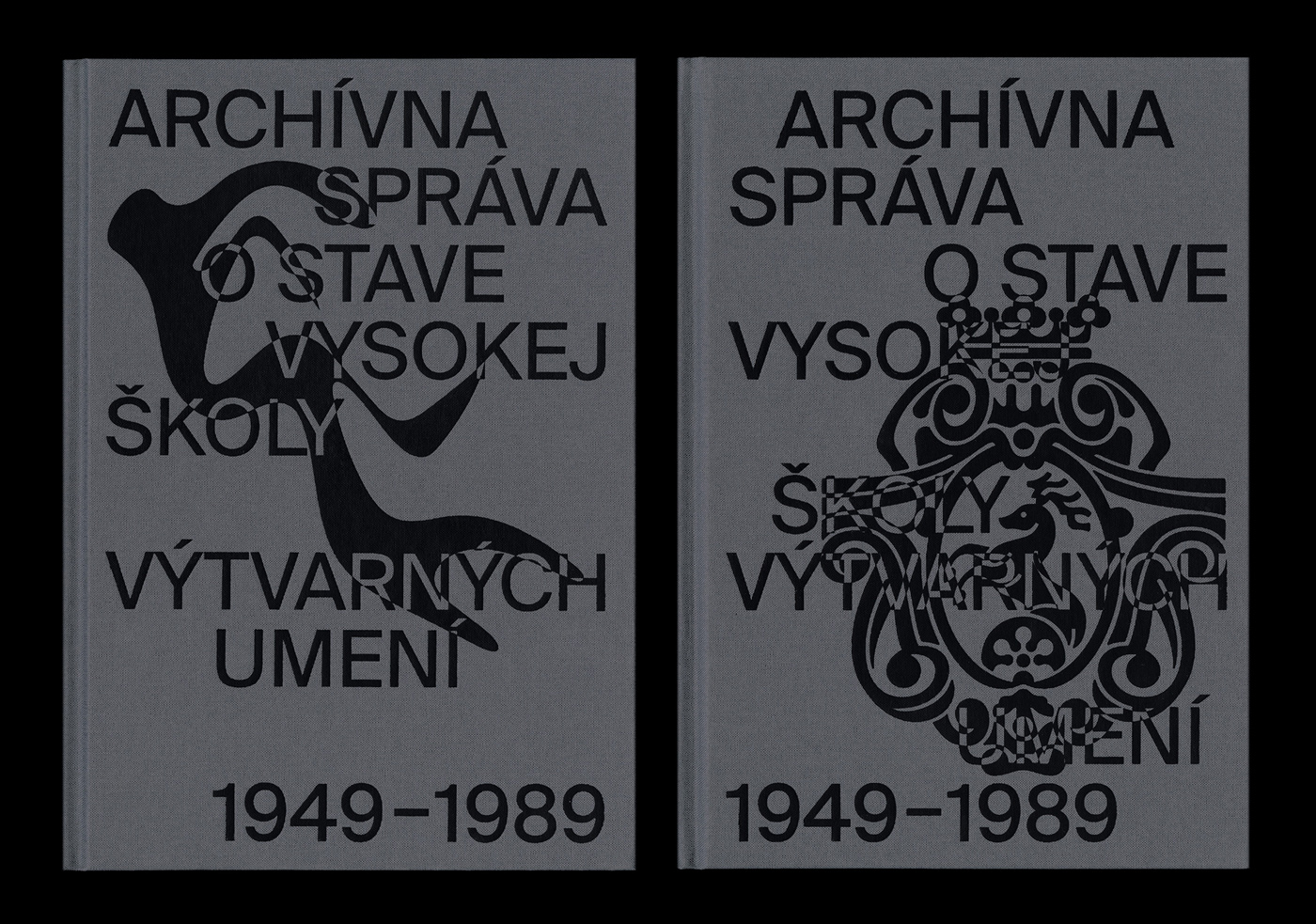
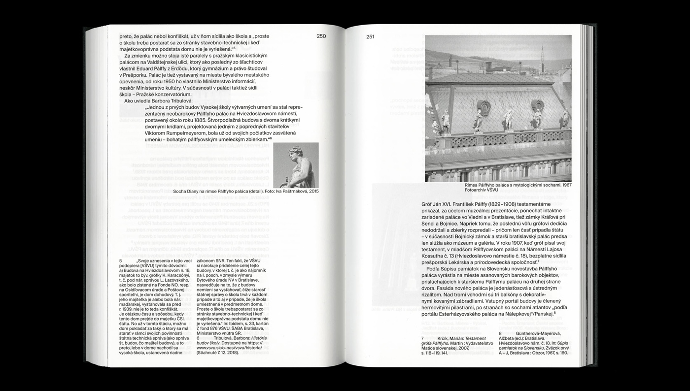
We are slowly finishing up a project we started roughly a year and a half ago – the new visual identity of our alma mater, the Academy of Fine Arts and Design. This was a coincidence – on the occasion of its 70th anniversary, the school published a publication mapping its history. We were commissioned to design it and were given a relatively free hand. While creating the book, we found out that the school had practically no visual identity throughout all these years. So we decided to use this revelation as a starting point in creating the concept for the book itself and came up with a mad idea – we can literally make up the whole history of school identity.
What are the hopes and dreams for the future of Andrej & Andrej?
To travel and work from somewhere else is one of our big dreams again. But we’ll settle for less – for attending a design exhibition or conference live again. Another one is that we get a chance to work on an identity for a football club. Or at least the one we keep writing could respond. Or an airline! That’s a big dream. Ideally a one that deals with space travel. There’s a lot of potential for design up there. You know, if we are to colonize Mars, we will definitely need a flag.


