
Since we last wrote about Colin Doerffler about a year ago, quite a lot has changed for the graphic and type designer. After leaving Munich in October of 2019, Colin started working at London based studio OK-RM. “My past year was full of new experiences – living in a vibrant city, working in very interesting and inspiring surrounding at OK-RM and I continued working on various independent commissioned projects”, he tells Collide24. Among these independent projects is the collaboration with the independent record label DISSOLUTE on the design for their new label series Liquid Identity. The record label is run by Jakob Thoene and Maximilian Langenbacher, who founded the label in 2017.
“My first conversation with Max via phone was very positive, I directly felt a lot of trust from his side and I was very much looking forward to our collaboration”, Colin remembers. They first gut introduced by Jakob Wise, with whom DISSOLUTE has worked on several projects over the last years. “Colin’s work always stood out to me”, Max states, “Having the opportunity to work together was exciting. Right after we had introduced our thoughts for the project, Colin took over the full lead.” As with all projects and releases, Dissolute aims to create something representing their values. “There are no design briefings or similar for our collaborators as we believe in their art direction. Through this, we strive to incorporate the artists design language organically”, Max explains.
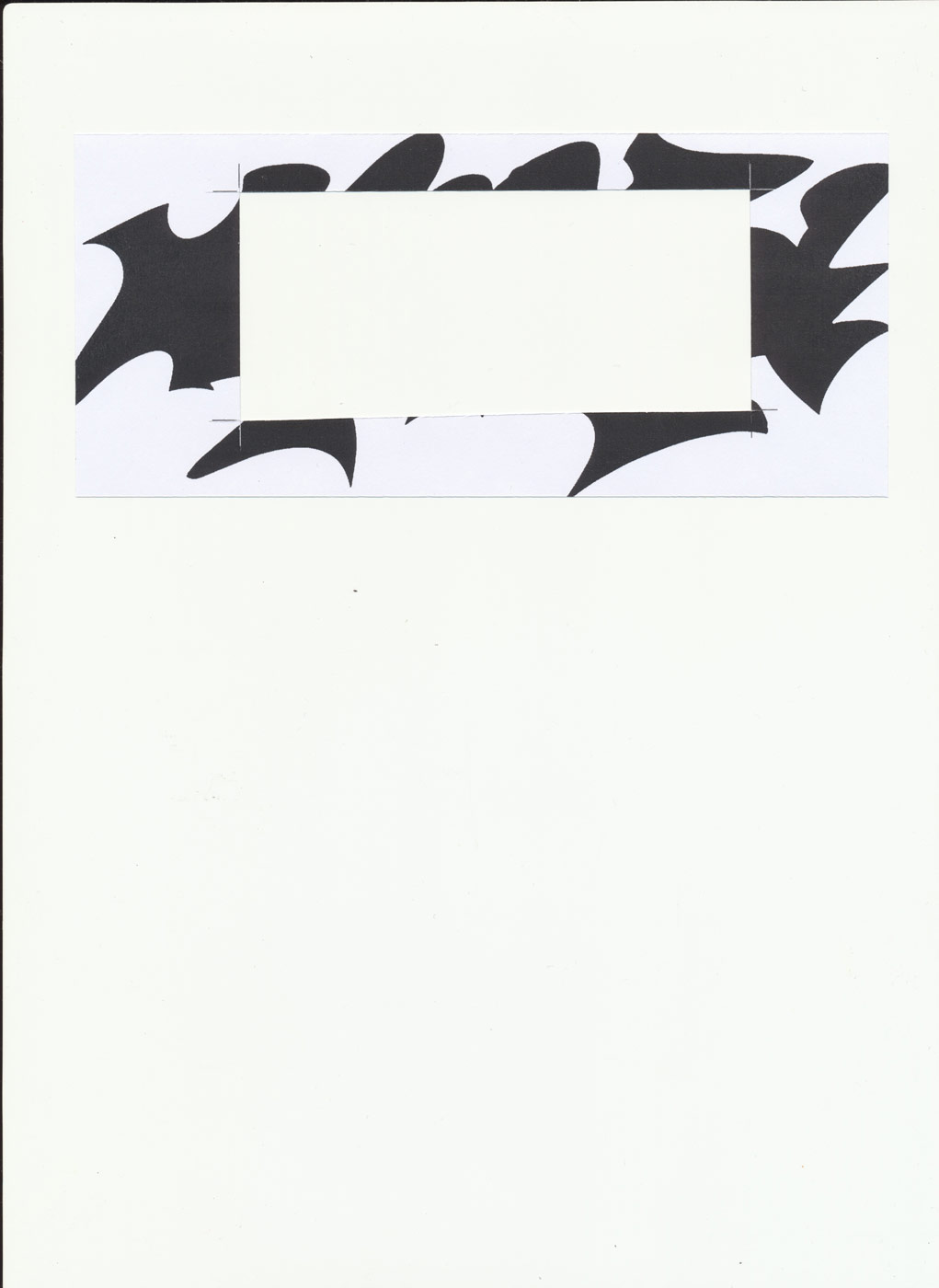
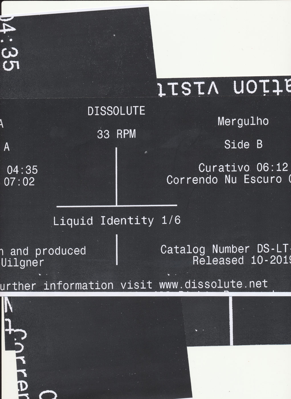
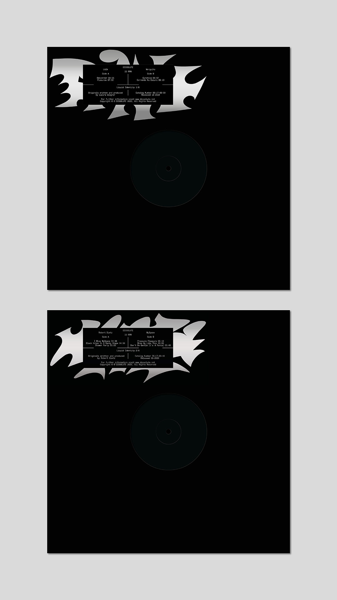
The vinyl itself, as well as its sleeve and center label, come in all black, pursuing the idea of a totally black visual approach. The briefing for the project was very simple: Starting with a black canvas, Colin applied himself to create a sticker for a series of six black label releases. “It was very clear from the beginning that it was all about the communication of things – how to create a narrative around a special series and how to be as effective as possible in terms of production costs for the stickers”, Colin explains, “There wasn’t a big budget for the production of the stickers, which became an interesting constrain for the design.”
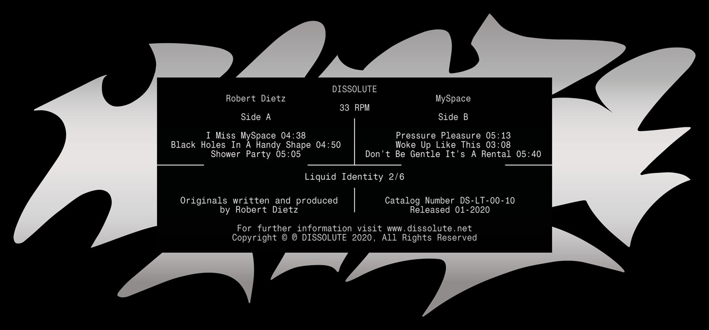
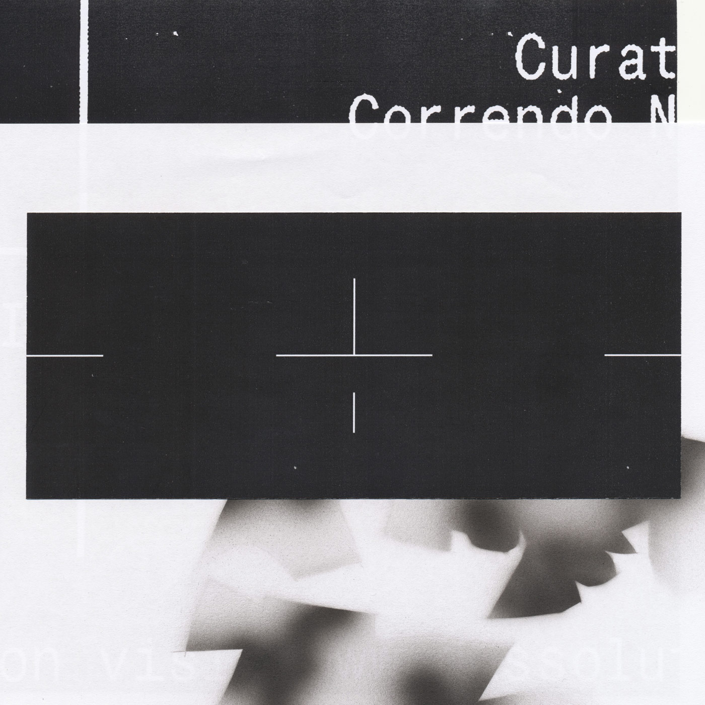
The sticker is the absolute center part of the project, not only physically on the vinyl, but also digitally. The public release of the series was separated into three phases, coming together to one paradox design identity in the end which is solid and liquid at the same time. “The first phase was the introduction of the static format (the informational layer), this phase was very much driven by the interest of finding a systematic design that will work for all 6 upcoming releases”, Colin guides us through the three phases, “The second phase added a visual layer to the solid information layer. We shifted the analogue sticker to something digital, the cut-out sticker became a digital sticker used for instagram stories.”
Especially designed to work for this usage, the lines on the design are working as guidelines to place it in the same position on the instagram story over and over again. This layout enabled them to create a unified visual approach for all videos, combining various video snapshots to one glimpse of a mood. The videos can be seen as counterparts to the solid black box, creating “a moment of flux which is ever changing”. “The final phase showed the printed sticker on a reflective material which reflects its surrounding, which is similar to the video moments of the previous phase. It’s always changing, always liquid by the nature of its materiality”, Colin states.

The title of the series, Liquid Identity, developed throughout the process. “Very early in the process it was clear to us to create something that is in constant flux. An identity that comes through the variety of moving images and through reflections of its surroundings”, Colin tells us, “Additional to this layer of movement we created a static layer which is purely informational. The tension of something ever changing and something static creates the liquid identity.” The series launched with Mergulho by Brazilian artist LAZA and My Space by Robert Dietz. In the next two years, DISSOLUTE has five other releases from the series in the pipeline, each of them coming in the same color scheme.

“I often use music as an inspiration in the very beginning of a project. For me a sound can sometimes already describe what I am aiming for with the design. Later on I’ll try to find the right design and concept that matches with the music layer” Colin says, explaining us how he integrated the music of LAZA and Robert Dietz into his creative process, “And in case of working directly with music, like here, it makes it easy for me because I don’t have to select music that fits to my mood. It starts with the music.”
From the very beginning, Colin has been very much interested in the whole process of this project and in creating an interesting narrative around a simple object, like a sticker. “Additionally I found it very interesting to use instagram as the main constrain and inspiration. How to use it as a tool to tell a story effectively and how to create design with it?”, he reflects. “The biggest challenge in this project was to stay proportionate and reasonable with the budget for the sticker. Very early on in the process we evaluated what is feasible and what not. We had many ideas regarding the materiality but had to make sure it stays in the budget. Even though this sounds annoying in first place, constrains like this help to make decisions and help to create a design. To be honest I prefer the challenge to stay in a tight production budget to an open budget which makes it sometimes difficult to make decisions.”
Looking into the future, Colin has a bundle of new projects and collaborations in the pipeline. The last month he worked together with the musicians of Couch Prints, a New York based indie pop band on the artwork for their first EP. Apart from two new self published book releases with Benjamin Lewin and Thomas Gothier and his job at OK-RM, he is currently working on a very personal and intimate project, an artwork for the 4Sale Blues band. “It’s the band of my father and it was a lot of fun and an honor to design their upcoming 2nd album which will be available on CD and on Spotify by end of October as well. I love the moment when I can help my friends and my family with my design practice. It’s not required that often, but when it is, it’s a lot of fun for me”, Colin states.
As a designer, Colin draws a lot of inspiration from his surroundings and reflecting on his work and personal life. “The biggest turning points in my creative development comes through putting myself in new contexts. It can start with meeting new people, going to new places and working for new clients. That’s why I am always curious for constant movement and a flexibility in life and work”, he tells us, “Maybe I wouldn’t describe them as turning points, they are points to (re)focus. I don’t leave anything behind, I take everything and try to rearrange my relationship to my experiences. I often get inspired by things that happened or I’ve experienced in the past just by looking at it from a new perspective.”
Colin Doerffler
Website
Instagram
DISSOLUTE
Max Langenbacher and Jakob Thoene
Website
Instagram
Soundcloud
Youtube
COLLABORATIONS TO LOOK AT:
Valentino Betz and Marvin Schuhmann from Public Possession
Nic Tasker and Alex McCullough from AD 93


