
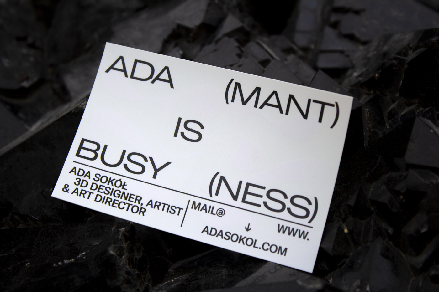
When 3D designer and artist Ada Sokół teams up with Paris based design studio “Panama Papers” to redesign her identity, you just know the result is going to be impressive. Soon after seeing the work the studio created for the art publisher “Entercourse of the New Age” and one of his exhibitions that she was also part of, Ada decided to get them on board of designing her new visuality. “The whole graphic identity of the show, from posters to catalogues, looked so well-made and I knew I had to reach out to the Panama Papers team immediately. We met in Paris for a coffee and after hearing their story and seeing their creative passion, I felt that they would complement my works & creative energy”, Ada tells us about their first encounter. Together, they came up with the idea of a “Malleable identity” in order to relate to Ada’s design practice. “Malleable Identity is rebranding in more ways than one”, Ada explains us about the concept, “Firstly, because we need to change ourselves to grow personally. It’s not about constantly changing the mind, but trying to be better & better. Secondly, the tagline “Ada(mant) is Busy(ness)”, that is on the one side of my business card, represents my determined, stable practice and hard work behind it.”
The Paris based 3D designer and artist has worked for several luxury and fashion brands in the past, like Nike, KENZO, Rimowa and Gentle Monster, creating global campaigns, videos and multi-media installations. Derived from a creative upbringing with both parents working as architects in Poland, her interest in forms, art and design has always been part of her childhood. “In the 1990s, my father switched to architectural renderings which coincided with the time I was learning to draw & use the computer”, Ada tells us, “I had the beauty of architecture in mind even through high school (and took some relevant classes too!), but it was at this time that I also began cultivating an interest in fashion, digital art & music scene. I started fashion design studies in Warsaw, but never finished them. Then, I had personally hard time, and although I was accepted to the London College of Fashion for Fashion Communication and then to Bard College Berlin, I never got a chance to study.” As a result, most of Ada’s practice and the unique, visual language she is known for is self-taught. “During my teens and in my early 20s, there were not many interesting things going on in Poland. I got fascinated by digital art through Tumblr and Facebook and found it to be more fascinating than my mundane reality”, she explains. After moving to Paris and experiencing its design scene, she finally found a middle ground between beauty, progressiveness and conceptualism. “It’s been a welcomed & needed influence for sure.”
How would you describe the aesthetics of your design?
Ada: It is constantly evolving, but for that moment I would say: sensual, organic & weird-beauty.
What is your daily process like?
Ada: I wish I could tell you that there is some routine that I practice daily to be more productive. I tried to develop a solid regime for a long time, but it is actually the chaos that introduces the best ideas to my mind. Boredom & comfort zones do not support progress. Obviously, there are things that I need to do for myself in the week in order to be balanced, but daily (or nightly) there is no particular rules that I follow.
What do you see as the turning point in your creative development and career so far?
Ada: The global campaign for Nike AirMax DIA gave me faith that my aesthetics can suit the commercial realms on a big scale. Coincidentally, the campaign launched on my 25th birthday & I discovered it on Nike’s window display during a walk in Paris with friends and family. That was the most surreal & intense feeling I’ve had in my creative career.
What do you see as being the biggest challenge when working on your own visuality?
Ada: Making decisions without knowing how they will be perceived by others. But I am actually working on myself to stop worrying so much about that.
Founding the studio in 2018, the story of Panama Papers Office has come a long way. The three members – Ilan Begarin, Pierre Dufresne and Florent Martini – met each other during their studies in Paris and spent five years working together on school projects. “Before that, Florent had already studied digital strategy and advertising, Ilan practiced printing techniques at Maximilien Vox and I was mostly drawing during economic courses at the university”, Pierre tells us about their early beginnings, “During our bachelor in graphic design, we were commissioned for art direction and printing production for the French electronic music label Linear Movement. For 3 Years, we oversaw every aspects of the communication, from design/printing stage of the vinyls to event/logistical management. We arranged a silkscreen workshop in a 20m2 studio and printed each release in 300 hundred copies by ourselves. It has been our first step in the pro-world. And that’s it … it became obvious we had to stick together and give us a shot.”
Soon after their master graduation in Type and Publishing Design, they were evicted from the studio and had to move out. Having to start from scratch, the idea of PPOffice was finally born. Besides their work for publisher “Entercourse of the New Age”, the studio has also contributed to the 7th issue of the Tunica Magazine and has been part of several exhibitions, among them the Graphic Design Biennial Le Signe in Chaumont and the Offprint Tate Modern, London.
After one year of existing as a studio, they still have pretty fluid dynamics and working processes, as Pierre tells us: “Every studio has its own recipe. Creating a studio raises so many questions, next to economic and creative matters. Internally, because of our respective backgrounds and profiles, we are approaching our roles at different scales. Where Florent is a very good studio manager, Ilan is a mess at work. I like working on our social medias, Florent doesn’t feel comfortable. Ilan is the best studio head cook, I couldn’t make you an egg.”
What or who were your early passions and influences?
PP: According to Ilan, Pierre’s early passions are: Cartoons & Cigarettes
According to Pierre, Florent’s early passions are: Video games & Kinder surprise eggs
According to Florent, Ilan’s early passions are: Wildlife documentaries
What did you see as being the biggest challenge when founding a new design studio?
PP: MAKE_MONEY.FAST
What is your daily process like?
PP: There are so many specific cases. Ultimately, running a design studio looks like : 70% of logistic / 30% of creative works… It includes a lot of emails, appointments, estimations inquiries and negotiations… It doesn’t looks stimulating, but it is, making a business work is just as interesting than creative works to me.
How closely did you work together with Ada during this collaboration?
PP: Ada lives 20 minutes from each of us! We are in constant relation for 6 months now. We meet at least 2 times per month + email & instant messaging. We are sometime working during our appointments, sometimes not. We maintain this lightness from our first encounter, it makes us friends and allies now.
What do you see as being the biggest challenge when working on someone’s visual identity?
PP: To get along with the person you are working with/for, definitely. Humanly speaking.
It is so far from working on a corporate identity for example, dealing with communications manager you will meet once or twice during the whole project.
Feeling her logo and identity should be designed through a different perspective than her own, Ada left the field to PPOffice who happily accepted the challenge. “Upon meeting Ada, we knew that something extraordinary needed to represent her brand”, they tell us, “We are seeking for the emergence of new forms related to Ada’s practice, we are opening up new horizons. For now, she has mainly delivered a high standing creative service for some of the world’s renowned luxury brands. We brought the idea of introducing her own fashion products, by mixing her know-how and experience with our understanding of contemporary forms. Internally, this rebranding also aims to organize her new brand’s sections. We will soon be able to create synergy between her creative services & self initiated Fashion products. It’s a gateway to ‘human-brand identity’ experimentation field, it’s malleable.”
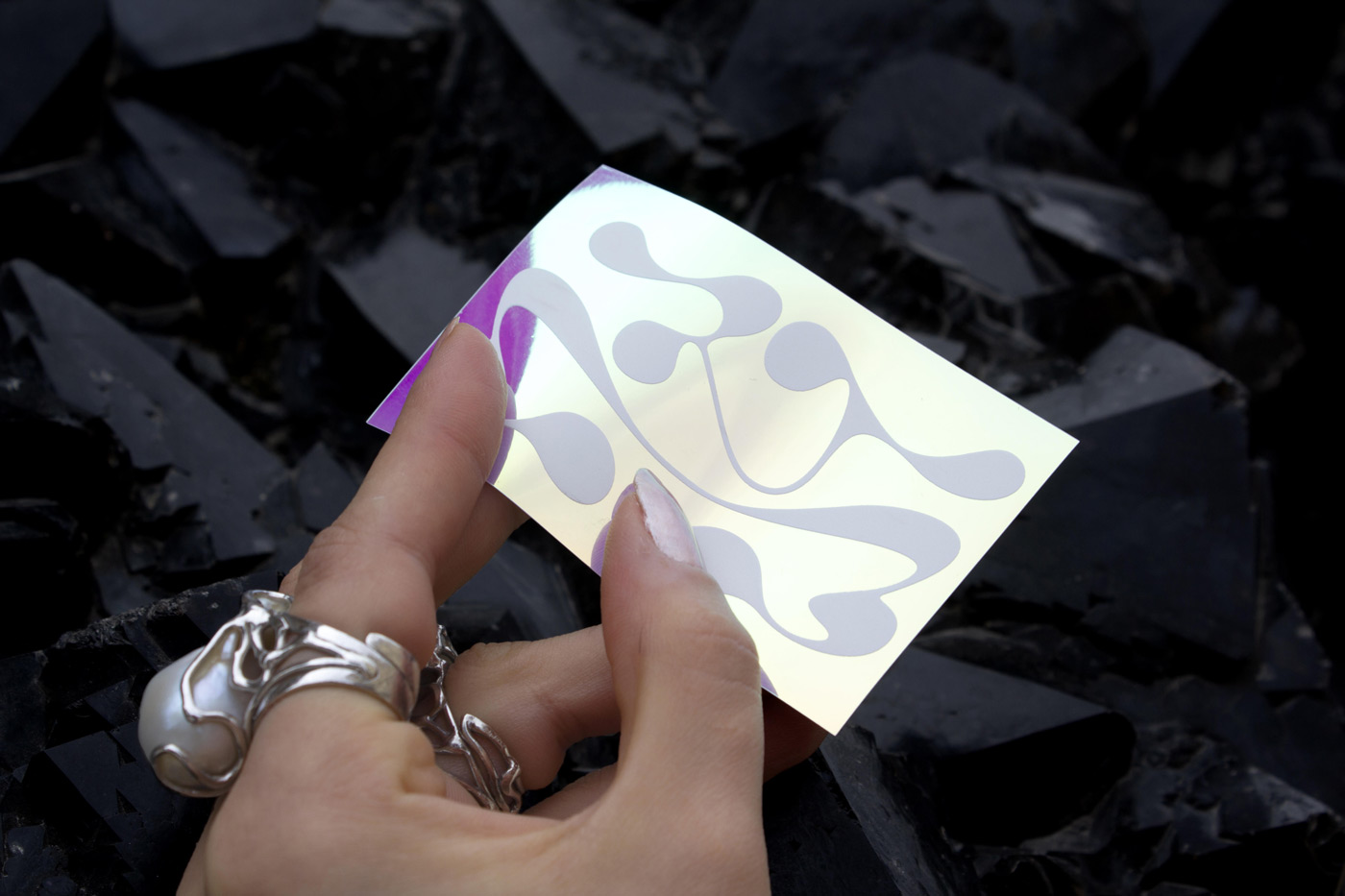
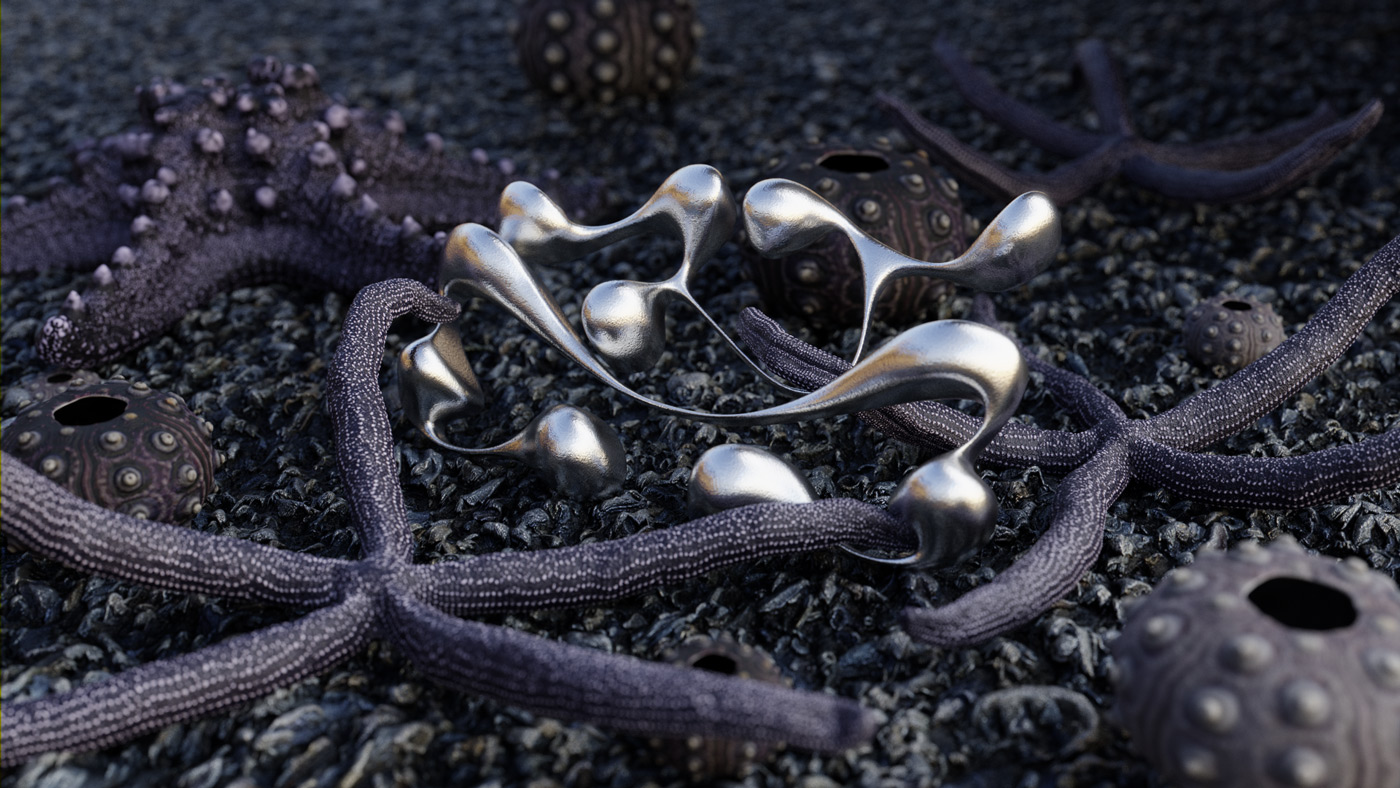
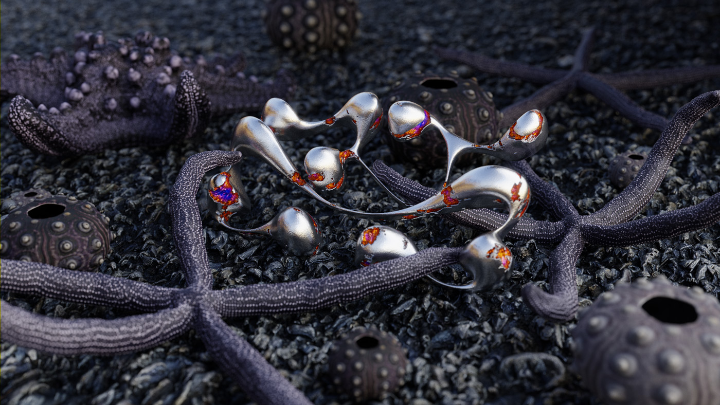
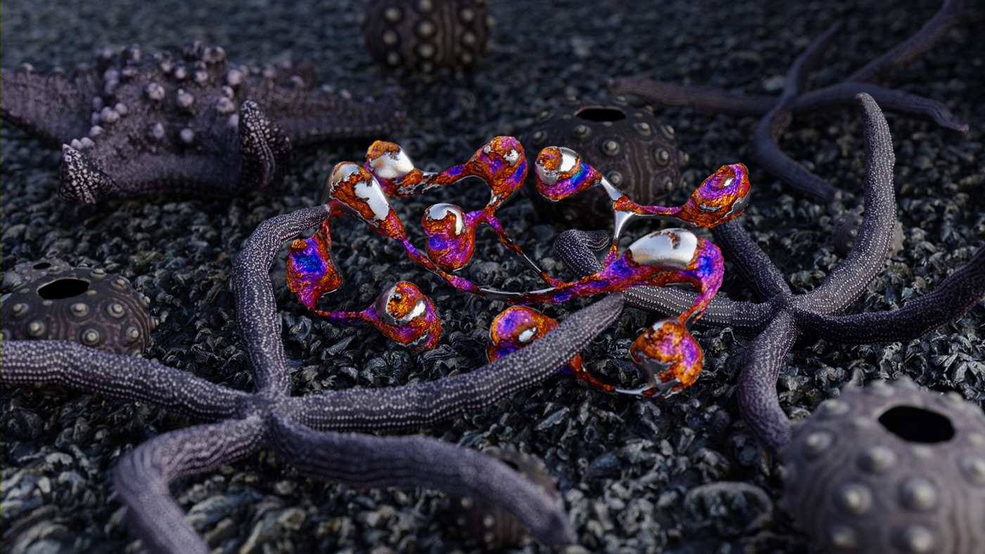
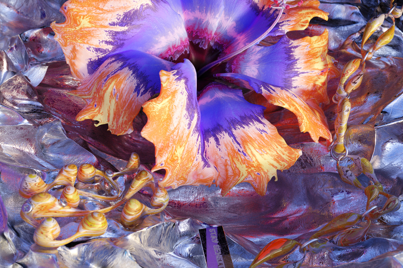
The overall working process consisted of a lot of turnarounds regarding the logotype, the business cards shaping and the story-telling, as well as appointments with their printer, L’imprimerie du marais, a state-of-the-art printer for fine works and untypical projects. To incorporate Ada’s spirit, they chose an ultimately, iridescent and formable material for the business cards and used screen-printing to add a rough touch and obtain a memorable tactility. For the logotype itself, they created experimental and abstract (typo)graphical forms which Ada converted into 3D renderings and animations in the next steps. “We wanted to convey this feeling of an organic and smooth shape that refers to Ada’s realm. The most interesting part was to see our discussion with Ada taking the form of a story telling, looking for an environment/materials to fit the brief. Ultimately, we wanted the logotype to be an appearance, that reveals itself within marine flora and fauna, at low tide. When we first saw the shape becoming a shell among starfishes and sea urchins, laying on the black sand, we finally had the conviction that our design was a success.”
As Ada’s practice is deeply rooted in 3D, it was grounding for her to bring the logotype to life through animation: “Graphic design is fascinating, but creating the logo animation was natural for me to cement the ‘Malleable Identity’ as the true Ada Sokol identification.”
Did you start working on the visuality with a clear idea in your mind or does the design develop over time?
Ada: With the 3D, you always need to forecast. Will the piece be a still image only or will there be an animation to go with it? The technical plan for 3D work always rides on this question. Once this is determined, you need an initial idea or concept & then a vision to find the right models that will appear on the scene. It’s also important to be flexible – your first concept will never be 100% of the final outcome.
PP: A little bit of both. We are mostly working this way, striking a balance between what we are certain and uncertain of.
What is important to you during a collaboration?
Ada: Joy and creative energy. I always want every single collaborator to be happy with the result of the personal project.
PP: Even if it’s naive, I like to start from the idea that a collaboration could last for ever, by constantly bringing new ideas, new purposes & formats over an unlimited time. I consider them as a unique form of work where nothing is definitive or frozen. Only the needs and availabilities can reach their limits. That’s the most important to me, to keep this state of mind before and during a collaboration. At the end, you can enjoy the teamwork and feel the mutual confidence you established with you collaborators.
How does working together affect productivity?
Ada: Exchanging ideas with others opens your own horizons. It is extremely motivating, but it can also be extremely hard to find middle ground suiting for all collaborators. However, while the process is difficult, something can always be learned through collaborations.
PP: Working together affects the creativity process before everything else. Because what we are doing with Ada hasn’t a commercial purpose (at the moment), considering a logic of productivity doesn’t have any relevance in this case.
Are there any other mutual projects in the pipeline?
Ada: Of course! We are continually developing “Malleable Identity” with Panama Papers & other collaborators – I’m so excited to share more with you later! I am also aiming to work on personal projects with other creatives and in different fields. I have a few dreams right now – incorporate music in my work & also create more tangible non-digital objects. Many great things are yet to come!
PP: Indeed! We hope to show you soon what we are working on.
Panama Papers Office
@panama_papers.office
Recommendations / Collaborations to look at:
Printed edition and season preview 2019/2020 of the Bavarian State Opera, directed by Bureau Mirko Borsche & Scorpion Dagger


