
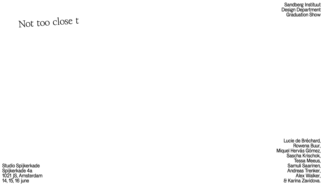
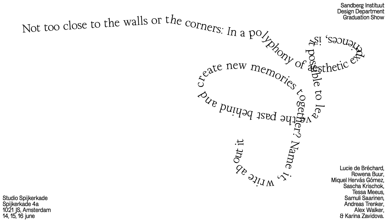
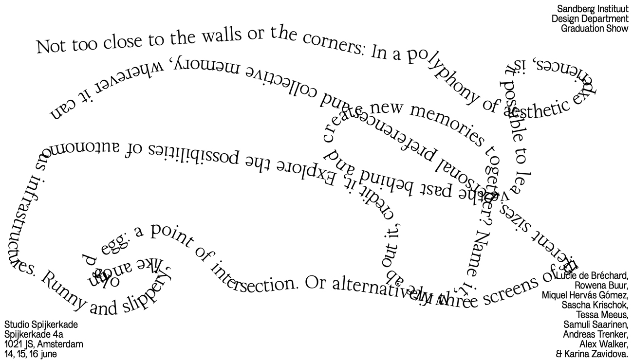
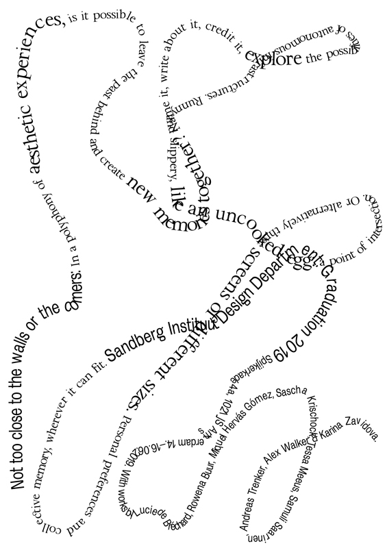
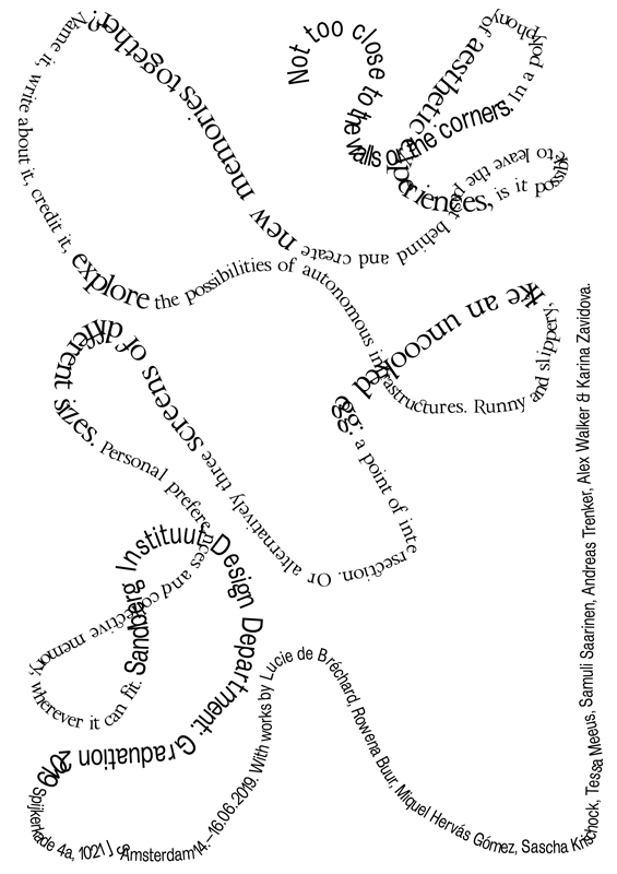
“The concept came up in a collaborative conversation – we wanted to work without images, but have words create images in the spectator’s mind”, Charlotte Rohde, Tali Liberman, Heleen Mineur and Wouter Stroet tell us the idea behind the exhibition concept for the Sandberg Instituut Design Department Graduation 2019. The design is clean, simple, but impresses with its playful, almost poetic approach and its ability to create vivid images in your mind – without using any images at all. By setting the typography in unusual, abstract shapes, but reducing the rest of the design to its absolute minimum, the four designers created a calm, but strong and expressive message. “We asked the graduates about their works, mostly about practical things like the installment or the situation, and created a cut-up of those statements to unite all of the graduates in one text. From there, we gave it a shape, that was very loud in it’s silence. We read the group of graduates as a group of very strong, but also modest and individualistic people. Their works don’t scream, they make their statements calm but certainly. It was important to us to match their tone.”
The four designers are currently studying at the Sandberg Instituut Design Department, but they all concentrate on a certain subject. Heleen Mineur works as a designer in the fields of video, print and performative work. Her projects combine different media, like text, performance, type and animation. She describes her own design style as varying “from simple and temporary to overly stimulating, radical and weird. It is often a mix of media, what is super interesting to me to work with as a designer in this digital time. Shapes and symbols I collect from (digital) resources shape the way I make; yet they come together in abstract stories.”
Tali Liberman’s work focuses mainly on editorial and print design. “My design style usually is very strict and based on guidelines and rules I create for myself. I find that my challenge is to know when the rules should be followed meticulously and when they should be broken. Now I try to design more freely and to break those rules. Also It usually has a unique combination of 3 languages: Hebrew, Arabic and English, so it is something I need to consider during the design process.”
While Charlotte Rohde has designed a bright range of beautiful typefaces in the last years, among them “Serif Babe” or ”Marguerite Grotesk”, she is also the curator and founder of the typedesign platform “Type Club Düsseldorf” and has worked on several other editorial and cultural projects. “My personal design style is based on sharp typography, clear forms with controlled loss of control”, she explains, “Also I love working with typography because it allows me to work with words and shapes at once, which is a very powerful combination to me. Form follows feeling!”
Wouter Stroet has a strong focus on film and digital media. He is also part of the self-initiated platform “outline.jetzt”.
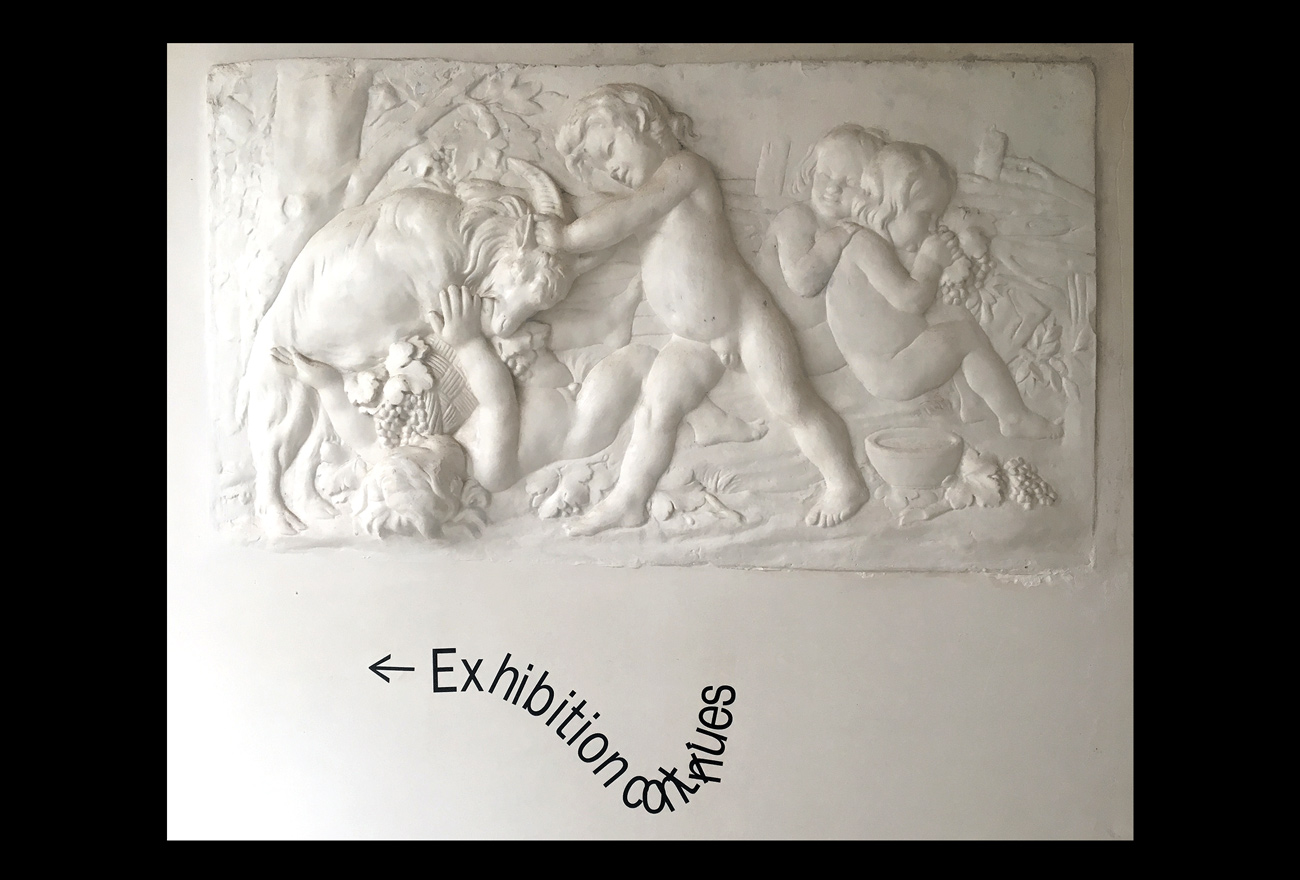
After teaming up to work together on the graduation identity, the four designers started by doing their own research and collecting some inspiration. Since they all had a different expertise, the division of the tasks happened quite naturally, as Charlotte explains: “Tali is an amazing editorial designer, so she would make the catalogue; Wouter did impressive works with google maps before, so he would take care of the website and interactive experiences. Heleen is a great conceptual mind and so she took on the yearbook – a separate task, but still we gave feedback both ways. Me as the type designer and typographer took on the posters and signage for the space using Pauline le Papes Till Normal Typeface and my own Armand Grotesk Narrow.”
Creating for an exhibition compared to their usual design projects was quite “applied”, as they had “to match the exact tone and message the works tell together.This can be mega cryptic, especially when a show is not curated on theme or media. A lot of abstract thinking goes into this part. What makes it nice is that you need (and get) full trust from the group, so it feels like less of a commission and more like a gift. Also the process is very practical (based on time and possibilities) and more spatial then the usual. But what made it nice is that we could explore a poster through our own rules and views on design in the department, letting go of rules probably applied on commercial identities.”
As collaborations are rarely “as fluid as you hope”, trust is a big factor for Tali, in order to have a successful outcome. “Creating a good energy together, listening to each other, letting go of ego issues and learning from each other: I think that collaboration means that you will have to compromise, and it doesn’t mean to compromise with the outcome. I believe that this process brings the most interesting results.” “By breaking structures, new paths and possibilities can be created”, Heleen adds. “Choices can be made also a lot faster based on facts and less on emotion. We as a society are trained to be independent and keep our time for ourselves and to earn money. I’m actually training to appreciate communal time and sharing information. Although most times it takes longer in the end, time is spend well.”


