Typography as a visualisation of emotions

Typography is often looked on as a technical tool, the primary focus laying on functionality and readability. For graphic designer Leonhard Laupichler there is a whole different level to typography which finds expression in the visualization of emotions. His project “NEW AESTHETIC” deals with this hidden impact and power of type and his artistic value: “The book mainly focusses on feelings. Just like the first impression I get when meeting a Person: The impression a typefaces leaves when I look at it for the first time matters and the word it spells seems like a rather secondary information.” The book can be seen as a curation of contemporary and independent type design and pictures a moment of ever changing trends in modern type design. Even if the presented typefaces like Kazuhiro Aihara’s “Sword” or Nolan Paparelli’s “Everett” could not be more different to each other, they all have something in common: “An expressive and strong character is what unites all typefaces.”

The first part of the book shows typographic posters which were created by every type designer to display their typeface in their own unique way. Each poster is supported by a page that gives short and basic information on the type designer and his typeface, such as a hint to the character index at the end of the book, where the full character set of each typeface can be seen. “My intention with this book was first and foremost to create a source of inspiration that addresses the reader in an emotional way, communicating feelings and impressions. I aim to remove type design from the usual fast paced context of websites and social media in order to create a new space in print to make them come alive. This creates a totally different experience when getting to know typography. The fact that I show typefaces in a book without any digital context helps to take more time to appreciate each font. Enough time to create a feeling. I can now sit down, open the book and get inspired at my own pace, no digital content flood distracting me. All in all I was able to collect 98 typefaces on 300 pages.”

“Kekra“ font is the result of a workshop initiated by Léa Fournier in 2018 about type design dealing with constraints, geometry and sensibility. Designed by Jules Durand, Léa Fournier and Valentin Garcia
“While working on “Arachne“m I was reinterpreting common elements of classicist typefaces, hence I chose to call it a new classicist typeface. Arachne's strong character derives from the combination of soft strokes and sharp, pointy edges and it's many eye catching details.” Leonhard Laupichler. Release 2019
“The “12:51” font was created in 2016 as part of the installation piece “My voice found the words I sought”, which is a visualisation of the relationship between word, image and reality to elaborate on how they define, mask and manipulate each other.” Colin Doerffler. Release 2018.
Left: '12:51' Typeface by Collin Doerffler, Right: 'Aegi Regular' by Mario Naegele, Christian Horrer

Leonhard’s fascination for typography arose during his studies at the university in Münster, Germany, where he finished his studies recently. “I’d say it comes from the interest to explore the origin of aesthetics and perception. To go deeper and deeper, everything is ultimately based on simple geometric forms. Typography is about communication through forms, this process can be very factually, but also emotionally, almost figuratively.” At the moment he is working on a few project he started at university. His design style could be described as “minimalist-expressive”: “Minimalist in the sense of consequently sticking to the essentials: I don’t want distractions, or anything besides the core information. My approach is to simply built a concept, make it logical and stick to it. I like efficiency. In my projects I always aim to generate the maximum out of the most basic information. I found that oftentimes a two step system applies: First you require one simple element in order to create a strong visual you can easily recognize. Then you can make this element maximally expressive and load it up with emotion.” His work being usually 2D-based, he acts up the principle that 3D is simply an extension of a design in order to align it to another medium. 

““Serifbabe" had a very intuitive process. Some time ago I made a draft for a serif typeface, just to try out how serif work, nothing special. A year later, I suddenly knew what to do with it. I worked maniacally for a few weeks and got very excited about it because it expressed a feeling I had in me.” Charlotte Rohde. Release 2019
'Nostra' is an extra-wide monospaced type family designed by Lucas Descroix. The typeface is playing with certain feelings of satisfaction – for example how a few thin strokes can create the shape of a letter. Release 2018–2019
Lapicide Typeface, Emile Vizcano built this Font inspired by stone engravings of Roman Times. It takes its name from the French word “Lapicide” which means 'stone engraver'. Release 2019
“Apparat“ is a semi-geometric sans serif font by Michael Clasen that was inspired by a sketch from the Czech graphic designer Jan Solpera. Release 2019

Collaborations are generally a very important part of Leonhard’s design process. “During my studies I learned more from other design students than from most professors. Exchange, networking and collaborative projects among designers are very important. In the process one pushes each other’s potential and helps bring out the best in everyone. I’m always open to new projects, just write me a message.” 

Left: Modal Regular by Stefanie Vogl , Right: Molody Regular by Tatjana Pöschke

Uniting the work of over hundred designers from all over the world, was a very important aspect of “NEW AESTHETIC”: „It is impossible to produce such a large amount of qualitative and diverse content yourself. I just wanted to create the framework by allowing all participants to move as freely as possible. It was very inspiring to see how everyone deals with the same task in very different ways. Without a collaboration this would not have been possible, only a type designer can speak for her/his own typeface in an authentic way, so the necessity to collaborate was it already determined by the topic I chose.” While his focus laid primarily on the presentation of the other typefaces and their diversity, it was important to Leonhard to be a part of the project by contributing his own typefaces “Arachne” and “Nullzehn”. At the moment, Leonhard is in contact with different publishers and plans on organizing more exhibitions where all the typographic posters will be shown on large format prints. If the project continues to be successfull (and we are sure it will be!), he is interested in working on a second edition in the future. 

We can not wait to hold it in our hands. 

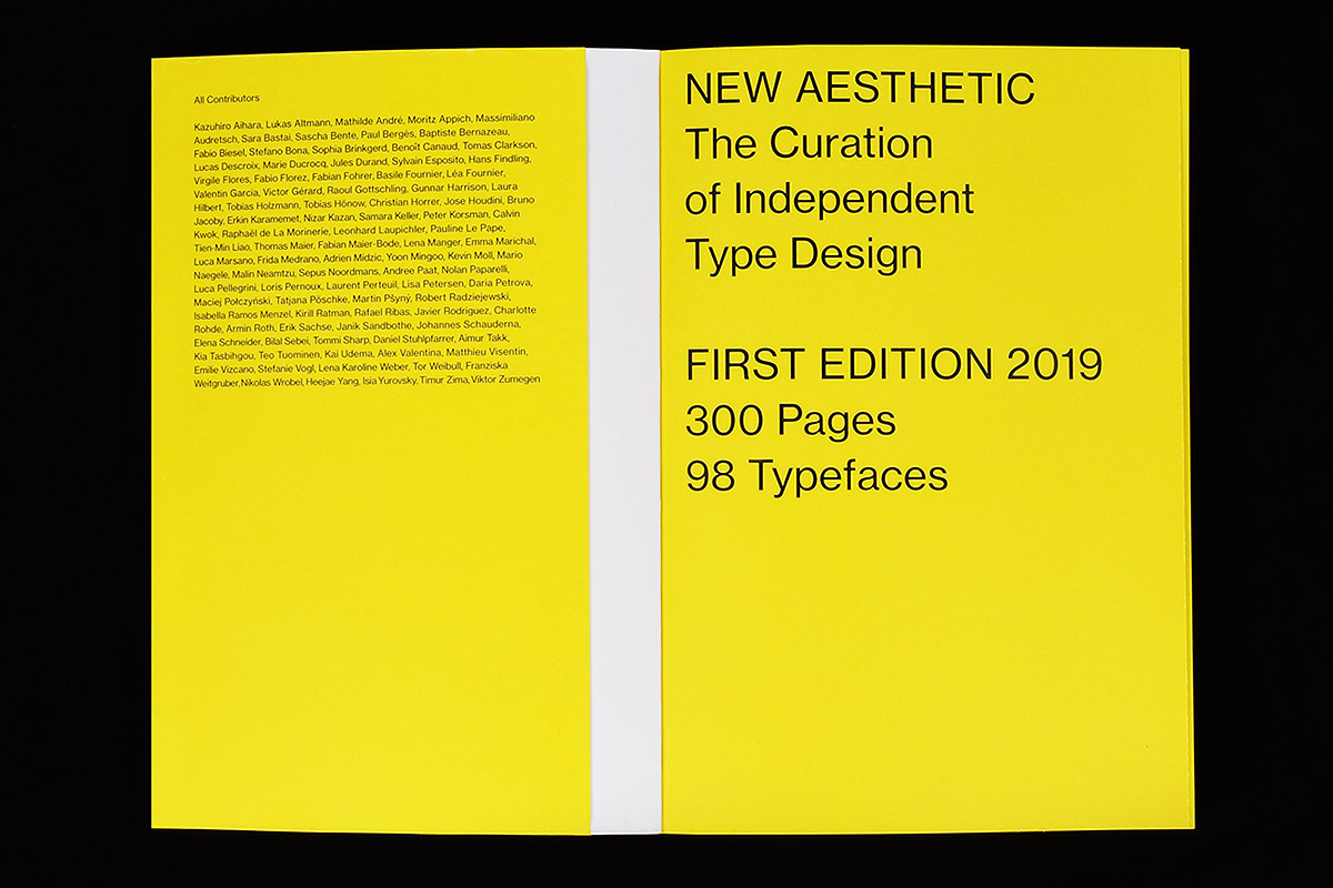
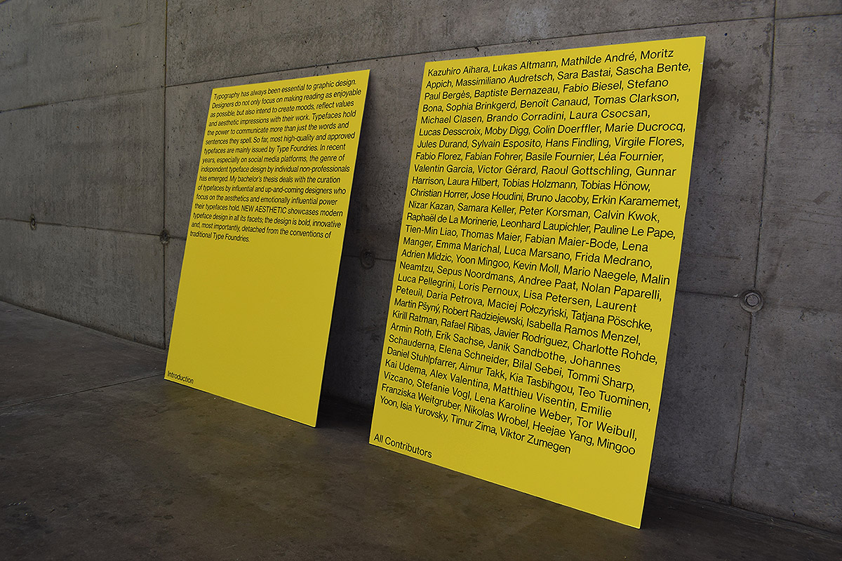
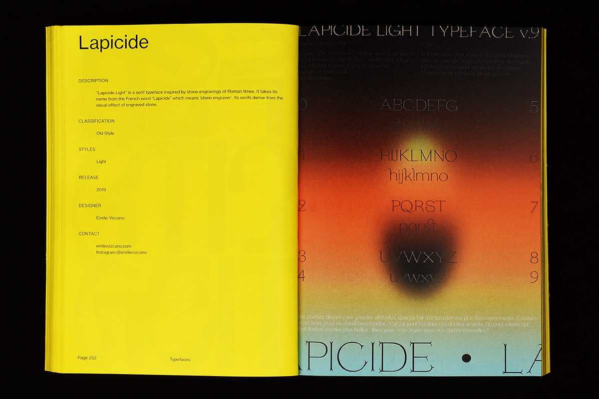
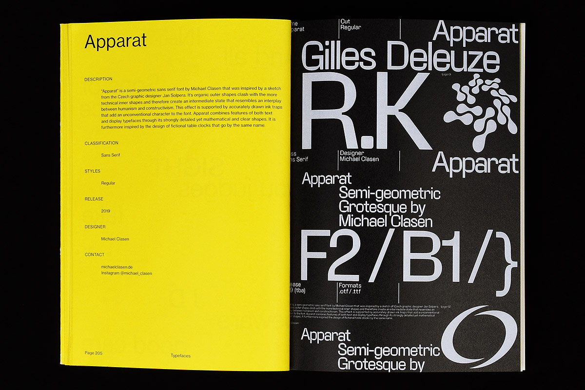
All participants in “New Aesthetic”:

Kazuhiro Aihara, Lukas Altmann, Mathilde André, Moritz Appich, Massimiliano, Audretsch, Sara Bastai, Sascha Bente, Paul Bergès, Baptiste Bernazeau, Fabio Biesel, Stefano Bona, Sophia Brinkgerd, Benoît Canaud, Tomas Clarkson, Lucas Descroix, Marie Ducrocq, Jules Durand, Sylvain Esposito, Hans Findling, Virgile Flores, Fabio Florez, Fabian Fohrer, Basile Fournier, Léa Fournier, Valentin Garcia, Victor Gérard, Raoul Gottschling, Gunnar Harrison, Laura Hilbert, Tobias Holzmann, Tobias Hönow, Christian Horrer, Jose Houdini, Bruno Jacoby, Erkin Karamemet, Nizar Kazan, Samara Keller, Peter Korsman, Calvin Kwok, Raphaël de La Morinerie, Leonhard Laupichler, Pauline Le Pape, Tien-Min Liao, Thomas Maier, Fabian Maier-Bode, Lena Manger, Emma Marichal, Luca Marsano, Frida Medrano, Adrien Midzic, Yoon Mingoo, Kevin Moll, Mario Naegele, Malin Neamtzu, Sepus Noordmans, Andree Paat, Nolan Paparelli, Luca Pellegrini, Loris Pernoux, Laurent Perteuil, Lisa Petersen, Daria Petrova, Maciej Połczyński, Tatjana Pöschke, Martin Pšyný, Robert Radziejewski, Isabella Ramos Menzel, Kirill Ratman, Rafael Ribas, Javier Rodriguez, Charlotte Rohde, Armin Roth, Erik Sachse, Janik Sandbothe, Johannes Schauderna, Elena Schneider, Bilal Sebei, Tommi Sharp, Daniel Stuhlpfarrer, Aimur Takk, Kia Tasbihgou, Teo Tuominen, Kai Udema, Alex Valentina, Matthieu Visentin, Emilie Vizcano, Stefanie Vogl, Lena Karoline Weber, Tor Weibull, Franziska Weitgruber, Nikolas Wrobel, Heejae Yang, Isia Yurovsky, Timur Zima, Viktor Zumegen

Latest articles