
As one of the first and fundamental forms of communication, writing and typography have a rich and fascinating history. Tracing its roots back to the Egyptian hieroglyphs that first appeared around 3200 BC, the style of writing has evolved over centuries, leading to the invention of digital fonts. To survive in this industry, type designers need to have a deep understanding of typography and its history. It was their shared interest in inspecting and classifying typefaces—old and new—which prompted Elias Hanzer and Lucas Liccini to design their own. The two graphic and type designers met during their studies at the Berlin University of the Arts, where they began working on some self-initiated projects outside of class. These fun exercises were the start of a long and fruitful collaboration, leading them to join forces and start their studio Hanzer Liccini in 2018.
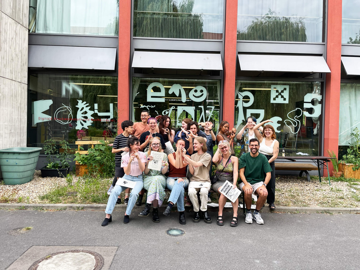
The studio specializes in graphic design and typography, often involving a heuristic approach. After taking some time to “build their portfolio, website and client base”, as Elias and Lucas tell us, the duo collected a number of exciting projects under its belt, among them the Exhibition catalog for Paul Spengemann’s Pocket Call, the website designed for the Schwellen series by artist Markus Zimmermann, or the website and identity for Architekturgenossenschaft C/O. “Internally, we value the collaboration between ourselves, bouncing ideas off each other. Externally, we appreciate working with engaged partners. It’s exciting when the process and dialog with clients reach a result which neither party would have imagined on their own,” Elias tells us about the role of collaboration in their practice. Thanks to their enriching internships and jobs—with Elias interning at Dinamo Typefaces and Lucas first interning at Fraser Muggeridge studio and then, later, working with Manuel Raeder and Quentin Walesch—the duo gained valuable experience, allowing them to hone their skills and find their unique creative voice.
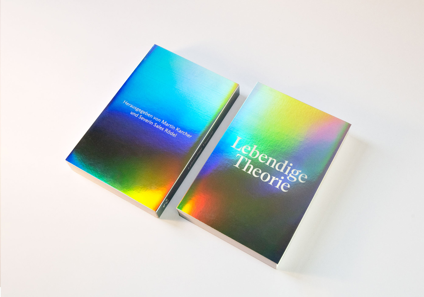
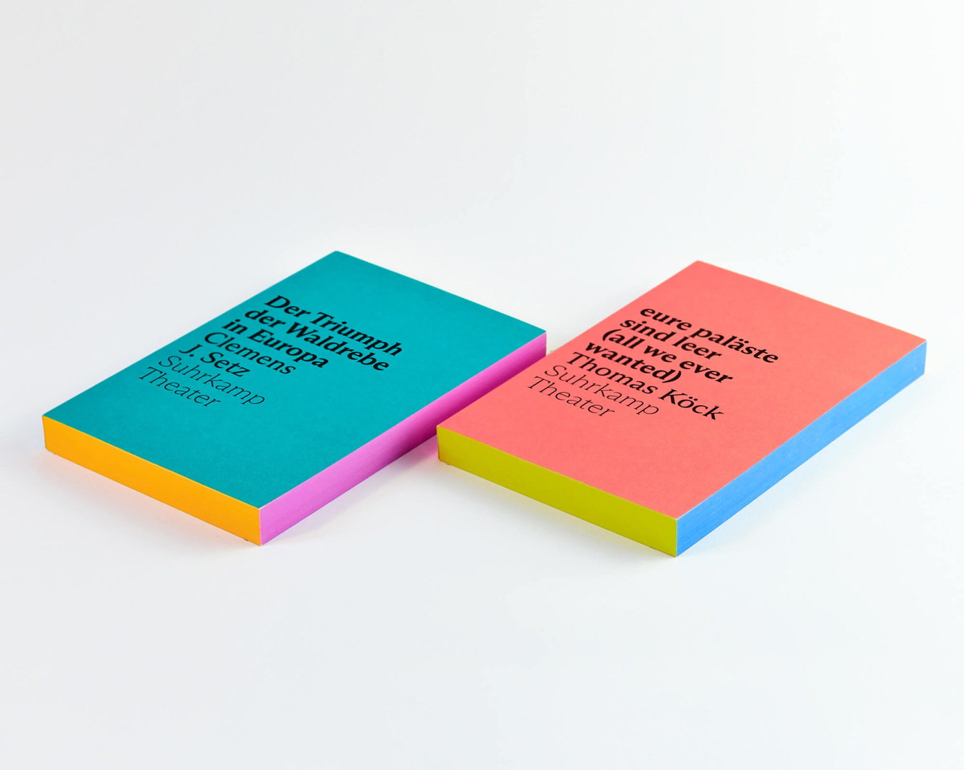
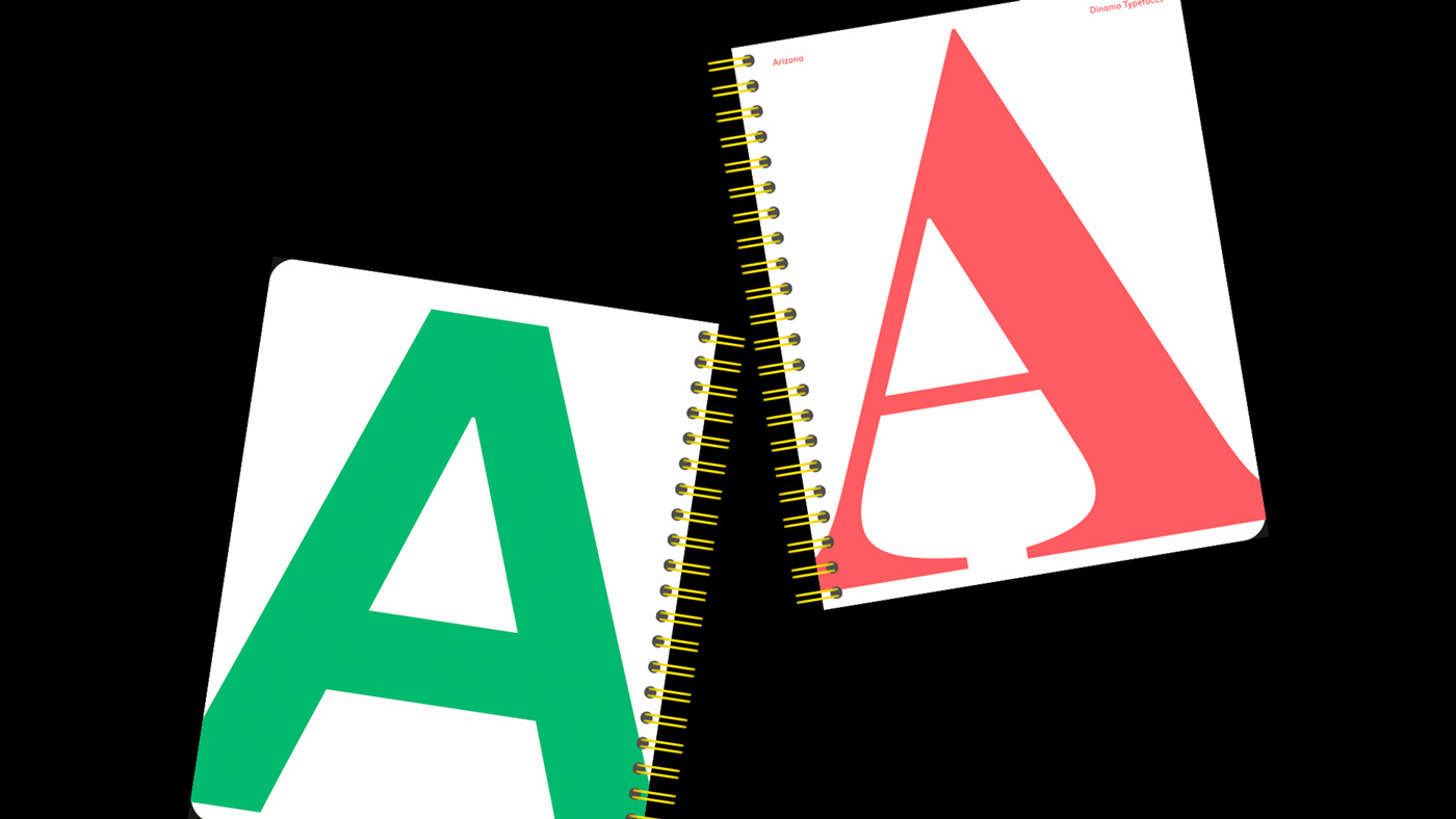
More recently, Elias and Lucas have developed a new book series concept for the theater branch of the renowned German publisher Suhrkamp. “We felt that we had big shoes to fill. Willy Fleckhaus (1925-1983) created the famous rainbow paperbacks edition suhrkamp in the 1960s, which are still being printed today. So we aimed to incorporate as much color as possible, applying a tri-complementary system to each book’s cover, as well as the fore-, head-, and bottom-edge of the paper block”, Elias tells us. Just as their predecessors, the books are strikingly colorful with beautiful, minimalistic use of ABC Arizona, a typeface designed by Elias for ABC Dinamo.
Alongside all of their commissioned graphic design work, Elias and Lucas founded HAL Typefaces, an independent platform for digital fonts and bespoke typographic solutions. “We see our studio as a balancing act between providing a service while simultaneously leaving room for experimentation and innovation. It helps us stay inspired if we can dedicate a small part of the week to designing things, such as typefaces, without commissions or clients involved,” Lucas explains.
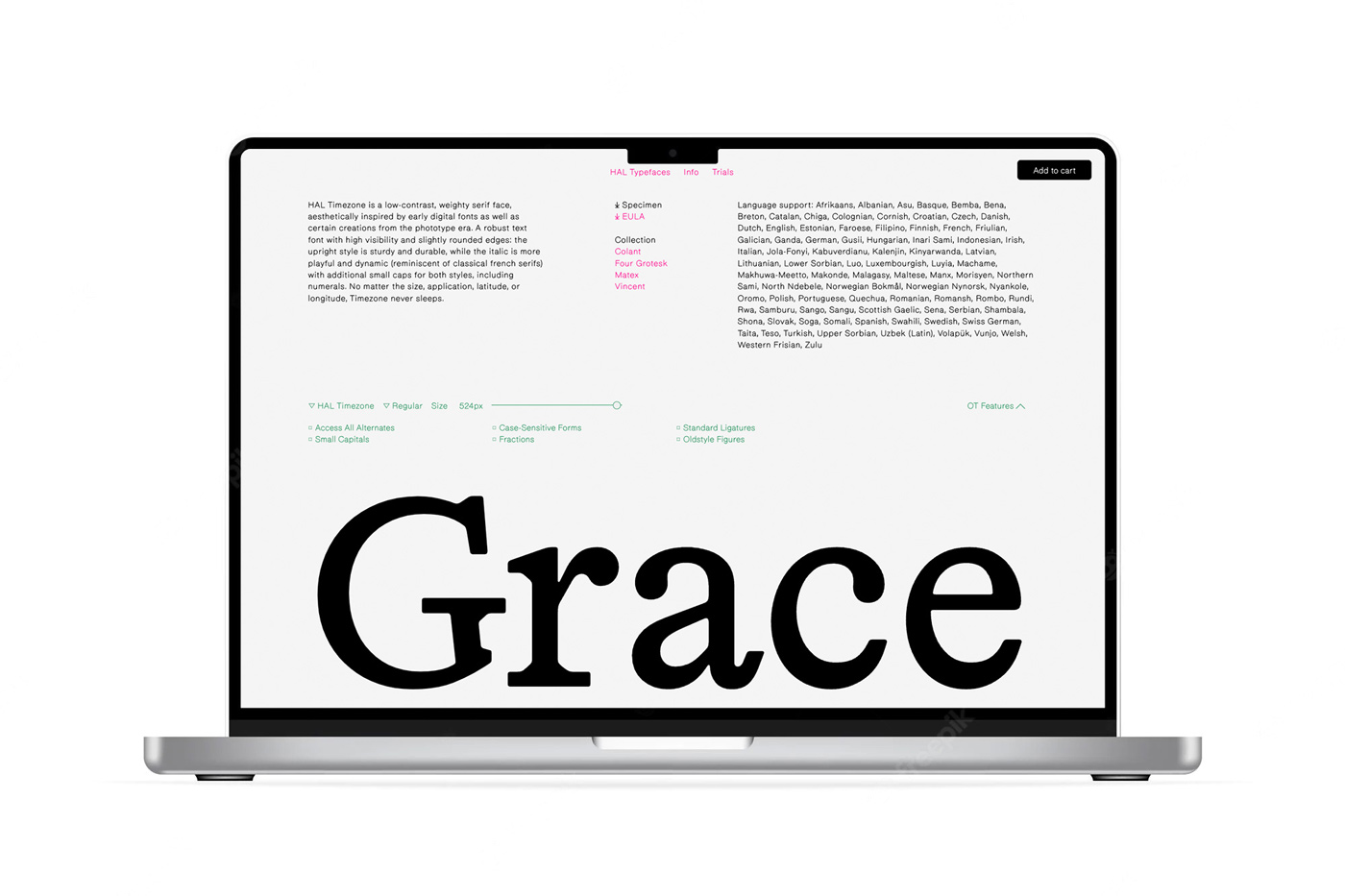
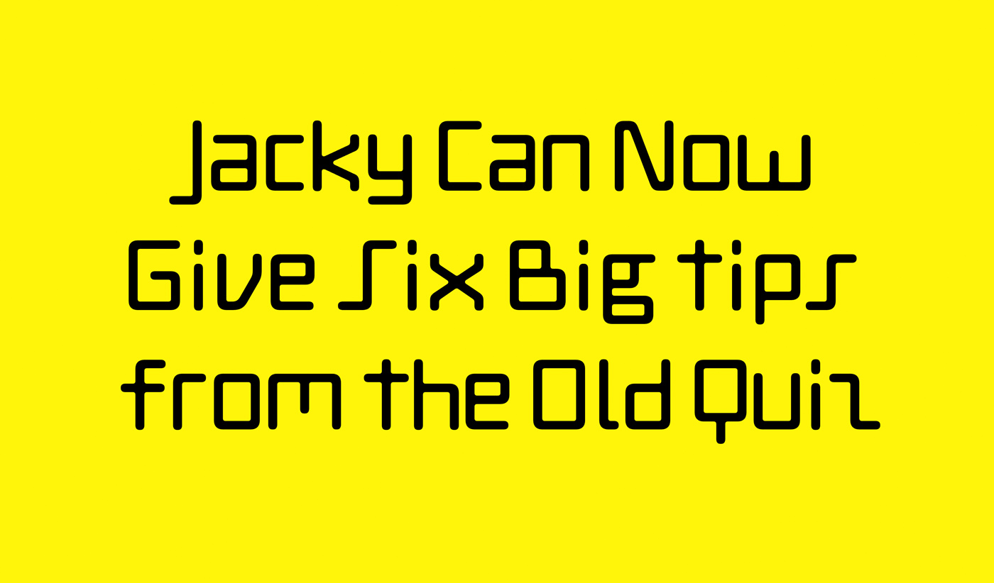
As with many of their fonts, the most recent release on HAL Typefaces takes a step back into history. HAL Four Grotesk was inspired by Empire Gothic, a font first published by Keystone Type Foundry in 1912—otherwise known as Grotesque No. 4 Italic or Times Gothic Italic. Coming in seven weights and corresponding italics, the result is “neutral” and “friendly”, while still having enough personality to stand on its own. “These boldly authentic, italicized styles from a century ago laid the foundation for further developing HAL Four into a versatile, all-purpose neo-grotesque,” Lucas tells us, thrilled about their latest release. Neo-grotesque typefaces are the heirs of the old Grotesque, the first form of sans serif type appearing in the early 19th Century. First named based on their quirky, odd-looking form, the style got more and more refined over the years, bringing them great popularity in the mid-20th century.
When searching for inspiration for new typefaces, Elias and Lucas enjoy looking into all fields of typography and its history without limiting themselves to a certain era or style. “I believe it’s helpful to stay open-minded. We are interested in looking at the media of typeface production, especially when one medium evolves or replaces another, for example, from metal to photo-type, the early digital fonts, or the software democratization of type design tools,” Elias explains. While styles and designs come and go, modern technology and new tools change how we design, use, and perceive type. “Every transition makes the production of typefaces easier, faster, more ungenerous, and more accessible and thus results in explosive outputs. Witnessing another small revolution, the current age of variable type, is also very interesting.”
Next to a website for artist Julia Haugeneder, Elias and Lucas are currently working on the design of the upcoming specimen for ABC Arizona and getting everything ready for their newest addition to HAL Typefaces: HAL Twins—coming soon!


