
On the road back from the Graphic Matters Exhibition in Breda, The Netherlands, Dennis Janssens and Tom Tiepermann from the creative agency ssnn – exhilarated from the event, but tired from the long drive – hatched the idea of organizing their very own festival in their hometown, Antwerp in Belgium. “While driving home we said to each other ‘Man, this was so nice! Too bad we have to drive all the way to the Netherlands for something like this… Maybe we should just organize it ourselves!’ And that was that”, the two designers tell Collide24. A few months later, the Antwerp Poster Festival was held for the first time in 2019, bringing together talents like César Debargue, Rikke Landler and Pierre Vanni. For the second round this year, the festival (which is still open to submissions!) comes in a very contemporary and expressive look, created in collaboration with Floriane Rousselot from Typelab.
Apart from their work on the Antwerp Poster Festival, ssnn has worked on various projects and collaborations in the past, among them their upcoming shirt edition with Belgian illustrator Juliane Noll, raising money for the BLM movement. The duo has met during their studies at university, where they worked together on many school-assignments, dreaming of having their own creative agency one day. “We were well in tune with each other and decided to give it a try”, Dennis and Tom tell us, “Being able to build our own portfolio and doing autonomous projects without being tied to another agency was very appealing to us. Also, the timing was just right because we were in a risk-free situation. We were both young and with the ‘Just Do It’ mentality from Nike in mind, we started our own creative agency. It would be impossible to fail because whatever way it went, we would have learned a lot.” Since their time at university, the duo has valued the benefits of collaborating together. “Everybody has his own strengths – and by combining these different strengths you can achieve so much more. We both believed in this philosophy since our studies and even started a platform on our school where students could link up and support each other.”
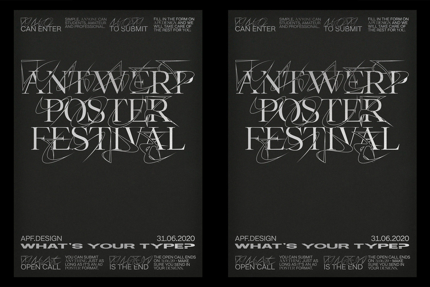
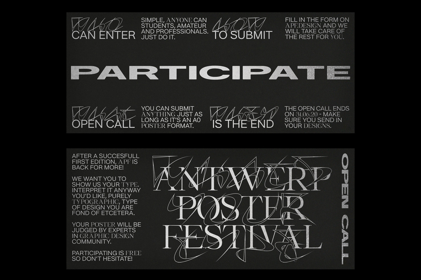
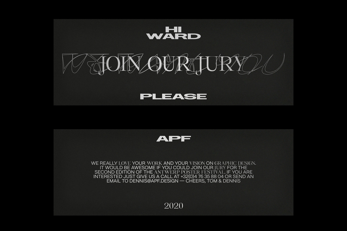
Instead of drawing on some imagery to create the identity of the Antwerp Poster Festival, ssnn took on the challenge to work solely with typefaces. “Each year we try to come up with a theme that allows for a very broad interpretation. This year it’s ‘What’s your type?’, as in ‘What typography do you use?’, but also as in ‘What type of designer are you?’. As an organization we try to stay neutral because the festival is all about the posters of the participants, not our own design work on the identity”, Dennis and Tom explain, “We know how critical everybody is of other design work and we want to reach a very wide audience. So the first weeks of designing always lead to some sleepless nights.”
Keeping with this year’s motto, the two designers aimed at showcasing experimental and independent type design – and found the perfect partner in Typelab. We first spoke to its founder, Floriane, about half a year ago, since then, the platform has launched his new website including an e-shop, release a new collection of fonts called “Space Collection”, and worked on a Digital Exhibition Animation in order to communicate on the new collection. At the moment, Floriane has two new fonts in the pipeline, putting a lot of work and effort into the making. “For this year I would love to focus more on creating typefaces, as the last year was more focused on the new website, and all the business behind it”, she tells us.
“We’ve been following Typelab for a while and we just love their typefaces. All of them are so different and unique so we thought it would be a great challenge to incorporate them in our branding. Also we think it’s great that they give a platform to young, up and coming designers to showcase their work”, ssnn explain. After finalizing their concept and getting in contact with Floriane, she offered them a customized collection for their new identity, including very strong, but also very different typefaces: Miu Miu by Flavien Minson, SerifBabe by Charlotte Rhode and her own typeface Slyther. “I thought different font styles can be such an interesting mix. And Studio ssnn used them in such a relevant way.”, Floriane concludes, “In my point of view, building up the whole identity system based solely on typefaces is quite an experimental approach that creates a visual language which works by itself and needs no more ornamentation. The festival this year is focusing on the question which type of designer we can be, and using different sort of fonts in the identity is clearing a great representation of the subject and the message AFP wants to spread: diversity and personality.”
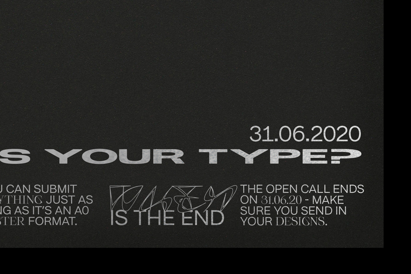
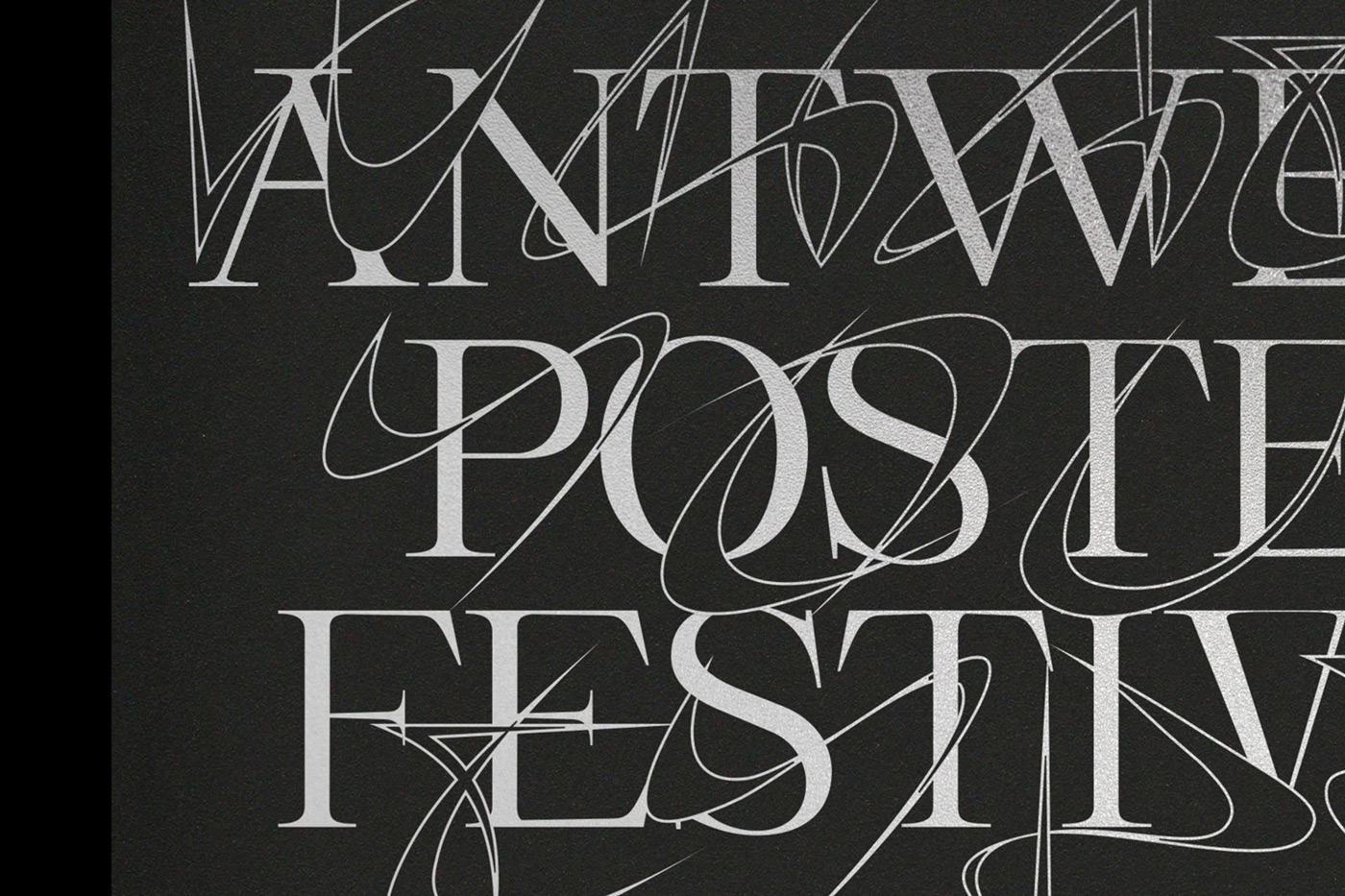
After suggesting the three different typefaces, Dennis and Tom began working on the design of the festival. By combining the three typefaces from Typelab with the Sans-Serif Nuckle from Heavyweight from the first edition of the festival, the duo managed to create an experimental and very unique identity, while still staying continuous in their visual language. “It took a while to find the right combo and look and feel. We also wanted to play with the legibility of our content. So we decided to use Slyther more as a decorative element. People who know the font will be able to read it while others wouldn’t”, the duo explains. Being used as an outlined version throughout the branding, Slyther “lends the identity its graphical and exciting vibe”.
SerifBabe is used for the logotype as well as to highlight certain parts of the text. “It feels as the perfect correlation between a classic serif and an experimental font”, ssnn says about the typeface by Charlotte Rhode, who has also been a speaker at the first edition of the Antwerp Poster Festival. “Miu Miu was the perfect bold type to give an extra punch to our identity. With its extended characters it fills up the space without asking for too much attention”, Dennis and Tom explain, emphasizing the great talent of the young creator, Flavien Minson by adding: “At the Antwerp Poster Festival we love to highlight those that don’t have their own platform just yet.” Seeing so many different typefaces of her platform combined in one identity, Floriane was very pleased with the outcome, stating that she was “really surprised and glad to see how great they are working together.”
Although they tried out various colors and effects on the typography during their creative process, Dennis and Tom chose to maintain a slightly altered version the black, white and grey combo from the last edition in the end. As the production didn’t go according to plan due to the pandemic, the duo had to find other ways to communicate the event. “We wanted to print our posters on a nice black paper by Antalis covered with silver metallic ink. But then Covid-19 happened and the streets were empty… So our offline communication wouldn’t have had much use”, ssnn reflect. “This year he organizational side of the project has been very difficult. Luckily our paper and printing partner Antalis and Antilope de Bie supported us from day one even though the sector has been hit hard by this pandemic. Scouting locations was impossible and the uncertainty wether we can have lectures and workshops caused some grey hairs. But we’ve found a solution and will communicate this asap!”

In order to make the festival available to everyone, ssnn abstain from high admissions and accepts all submission free of charge. “Design should be available for everyone and we want to give everyone a chance to enter our poster competition. This way we hope to reach as many people as possible and have an accurate representation of the current graphic design scene. That’s why we always choose our jury as diverse in style as possible.”


