
Ever since they can remember, music has always been a huge source of inspiration in the lives of Timur Irgashov and Oris Sheol. From playing guitar at the campfire to having the same taste in music, the two friends have always shared the same interests. It is thanks to those shared interest that their longlasting friendship was soon turned into a stable and fruitful teamwork. “About ten years ago, Oris became engaged in the development of logos. Soon after he inspired me to try it out. I became better and better, until we ended up teaming up for some joint work”, Timur tells Collide24, “It was fun, but we still lacked some serious projects experience, especially me. We worked separately for a long time, just helping each other sometimes. But then, a few years ago we finally decided to work on all projects together.” The two Moscow based designers have worked on several projects and collaborations in the past, among them their recent self-initiated project “Dope Sound”, a fictive identity for a music label.
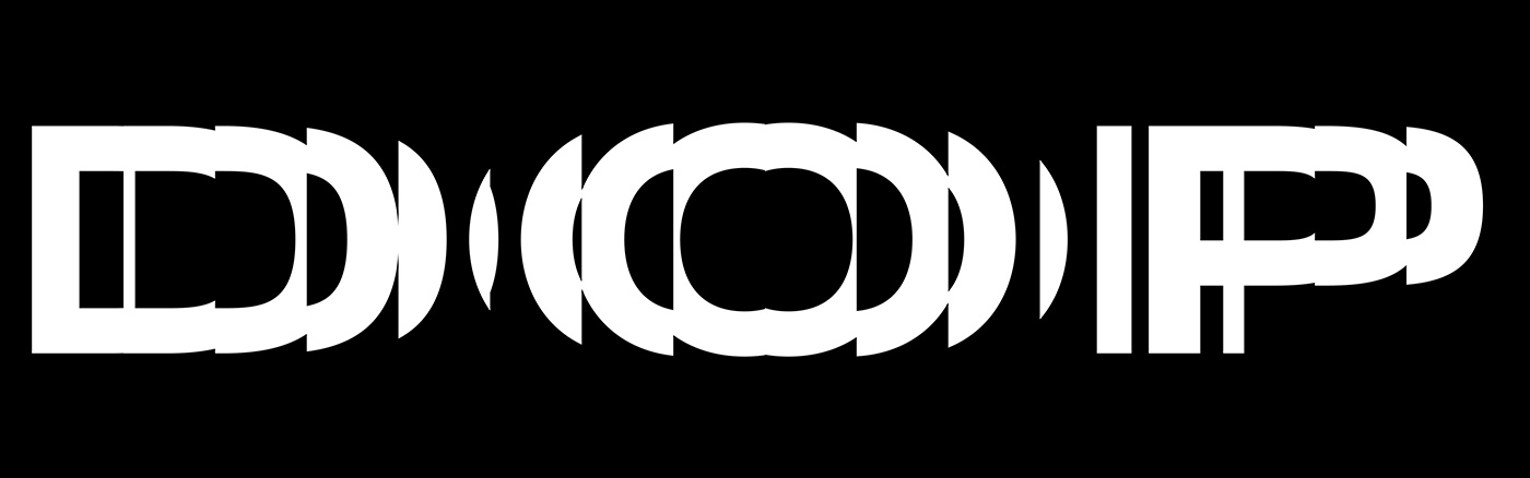
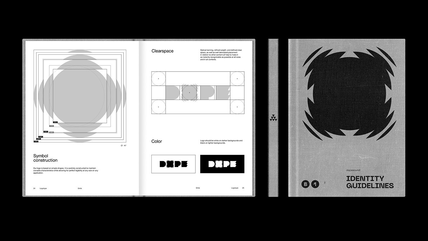
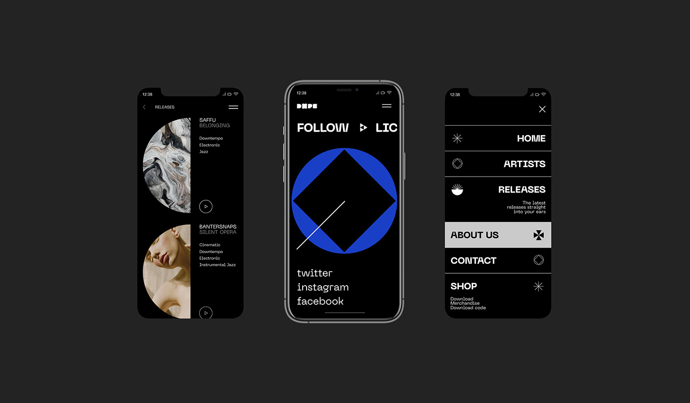
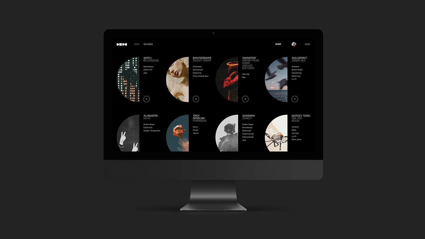
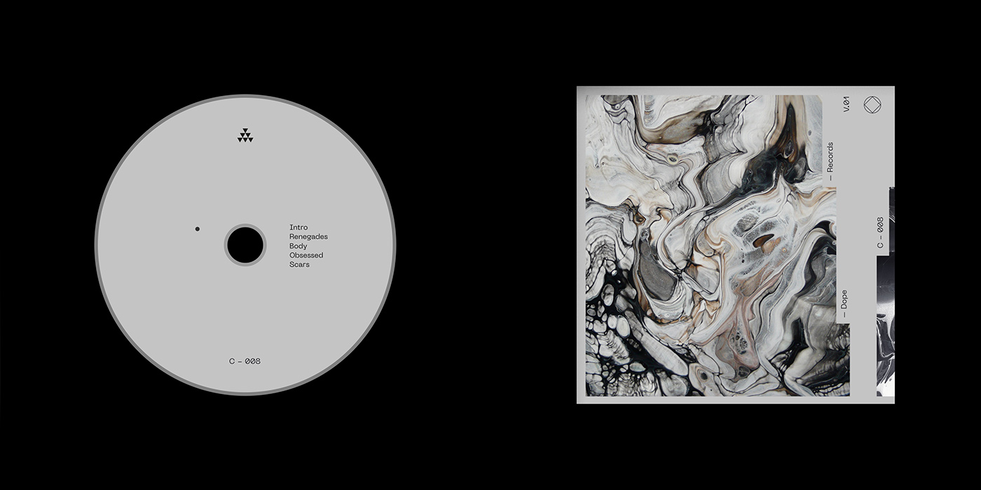
As the field of music offers enough space for experimentation, the duo jumped at the chance to manifest their love for music visually. “This theme is very close to us, less commercial, I would say. It has no negative stereotypes and offers great room for creativity”, Oris explains. Describing its visuality as a combination of “kinetic minimalism and brutalism”, the designers have worked out a full corporate identity system, starting with an animated and bold logo to posters, merchandise and a well-conceived concept for the label’s website. “Regarding the logo, we wanted to create a minimalistic sign, but make it literally look like ‘sound’. Initially, we thought of some simple geometric elements like circles, triangles and squares, but it looked very static”, Timur explains, “Then we came up with waves, vibrating refractions. Try to close your eyes and turn on your favorite music track, you might see the logo.”
As they currently did not have the option of working with a real music label, the duo decided to take the initiative and slip into the role of the client. “When you work on a project, the targets of the clients are what counts in the end. But we needed to distract from commercial orders, to work on something that was really catching. Therefore, we had to walk in the shoes of a client and try to understand what he might need”, Oris tells us. Like it’s in often in the nature of self-initiated projects, the two designers struggled to always make time for the collaboration. “I’d like to note that this was a non-profit project that we worked on in our spare time, so the process was rather disordered”, Oris explains, “We used to get distracted, take long breaks. However, we decided to publish this project so that we wouldn’t get stuck. In the end, we still had a huge amount of unused material, which we simply did not manage to arrange properly.”
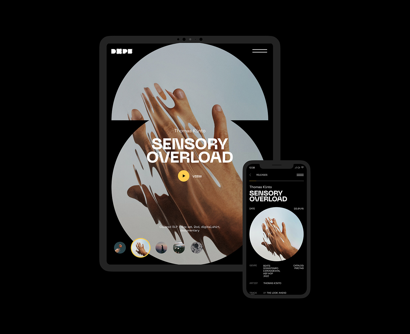
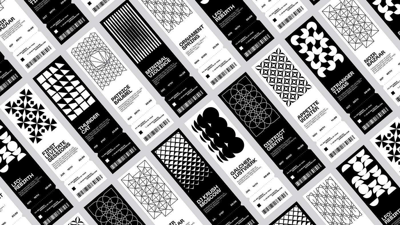
By using individual geometric patterns throughout the identity, the duo tries to capture the characteristics of each presented artist. “First of all, we thought of how it would work in practice. If we chose to work on the concept mainly with images or photos, we would certainly have further problems with their availability, quality and originality”, Timur concludes. By translating the idea of rhythm – a strong, regular repeated pattern of movement or sound – into visual patterns, the duo aimed at creating an atmosphere close to “downtempo: rhythmic, hypnotizing, but not depressing”. The result can be seen as Oris and Timur’s very own interpretation of contemporary design for the music industry. “Imagine some large and vibrant night city like Moscow, New York, Berlin. And imagine yourself in it. You are right on the embankment or on the bridge, cars are rushing, the city is singing and all its sounds in your head blend into one background pattern, and time freezes for a while. This is the feeling we wanted to make you experience.”
After so many fruitful collaborations together, the duo clearly appreciates the benefits of working together. “This is such a good way to expend your experience in the field of design and communication”, Timur tells us, and Oris adds: “This is main idea of this project – charging our brains. Some people engage themselves in the ‘365 days of type challenge’ – we work out concepts for fake brands. By the way, we have already received several offers to buy this identity from us, although we are ready to just give it away for free to those who can bring it to live.”


