
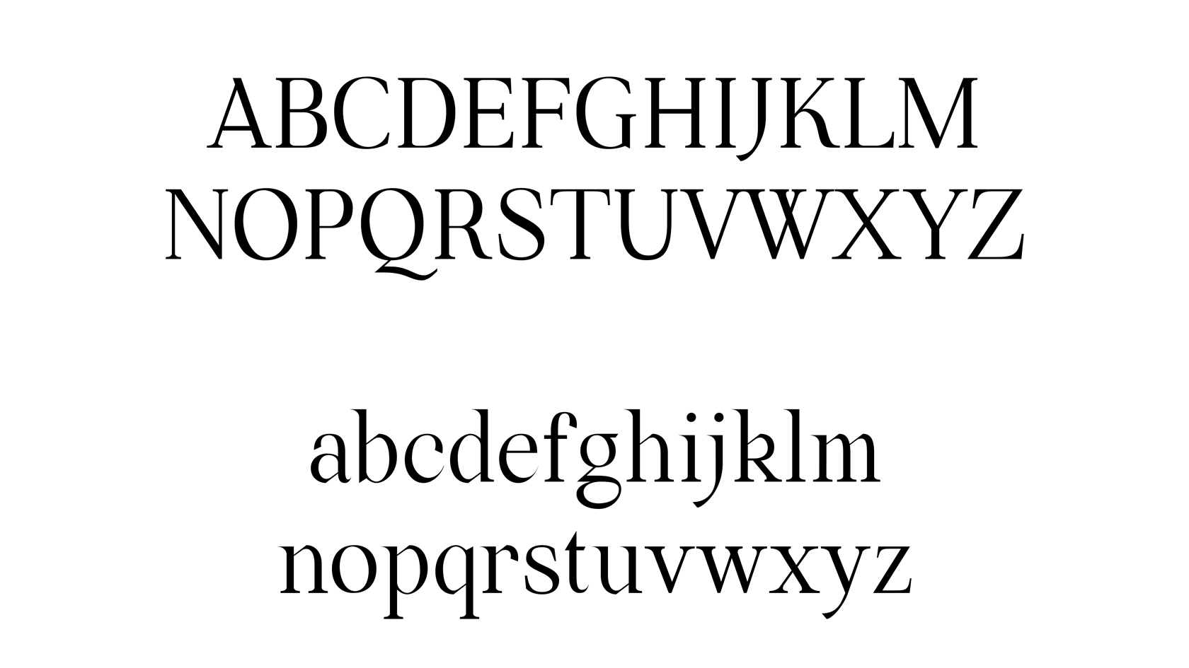
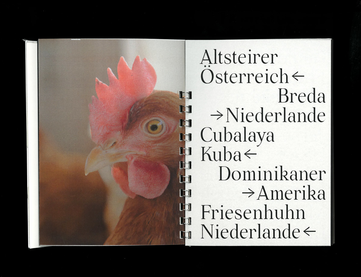
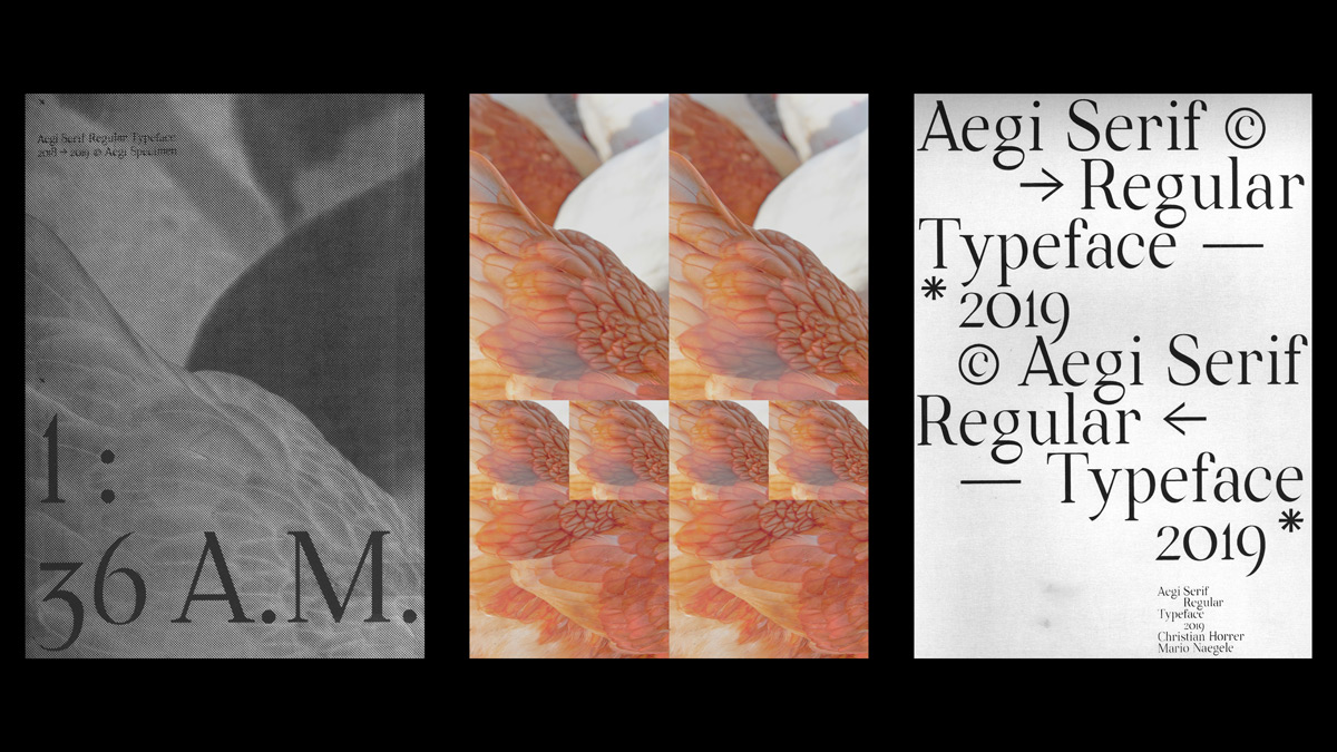
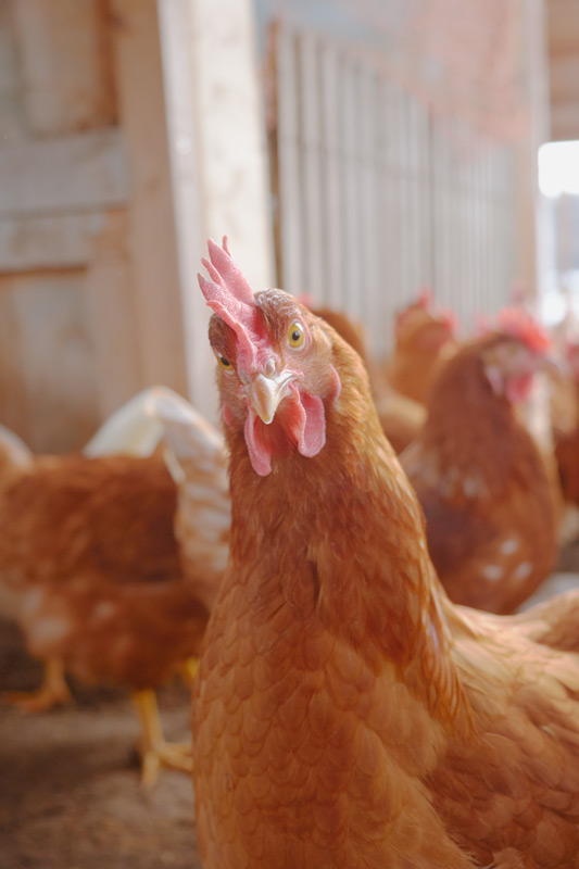
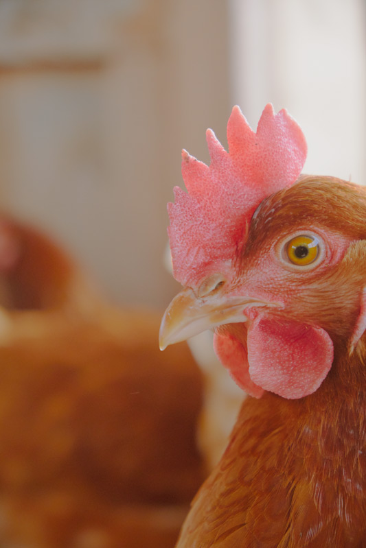
“The name ‘Aegi’ has no fixed meaning and is rather an undefined word. The sound and a suitable representation of some letters was important to us”, Christian Horrer and Mario Naegele tell us about their contemporary, serif typeface they’ve released in 2019. “In the design process we added the sharp edges, which reminded us of beaks. Then we photographed chickens for the font specimen. We noticed that this ambivalent character of the animals fits suitably with the typeface.
This is how we ended up with ‚Aegi’.” After meeting each other at the beginning of their studies in Konstanz and quickly realizing they share the same attitude towards work, the two Vienna based designers started collaborating and discussing their common output. Apart from their typeface, they have also worked on several projects together – among them the visuality of the KD––Lounge in 2019/20 from our previous article. “The decision to collaborate together was not made at a fixed point in the past. Both of us know that only certain projects can prosper with collaboration and others do not. When it came to designing „Aegi“, we simply had one goal: to tailor a font and to come up with suitably contributing solutions as best we can”, the duo explains.
Christian Horrer’s career started out with a focus on illustration rather than type design, but during his studies at HTWG Konstanz his fascination for graphic design and typography grew. “In course of my studies, I moved away from classical illustration”, he tells us, “Today, I focus on pictorial work, specifically 3D design. I have consolidated this throughout my internship at ‘Deutsche und Japaner’ and I am continuing it progressively ever since. I try to keep pictorial elements in the design and to find a suitable balance between concept and experiment. I often use contrasts in between irritation and harmony, to introduce and contextualize my projects.”
During his childhood, Mario was inspired by the work of the sculptor Karl-Henning Seemann who used to live in his neighborhood. “I’ve enjoyed working on physical craft ship from time to time”, he explains, “In retrospect, I would say that these things have shaped me and my work in some ways.” To Mario, the process of type design has some similarities to the art of craft. “I like the constant course of rethinking and tailoring. In addition, I simply enjoy collecting and arranging books, dealing with layout, interior space, spatial arrangement, sculptural objects, etc.” In his recent projects, space and composition play an important part, as well “a large spectrum of resources resulting from prior research.”
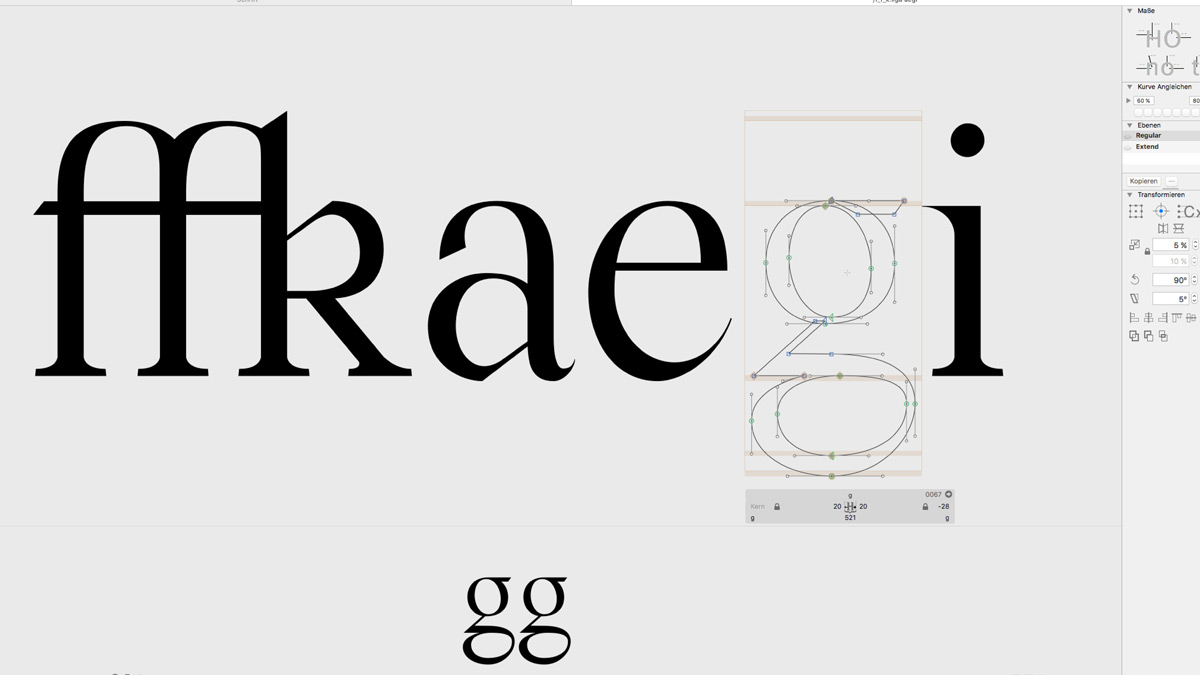
As Aegi was the first typeface Christian and Mario created, they had to start from scratch and acquire the skills autodidactically. “The process was of more interest to us than the result. We started with simple experiments using ink and quill. We tried different attachments and varied line widths, proportions or cone widths”, the duo explains. By setting their focus on legibility, they worked on strong contrasts and broken off curves that they adopted from certain quill caps.
For the two designers, it is important that the typeface is used in different contexts. “Our font is not to be used by people practicing racism, transphobia, homophobia, sexism, or any other form of discrimination. We are aware that a font is a tool provided by the font designer. Therefore you cannot and should not completely influence its final use”, they conclude, “However, we prefer to see “Aegi” in cultural projects. Students willing to use our font should not hesitate to contact us!”
While creating the typeface, the duo had to face different challenges – above all the correct handling of space and contrast. “There is always a lot to be revised and adjusted. Adapting the characteristics between capitals and lowercases is demanding”, they tell us, “For us beginners the handling of W, X, Y and Z was challenging. Further, correct kerning and mastering, which also requires many rounds of adjusting and tailoring.”
As their aesthetically output differs, Mario and Christian usually take on specific roles during a collaboration. “Thus, we have altering approaches, but we are quite capable of balancing them and not just insisting on our own ideas and interests”, the duo explains, “This may also lead to intense discussions. Usually one of us takes over and pushes the project forward again. A stagnating process sometime can be bypassed this way.” Before diving deep into the creative process, they normally start with sketching on paper and making a moodboard. “We try to follow the path from the beginning without exactly knowing the final product. Detours and short cuts to the once started path are always part of our process in seeking a suitable version of the final product”, they state, “The overview can be lost quickly, especially when designing fonts. That’s why externals are so important. Of course, this ends up in making more compromises, but a constant discussion also leads to the fact that you are able to be more empathetic. This is what determines success in working with customers, as well.” Besides being able to compromise, it’s important for them to share the same ambitions and the same level of commitment. “Showing understanding and empathy, being able to take a step back sometimes. If the counterpart can boost you further, it is also fertile. It may also be a relationship between love and just a little hate.”
Besides building upon this typeface further in the future and working on a few updates, Mario and Christian will collaborate with Typescarf and create an accessorize using their typeface “Aegi”. Stay tuned!


