
The independent publishing fair “It’s a book” has taken place in Leipzig for the tenth time in 2019. With its mission to encourage discussions and the exchange of ideas, it is an important platform for actors in the independent publishing scene. The fair never wanted to be a market place only, instead it is meant to be a space for interaction with full-day symposia, exhibitions, performances, and installations. Not only international publishers have the possibility to show their publications, students are invited to present their current book projects as well. The publishing fair was started ten years ago by Anne König, Jan Wenzel and Markus Dreßen, the heads of Spector Books. After a few years, it finally moved from the Theater of Leipzig to the HGB (Academy of Fine Arts Leipzig) in 2013. At that point, the students of the HGB got involved in the organization and design of the publishing fair. Every year there is a central idea, which students develop half a year in advance, influencing the choice of the publishers, the speakers and the overall design concept. In the year 2018, the three designers Anne Dietzsch, Elias Erkan, and Silvan Possa worked on the design of the publishing fair under the chosen leitmotiv the manifesto and created a minimalistic, but contemporary look for this occasion. We talked with the trio about their overall background, the meaning behind their design concept for “It’s a book 2018” and the relationship between the OLD and the NEW.
First of all, can you tell our readers a bit about yourselves and your backgrounds?
Elias: I’m born and raised in Augsburg, Bavaria. I almost ended up in a professional sports-career until I decided to focus more on my interest in fine arts. After I went to a lecture by Markus Dreßen in 2014, I knew that the graphic-design department at the HGB Leipzig was the right place for me. Since I started studying in 2015, my work focuses mostly about book-design, especially in the field of architecture.
Silvan: I‘m born and raised in a small town near St.Gallen in Switzerland and did my Bachelor degree in Visual Communication at Zurich University of the Arts. After my second year I went to Leipzig for an exchange semester at HGB. That‘s where I met Elias and Anne.
Anne: I am from Thuringia, moved to Leipzig in 2010 and have been studying typography and type design at the Academy of Visual Arts in Leipzig since 2014. I studied in the classes of Markus Dreßen (Graphic Design), Fred Smeijers & Stephan Müller (Type Design) and Ludovic Balland (Typography). Recently I moved to Berlin and am increasingly interested in the possibilities of Digital Design and Programming.
How would you describe the aesthetic of your work?
Elias: I try to work with an engineering or architectural approach, rather than an illustrative. I would say my style is plain, very programmatic and always based around typographic systems and hierarchies like grids, point sizes, character styles etc. Also I’m really bad with colors, so my stuff tends to be 99% b/w.
Silvan: Of course to find an own design style or visual language is a long term process. But typography has always been one of the main ingredients in my work. Abstraction and a certain radical typesetting in combination with typographic systems, shapes and images generates tension.
Anne: A style is not important to me, but I think about principles and values of my design practice. With each project I find it exciting to redefine references and to create suitable formal languages—A back and forth between intuitive form finding and intellectual reflection.
Where does your fascination for graphic design and typography come from?
Silvan: As a teenager I came in touch with the local skate community. Especially skate brands were always driven by strong logos or illustrations which I kept an eye on. A little later graffiti inflamed my passion for shapes and especially typography.
Elias: Like Silvan skateboarding had a big influence on me, especially in terms of fashion and my taste in music. I was so fascinated, when I saw Harmony Korines Kids for the first time at the age of 12 or music videos by Spike Jonze. That kind of lifestyle shown in these films. Around the age of 16 I discovered electronic music, maybe that was the point where I really paid attention to graphic design. Labels like Smallville or Perlon designed by Stefan Marx and Double Standards drew my attention. I became really obsessed in collecting records, what shifted into collecting books really soon, when I went to the bookstore MZIN for the first time. The summer before I started studying I went to Warsaw, where I saw Ludovic Ballands design for the Muzeum Sztuki Nowoczesnej w Warszawie for the first time (not knowing who he was and that I would end up studying in his new formed class two years later) I was really exited by the clarity and typographic strength of the posters and the exhibition design.
How has Leipzig shaped you creative output?
Elias: Leipzig is a very lively city. Because of its GDR heritage it’s still really cheap and easy to find a spot to run an art space bar or club in. There are multiple events like talks, discussions or exhibitions every week, so you get a lot of input. The graphic design community is also pretty strong. I’m influenced by former students of the HGB like Helmut Völter, Spector Bureau, Lamm & Kirch, ARC and many more. But I guess what mainly shaped my creative output was the teaching at the HGB, especially the two foundation years of Markus Dreßen with his Moholy-Nagy-like approach to design were really influential on my way of thinking. Since living in Leipzig, the bookshop MZIN and my friendship with it’s owners Karen Laube and Philipp Neumann is also really important to me. Everyone who ever took a step into MZIN can tell that Philip is a living encyclopedia for almost every aspect of culture like design music, architecture. He introduced me to so many of these things and was really influential on my development as a graphic-designer.
Silvan: Zurich has a long tradition in graphic design. Some principles or maybe even craft from the earlier days get still taught at ZHdK. Of course that‘s something which influenced my creative output in a certain way.
Anne: Leipzig’s long tradition of printing is still present in the city, as well as in the HGB—it links the teaching closely with this awareness. This is the reason for the expertise and high quality of book design—but it is certainly also a comfort zone. I always enjoyed getting involved in discursive as practical projects like It’s a book and was clearly shaped by conversations with the local scene.
Leipzig not only has excellent designers, but also an interesting art scene. In my two-year job at a gallery, I visited lots of local and international art events where I worked with several impressing people—it was an incredibly exciting and development-rich time for me. In these days, some friendships have emerged, which are important influence to my live and work to this day.
If you are looking for inspiration, where do you turn to?
Elias: The discourses with my fellow students like Peter Cornicius, Sophia Eisenhut and Tobias Klett are the best inspiration for me. Just asking them for an opinion or advice always results in something productive for me. There are some topics constantly on my mind like architecture, especially social housing built by people like Hannes Meyer or Harry Glück. I try to convert the immersive methods of the post-dramatic theatre of Rimini Protokoll into my own graphic-design practices for some time now. Maybe it’s a little abstract, but I think listening to music all day long while working left an impact on my work as well, so I guess Brian Eno, Steve Reich and Barrington Levy left their mark.
Silvan: I get my inspiration from many different impressions in my daily life. Be it a walk through a city, an exhibition, a building or friends.
Anne: Inspiration mostly always occurs in moments when I take the time to think about form. Often I discover analogies in profane things, which develop into concrete formal ideas or concepts. Music and a glass of red wine are witnesses of the whole.
Tell us more about your design process! What were the first steps of the collaboration?
Silvan: Due to the fact It’s a book is organized and created by a group of students, first we met every friday evening to discuss our intentions and the impact we wanted to create around the book fair/symposium.
Elias: First we brainstormed what impact manifestos had on graphic-design practice in the past and how we could use these „rules“ as our own manifesto to create the visual identity. After coming to a dead end with that idea we tried to grasp that topic in a more radical way, as we discussed about what a manifesto meant to us and what it has to accomplish.
Silvan: During this process we had many different approaches for the design. The final concept/idea came up shortly before the poster had to go to the printery. What that means is the end result was actually product of a complete turn in the end of our process.
What is the concept behind the overall design? How does it incorporate the spirit of the book fair „It’s a book“?
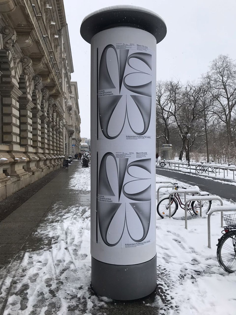
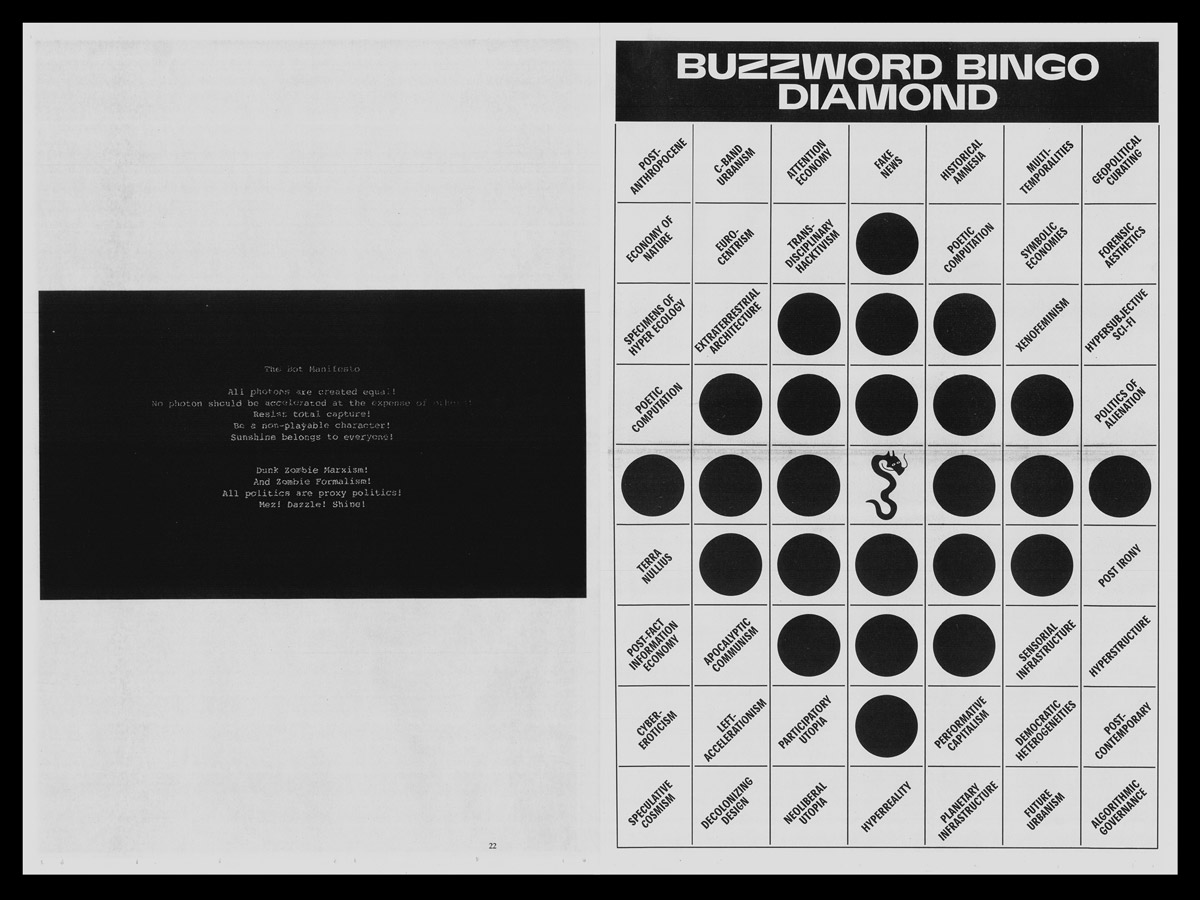
Anne: Following the annual topic “It’s a book, it’s the old to protest, it’s the new to request.”, which was dealing with manifestos, the poster and the newspaper are working as a yin yang formation: old and new as fluid oppositional forces that, despite their contrariness, relate to each other, deconstruct themselves and explore scope.
Elias: We examined the potential of transliteration—the transformation of type—as a subversive strategy in terms of identity policies on the one hand and the performance of writing on the other hand. You can’t really say that we incorporated a spirit, I think each year you start all over again, the team changes, apart from some core-members like Dr. Sabine Schmidt, Markus Dreßen and Albrecht Gäbel the crew is changing each year, what means a different input for us.
What is the idea behind the 3D letters on the front of the publication and on the posters?
Anne: The free letter shapes of the poster associate the liberation from convention: it pushes against modernist typography, forms itself in the won space, creates non-bindingness and keeps questions open.
Elias: NEW—not yet manifested. Matter liquid, in an intermediate state. The font acts more as a performer here starting out of nothing, pushing against everything, but going nowhere.
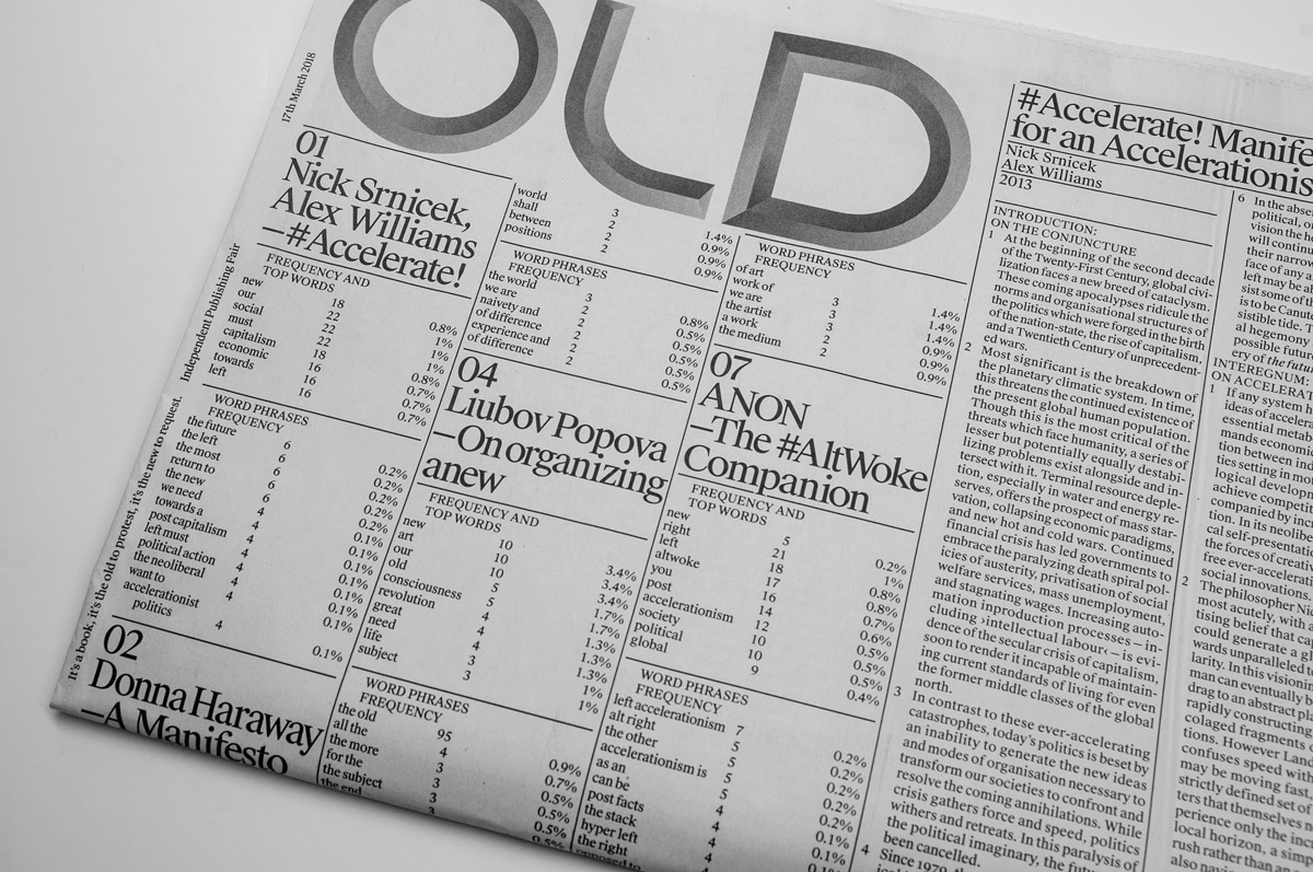
The Font pushes the typeface into its format as it moves. Not clear, but powerful. In their materiality something between solid and liquid. It is not clear, showing a state in between. the rest of the information, clearly separated by lines, squeezes in between as a neutral observer. Non-commenting rather moderating. OLD — pictured here as a stone cut logo. The font is reminiscent of the Bauhaus and modernism. It exposes the classical modernism as a not redeemed artifact of the past. Also its kind of joke to have OLD as a logo for a newspaper.
Does it make any difference to design such large-sized formats as a newspaper compared to your usual editorial projects?
Elias: Actually I think designing a newspaper is fairly easy, because we as readers are so used to a medium that hasn’t really changed much since almost 200 years. Just leaving space blank in your layout or using an offbeat typeface already creates attention. Also, I think you can treat every spread more as poster since you can create tension simply by big size contrasts.
The reason why we decided against making a book that year and designing the newspaper is the citation of many manifestos of the artistic avant-garde, such as the Futuristic Manifesto by Marinetti, published in the newspaper Le Figaro. Moreover, it is an ephemeral medium, which demands a certain topicality.
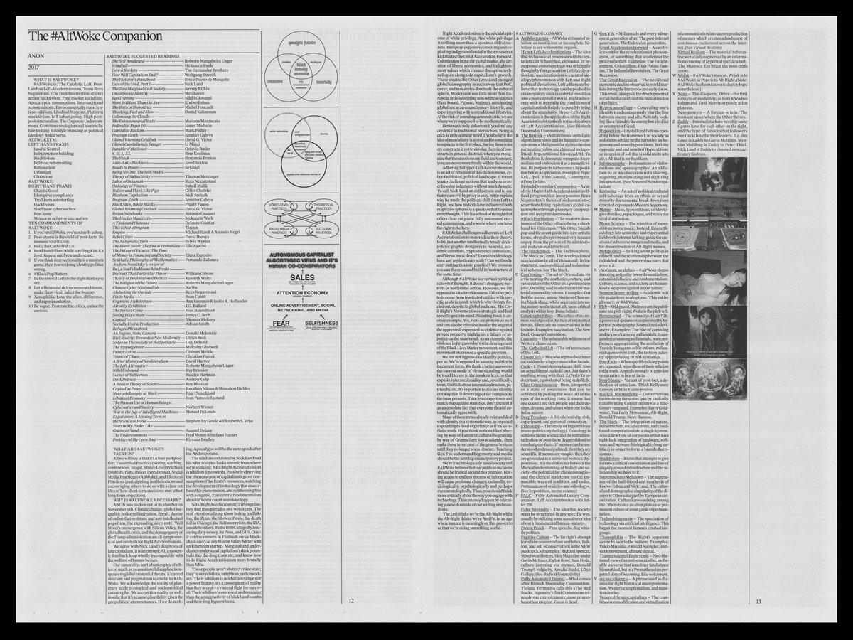
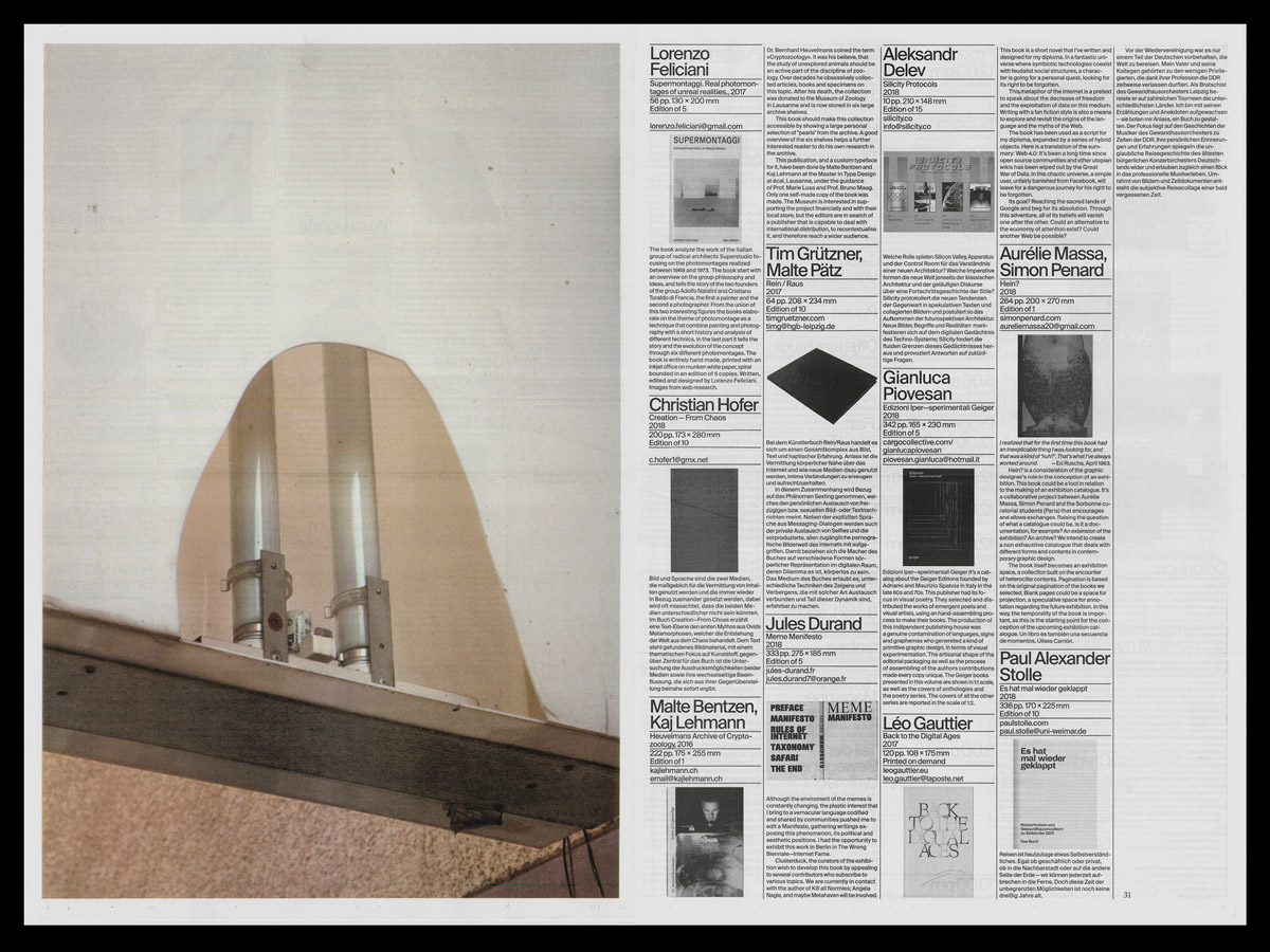
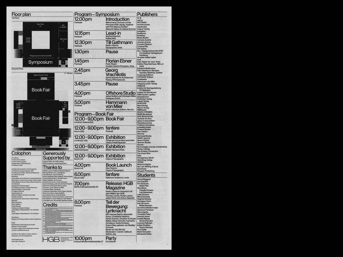
The newspaper is divided into two parts, the first one begins with the experiment to locate linguistic figures in the subsequent manifestos and tries to conceive of the manifest as an independent text form. The selection of printed manifestos is based on questions and issues that have arisen in discussions in preparation. In the second part, we gave space to contributions of symposium guests and students, the winners of the student competition, as well as information about the fair.
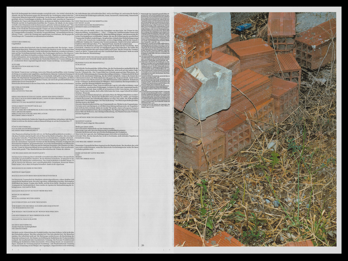
Everything is accompanied by a photo essay by Philip Markert, whose pictures subtly observe state and contemporary descriptions of urban space in their openness.
How has the cooperative working process been so far?
Anne: I think that’s why it has become such a good result, because we have had intense discussions. It was an exhausting and instructive process at the same time: the three of us are confident designers who are always involved in projects with their ideas and perspectives. I think it is a great quality of collaboration to give space to discussions, to step back at the right moment to evaluate what decisions have to be made to create an excellent product. So it’s about compromise in the best sense: concessions in favor of quality through collaborative expertise.
What’s your own understanding of the term “collaboration”?
Elias: When working as a graphic-designer in a non-artistic way, you are always a kind of collaborator, while doing a project you have to connect with so many actors. Dealing with all of these variables is a big part of our work.
Anne: What makes collaborations interesting to me is that each of the participants, motivated by their own practices, enters into a collaboration in order to create a common vision and a result that one would never have produced in this appearance by herself. The collective negotiation of design values arises from expertise and allows it to grow at the same time.
How important is it for you to collaborate with other artists?
Anne: I think they make sense when people share a vision, provided communication and zeal match, which isn’t always the case. I personally enjoy working in collaborations, but I think it’s very important to give individual practice space to develop an own strength. In that case collaborations can develop suspense and lead to interesting ideational or formal expression—a new aesthetics.
Do you have someone in mind with whom you would like to start a collaboration?
Elias: I still haven’t designed a record cover yet … that’s on my list for sure.
Silvan: I can’t name a certain person or a company, but in general i find an interdisciplinary approach to projects very interesting.
Anne: I have an eye on the work of Yehwan Song, who has a playful way of exploring the scope of digital applications. Furthermore interdisciplinary collaborations—with sciences, activism as well as music or fashion—would surely get my attention.
Do you have any collaborative projects in mind which you find inspiring?
Elias: The collaboration between Schauspiel Stuttgart and Spector Bureau (Katharina Köhler, Jan Wenzel, Markus Dreßen and Jakob Kirch) is an outstanding example for me.
Anne: Brian Eno and Peter Schmidt’s Oblique Strategies is something that pops in my mind. Both of them felt a need of writing down lines to negotiate doubts and blockades during their creative processes. When they discovered their similar approaches of handling, they decided to create a edition—a set of cards with simple phrases, which encourage artists of all disciplines to lateral thinking. These cards actually work similar to a collaborator, who gives you an unexpected new perspective on your work. I would love to have a set of these cards.


